React Infinite Gallery 🖼️
June 16, 2025 · View on GitHub
React Infinite Gallery 🖼️
A beautiful infinite wraparound gallery React component that supports both images and videos with smooth animations and interactions.
Live Demo 🚀
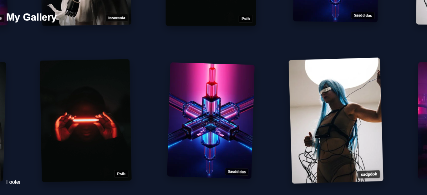
Check out the live demo to see the component in action!
Installation 📦
npm install react-infinite-gallery
Or:
yarn add react-infinite-gallery
Features ✨
- 🔄 Infinite scrolling with smooth loading
- 📱 Fully responsive grid layout
- 🎯 Lazy loading of images for better performance
- ⚙️ Highly customizable grid settings
- 🎨 Clean and modern design
- 🚀 Lightweight and optimized for performance
- 🎨 Clean and modern design
- 🚀 Lightweight and optimized for performance
Usage 💻
import React from 'react';
import InfiniteGallery from 'react-infinite-gallery';
import 'react-infinite-gallery/dist/InfiniteGallery.css';

const itemsData = [
  {
    id: 1,
    type: 'image',
    content: 'https://example.com/image1.jpg',
    badgeText: 'Sample',
    color: '#EF5350',  // Optional: custom color
    rotation: 2,       // Optional: custom rotation
    scale: 1.1         // Optional: custom scale
  },
  {
    id: 2,
    type: 'video',
    content: 'https://example.com/video1.mp4',
    badgeText: 'Video',
    color: '#42A5F5'   // Optional: custom color
  },
  // Add more items as needed
];

function App() {
  return (
    <InfiniteGallery
      itemsData={itemsData}
      cardWidth={280}
      cardHeight={380}
      headerContent={<h1>Infinite Gallery</h1>}
      footerContent={<p>Gallery Footer</p>}
      galleryAnimate={true}
      badgeClass="custom-badge"

    />
  );
}
Props 🔧
| Prop | Type | Default | Description |
|---|---|---|---|
itemsData | Array | [] | Array of items to display. Each item should have: id, type ('image' or 'video'), content (URL), and optional badgeText, color, rotation, and scale |
cardWidth | number | 280 | Width of each card in pixels |
cardHeight | number | 380 | Height of each card in pixels |
headerContent | ReactNode | null | Content to display at the top of the gallery |
footerContent | ReactNode | null | Content to display at the bottom of the gallery |
galleryAnimate | boolean | true | Whether to show the initial animation |
badgeClass | string | '' | Custom CSS class for badges |
stackInDuration | number | 1500 | Duration of stack-in animation in milliseconds |
stackOutDuration | number | 1000 | Duration of stack-out animation in milliseconds |
playButtonProps | object | {} | Props for customizing the video play button |
expandButtonProps | object | {} | Props for customizing the expand button |
infoButton | ReactNode | null | Custom info button component |
Item Data Structure
Each item in the itemsData array should have the following structure:
interface GalleryItem {
  id: number | string;          // Unique identifier
  type: 'image' | 'video';      // Type of content
  content: string;              // URL of the content
  badgeText?: string;           // Optional badge text
  color?: string;               // Optional custom color
  rotation?: number;            // Optional rotation in degrees
  scale?: number;               // Optional scale factor
}
CSS Customization
The component comes with default styles but can be customized using CSS classes:
.ig-gallery- Main gallery container.ig-card- Individual card container.ig-badge- Badge element.ig-play-btn- Video play button.ig-expand-btn- Expand button.ig-info-panel- Info panel
Important Notes ⚠️
- A minimum of 20 images is required for optimal performance and user experience
- Supported image formats: jpg, png, webp
- For best performance, use appropriately sized and optimized images
- Make sure to import the CSS file as shown in the usage example
Example
Check out the usage-example.jsx file in the repository for a complete implementation example.
License 📄
MIT