React Fancy Switch
September 29, 2025 · View on GitHub
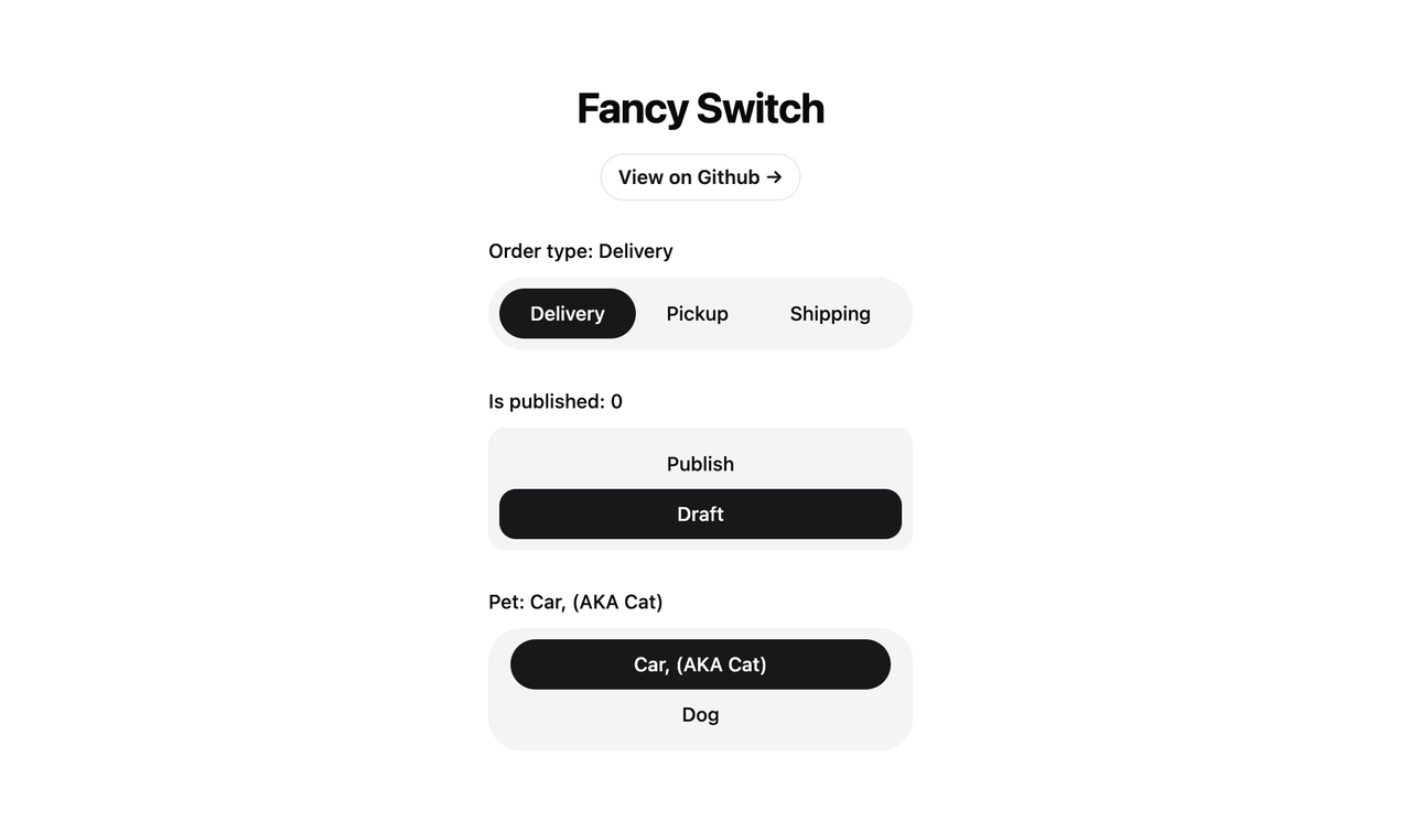


React Fancy Switch
React Fancy Switch is a customizable React component that provides an elegant and interactive way to switch between multiple options. It's designed to be flexible, accessible, and easy to integrate into your React applications, all without requiring framer-motion.
Note: There are currently no online previews or demos available for this project.
In the meantime, please clone the repository and try it out locally.
Features
- Supports both primitive (string/number/boolean) and object-based options
- Customizable styling for radio buttons and highlighter
- Accessible design with proper ARIA attributes
- Smooth transition effects
- Custom option rendering support
Installation
To use FancySwitch in your project, you can install it via npm:
npm install @omit/react-fancy-switch
Usage
Here are examples of how to use the FancySwitch component with different types of option arrays:
1. Array of Primitives (Strings, Numbers, or Booleans)
import React, { useState } from 'react'
import FancySwitch from '@omit/react-fancy-switch'

const StringExample = () => {
  const [selectedOption, setSelectedOption] = useState('apple')

  const options = ['apple', 'banana', 'cherry']

  return (
    <FancySwitch
      options={options}
      value={selectedOption}
      onChange={setSelectedOption}
      className="some-class"
      radioClassName="radio-button"
      highlighterClassName="highlighter"
    />
  )
}
2. Array of Objects (Default Keys)
import React, { useState } from 'react'
import FancySwitch from '@omit/react-fancy-switch'

const DefaultObjectExample = () => {
  const [selectedOption, setSelectedOption] = useState('option1')

  const options = [
    { value: 'option1', label: 'Option 1', disabled: false },
    { value: 'option2', label: 'Option 2', disabled: true },
    { value: 'option3', label: 'Option 3', disabled: false }
  ]

  return (
    <FancySwitch
      options={options}
      value={selectedOption}
      onChange={setSelectedOption}
      radioClassName="radio-button"
      highlighterClassName="highlighter"
    />
  )
}
3. Array of Objects (Custom Keys)
import React, { useState } from 'react'
import FancySwitch from '@omit/react-fancy-switch'

const CustomObjectExample = () => {
  const [selectedOption, setSelectedOption] = useState(1)

  const options = [
    { id: 1, name: 'First Choice', isDisabled: false },
    { id: 2, name: 'Second Choice', isDisabled: true },
    { id: 3, name: 'Third Choice', isDisabled: false }
  ]

  return (
    <FancySwitch
      options={options}
      value={selectedOption}
      onChange={setSelectedOption}
      valueKey="id"
      labelKey="name"
      disabledKey="isDisabled"
      radioClassName="radio-button"
      highlighterClassName="highlighter"
    />
  )
}
4. Custom Option Rendering
import React, { useState } from 'react'
import FancySwitch from '@omit/react-fancy-switch'

const CustomRenderExample = () => {
  const [selectedOption, setSelectedOption] = useState('option1')

  const options = [
    { value: 'option1', label: 'Option 1', icon: '🎉' },
    { value: 'option2', label: 'Option 2', icon: '⭐' },
    { value: 'option3', label: 'Option 3', icon: '🎨' }
  ]

  return (
    <FancySwitch
      options={options}
      value={selectedOption}
      onChange={setSelectedOption}
      renderOption={({ option, isSelected, getOptionProps }) => (
        <div {...getOptionProps()} className="flex items-center gap-2">
          <span>{option.icon}</span>
          <span>{option.label}</span>
        </div>
      )}
    />
  )
}
API
Props
| Prop | Type | Default | Description |
|---|---|---|---|
options | OptionType[] | Required | An array of options to display. Can be primitives or objects. |
value | OptionValue | - | The currently selected value. |
onChange | (value: OptionValue) => void | - | Callback function called when the selection changes. |
valueKey | string | 'value' | The key to use for the option's value when using object options. |
labelKey | string | 'label' | The key to use for the option's label when using object options. |
disabledKey | string | 'disabled' | The key to use for the option's disabled state (object options). |
radioClassName | string | - | CSS class name for the radio button elements. |
highlighterClassName | string | - | CSS class name for the highlighter element. |
highlighterIncludeMargin | boolean | false | Whether to include margins in highlighter size calculations. |
highlighterStyle | React.CSSProperties | - | Custom styles for the highlighter element. |
disabledOptions | OptionValue[] | [] | An array of values for options that should be disabled. |
renderOption | RenderOptionFunction | - | Custom render function for options. |
Additional HTML attributes for the container div can be passed as props and will be spread onto the root element.
Styling
The FancySwitch component provides several ways to customize its appearance:
- Use the
classNameprop to style the container div - Use the
radioClassNameprop to style individual radio buttons - Use the
highlighterClassNameprop to style the highlighter element - Use the
highlighterStyleprop to apply custom inline styles to the highlighter - Use the
renderOptionprop for complete control over option rendering
Example:
<FancySwitch
  className="flex rounded-full bg-muted p-2"
  highlighterClassName="bg-primary rounded-full"
  radioClassName="relative mx-2 flex h-9 cursor-pointer items-center justify-center rounded-full px-3.5 text-sm font-medium transition-colors focus:outline-none data-[checked]:text-primary-foreground"
  highlighterIncludeMargin={true}
  highlighterStyle={{ backgroundColor: 'blue', borderRadius: '8px' }}
/>
Accessibility
FancySwitch is built with accessibility in mind:
- Uses semantic HTML with proper ARIA attributes
- Supports keyboard navigation (arrow keys)
- Manages focus states automatically
- Includes a live region for screen reader announcements
- Properly handles disabled states
- Supports custom aria-labels through props
Other Projects
License
This project is open source and available under the MIT License.