Custom Controls for Xamarin Forms
July 19, 2018 · View on GitHub
Hi everybody, I finally find the time to bring some documentation to my awesome collection of XF controls. They are all pure XF controls with no platform-specific code at all. Since I'm very lazy, I will use this single file for all controls. Pardon my englysh and my foolishness, I'm italian.
Controls
| Name | Useless Description |  |
|---|---|---|
| StateButton | A button with On/Off state | Link |
| BadgeButton | A button that's nothing but a lot of talk and a badge | Link |
| AccordionView | Classic accordion-style control | Link |
| RepeaterView | RepeaterView | Link |
| WrapRepeaterView | Same as RepeaterView, but it spans multiple columns | Link |
| ProgressBarView | You don't like native progressbar, don't you? Neither do I! | Link |
| AutoCompleteView (discontinued) | Use at your own risk | Link |
Platform Support
| Platform | Supported |
|---|---|
| Xamarin.iOS | Yes |
| Xamarin.Android | Yes |
| Anything else | BIG NO |
UWP and other platforms are not supported, but since controls are pure XF they should work fine everywhere; I don't have tested them and I don't give support, but if you want to contribute let me know and I'll consider PRs.
StateButton

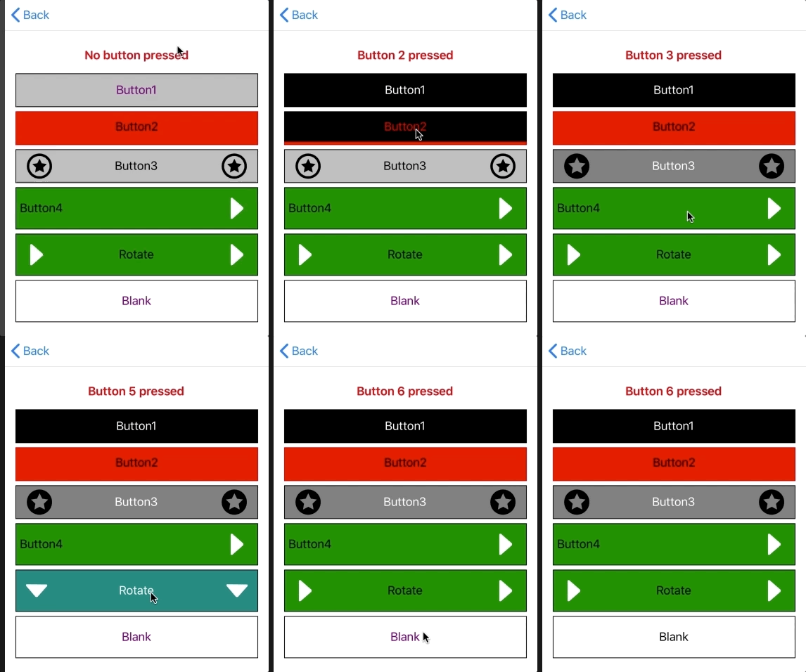
As the name should suggest, this is a Button with off/on state. Properties are:
public string Text{ get; set; }
public bool StateChangeEnabled { get; set; }
public bool IsPressed { get; set; }
public Color TextColor { get; set; }
public TextPosition TextPosition{ get; set; }
public Color ActiveBackgroundColor{ get; set; }
public Color ActiveTextColor{ get; set; }
public Color BorderColor{ get; set; }
public Color ActiveBorderColor{ get; set; }
public ICommand Command{ get; set; }
public object CommandParameter{ get; set; }
public Thickness Border{ get; set; }
public Thickness InnerPadding{ get; set; }
public FontAttributes FontAttributes{ get; set; }
public string FontFamily{ get; set; }
public double FontSize{ get; set; }
public FileImageSource LeftImage{ get; set; }
public FileImageSource ActiveLeftImage{ get; set; }
public FileImageSource RightImage{ get; set; }
public FileImageSource ActiveRightImage{ get; set; }
public bool RotateImages { get; set; }
I think there's little to explain: TextColor is the default TextColor, ActiveTextColor is the "pressed" color, and so on. You can place an image to the left and/or right side of the button the can be optionally be animated on click (RotateImages = true).
Usage
<ContentPage xmlns="http://xamarin.com/schemas/2014/forms" xmlns:x="http://schemas.microsoft.com/winfx/2009/xaml" xmlns:statebutton="clr-namespace:Xamarin.CustomControls;assembly=Xamarin.CustomControls.StateButton" x:Class="CustomControlsSamples.StateButtonPage">
    <ContentPage.Content>
        <StackLayout Padding="15">
           <statebutton:StateButton Text="Rotate" RotateImages="true" ActiveTextColor="White" ActiveBackgroundColor="Teal" TextColor="Black" BackgroundColor="Green" ActiveBorderColor="Black" LeftImage="arrowRight" ActiveLeftImage="arrowDown" RightImage="arrowRight" HeightRequest="60" Command="{Binding SelectCommand}" CommandParameter="5"  />
        </StackLayout>
    </ContentPage.Content>
</ContentPage>
...
