Gantry
August 8, 2026 · View on GitHub
Angular 20+ Gantt chart library — 100% free, zoneless, signal-based, zero
@angular/animations, zero@angular/cdk. npm package:ngx-gantry· component:<gantry>· class:GantryComponent.
Install
npm i ngx-gantry
# peer deps: @angular/core & @angular/common >= 20.2, plus dayjs
Features
| Feature | Detail |
|---|---|
| Signals | All state via signal() / computed() / effect() — no RxJS |
| Zoneless | Works with provideZonelessChangeDetection() |
| Bar registry | Plug in any custom bar component via provideGanttBar() |
| Virtual scroll | Scroll-position windowing, zero CDK |
| Lazy load | Angular 20 resource() + linkedSignal accumulation |
| Drag & resize | Pointer Events API + setPointerCapture() |
| Selection | Single / Ctrl+Click toggle / Shift+Click range |
| Keyboard | Escape, Ctrl+A, +/- zoom, T today |
| Tooltip | Native Popover API — zero CDK Overlay |
| Dark / light | Auto prefers-color-scheme + manual toggle |
| Animations | animate.enter / animate.leave (Angular 20.2 native) |
| Dependencies | Only dayjs (MIT, 7KB) |
Quick start (standalone)
// main.ts
import { bootstrapApplication } from '@angular/platform-browser';
import { provideZonelessChangeDetection } from '@angular/core';
import { provideGanttLib } from 'ngx-gantry';
import { AppComponent } from './app/app.component';

bootstrapApplication(AppComponent, {
  providers: [
    provideZonelessChangeDetection(),
    provideGanttLib({ darkMode: 'auto' }),
  ],
});
// app.component.ts
import { GantryComponent, GanttTask, ViewMode } from 'ngx-gantry';

@Component({
  imports: [GantryComponent],
  template: `
    <gantry
      [series]="tasks"
      [options]="{ viewMode: 'Month', rowHeight: 36, baseline: true }"
      [darkMode]="false"
      (taskDragged)="onDrag($event)"
    />
  `,
})
export class AppComponent {
  tasks: GanttTask[] = [...];
}
NgModule style
import { GanttModule } from 'ngx-gantry';

@NgModule({
  imports: [GanttModule.forRoot({ darkMode: 'auto' })],
})
export class AppModule {}
Custom bar component
import { Component, input, computed, ChangeDetectionStrategy } from '@angular/core';
import { GanttBarBase, GanttBarContext, provideGanttBar } from 'ngx-gantry';

@Component({
  selector: 'g[epicBar]',
  standalone: true,
  changeDetection: ChangeDetectionStrategy.OnPush,
  template: `
    <rect [attr.x]="geo().barX" [attr.y]="geo().y + 6"
          [attr.width]="geo().barWidth" [attr.height]="geo().height - 12"
          rx="8" fill="#6366F1" />
    <text [attr.x]="geo().barX + 8" [attr.y]="geo().y + geo().height / 2"
          fill="white" font-size="12" dominant-baseline="central">
      ⚡ {{ task().name }}
    </text>
  `,
})
export class EpicBarComponent extends GanttBarBase {
  readonly ctx = input.required<GanttBarContext>();
  protected readonly geo  = computed(() => this.ctx().geometry);
  protected readonly task = computed(() => this.ctx().row.task);
  override get context()  { return this.ctx(); }
}

// In providers:
provideGanttBar({ type: 'epic', component: EpicBarComponent })
// In task data:
{ id: 'e1', ..., barType: 'epic' }
Lazy load with GanttDataSource
const ds = createGanttDataSource({
  fetcher: (page, size) => fetch(`/api/tasks?page=${page}&size=${size}`).then(r => r.json()),
  pageSize: 30,
});

// Template:
<gantry [dataSource]="ds" />
Custom columns (left panel)
Two ways to define the columns of the task list panel.
a) Plain columns via the columns input — render returns a text string:
import { ColumnDef } from 'ngx-gantry';

columns: ColumnDef[] = [
  { key: 'name',  label: 'Task', width: 220 },              // built-in name cell
  { key: 'owner', label: 'Owner', width: 120,
    render: r => (r.task.data?.['owner'] as string) ?? '' },
];
b) Rich cell templates — for avatars, badges, progress bars, use cellTemplate
(from a viewChild TemplateRef) or the declarative <ng-template ganttColumn>:
<ng-template #statusCell let-row>
  <span class="badge" [class]="row.task.data?.['status']">{{ row.task.data?.['status'] }}</span>
</ng-template>

<gantry [series]="tasks" [columns]="columns()" />
statusTpl = viewChild<TemplateRef<ColumnCellContext>>('statusCell');
columns = computed<ColumnDef[]>(() => [
  { key: 'name',   label: 'Initiative', width: 210 },
  { key: 'status', label: 'Status', width: 100, cellTemplate: this.statusTpl() },
]);
The cell template context is { $implicit: row, row } where row: GanttFlatRow
(so row.task is your GanttTask).
Legend
<gantry [series]="tasks" [annotations]="annotations" [showLegend]="true" />
A floating legend lists the today marker and every annotation (with its
colour and label). Its strings are localisable (labels.legend, labels.today,
labels.annotation).
Theming
Every colour/metric is a CSS custom property set on the <gantry> host, so you can
override in plain CSS, or use setTheme() / patchTheme() / provideGantt({ theme }).
gantry {
  --gantt-bar: #6366f1;
  --gantt-today: #f59e0b;
  --gantt-font: 'Inter', system-ui, sans-serif;
}
gantt.patchTheme({ barColor: '#6366F1', todayColor: '#F59E0B' }); // runtime, one shot
provideGantt({ darkMode: 'auto', theme: { barColor: '#6366F1' } }); // global default
Dark/light is driven by [darkMode]="true | false | 'auto'". Built-in themes
LightTheme / DarkTheme are exported. Full token map:
GanttTheme field | CSS variable | GanttTheme field | CSS variable | |
|---|---|---|---|---|
backgroundColor | --gantt-bg | borderColor | --gantt-border | |
headerBackground | --gantt-header-bg | gridLine | --gantt-grid-line | |
rowBg | --gantt-row-bg | todayColor | --gantt-today | |
rowBgAlt | --gantt-row-bg-alt | textPrimary | --gantt-text | |
barColor | --gantt-bar | textSecondary | --gantt-text-sec | |
barTextColor | --gantt-bar-text | textMuted | --gantt-text-muted | |
barRadius | --gantt-bar-radius | fontFamily | --gantt-font | |
milestoneColor | --gantt-milestone | fontSize | --gantt-font-size | |
baselineColor | --gantt-baseline | arrowColor | --gantt-arrow | |
criticalColor | --gantt-critical | tooltipBg | --gantt-tooltip-bg | |
panelBg | --gantt-panel-bg | tooltipBorder | --gantt-tooltip-bdr | |
panelBorder | --gantt-panel-border | tooltipText | --gantt-tooltip-txt | |
selectionBg | --gantt-sel-bg | selectionBorder | --gantt-sel-border | |
scrollbarTrack | --gantt-scrollbar-track | scrollbarThumb | --gantt-scrollbar-thumb |
Internationalisation & date formats
Everything user-facing is translatable, and dates follow a dayjs locale + format.
Set per instance via options, or globally via provideGanttLib.
import 'dayjs/locale/it';           // load the dayjs locale you need, once

<gantry
  [series]="tasks"
  [options]="{
    locale: 'it',                                  // month/day names → Italian
    formats: { dateFormat: 'D MMM YYYY' },         // columns & tooltip dates
    labels: {                                      // any subset — rest stays English
      loadMore: 'Carica altro', todayButton: 'Oggi',
      viewModes: { Day: 'Giorno', Week: 'Settimana', Month: 'Mese', Quarter: 'Trimestre', Year: 'Anno' },
      quarterPrefix: 'T', halfPrefix: 'S',
    },
  }" />
locale— a dayjs locale id; import the locale first (import 'dayjs/locale/it').labels: Partial<GanttLabels>— override any UI string (buttons, tooltip, legend, header prefixesW/Q/H, duration text, column headers, aria-labels).formats: { dateFormat, header }—dateFormatfor columns/tooltip;headerfor per-view custom header formatters(date) => string.
Global defaults: provideGanttLib({ locale: 'it', labels: {…}, formats: {…} }).
Providers & setup
| Provider | Use |
|---|---|
provideGanttLib(config?) | One call in bootstrapApplication — registers built-in bars + global config (theme, darkMode, locale, labels, formats). |
GanttModule.forRoot(config?) | Same, for NgModule apps. |
provideGantt(config?) | Global config only (no bar registration). |
provideGanttBar({ type, component }) | Register a custom bar type (see above). |
createGanttDataSource({ fetcher, pageSize }) | Build a lazy GanttDataSource. |
Injectable services
Provided per <gantry> instance — inject them from a custom bar/child to read or drive state.
| Service | What it exposes |
|---|---|
GanttThemeService | resolvedTheme, isDark, setDarkMode, patchTheme, setCustomTheme |
GanttI18nService | locale, labels, formats (resolved signals) |
GanttColumnService | column defs: columns, visibleColumns, setColumnWidth, setVisible |
GanttSelectionService | selectedIds, handleClick, selectAll, clear |
GanttLayoutService | geometry & view state: viewMode, visibleRows, rowGeometries, todayX |
GanttScrollService | scrollLeft, scrollTop, scrollToDate, scrollToToday |
GanttDragService | drag/resize FSM state |
GanttBarRegistry | custom bar registration (register, resolve) |
Inputs & Outputs
| Input | Type | Default |
|---|---|---|
series | GanttTask[] | [] |
dataSource | GanttDataSource | null | null |
options | GanttOptions | {} |
annotations | GanttAnnotation[] | [] |
columns | ColumnDef[] | [] |
darkMode | boolean | 'auto' | false |
showToolbar | boolean | true |
enableDrag / enableResize | boolean | true |
tooltipEnabled | boolean | true |
showLegend | boolean | false |
| Output | Payload |
|---|---|
taskDragged | TaskDragEvent |
taskResized | TaskResizeEvent |
selectionChange | SelectionChangeEvent |
rowClick / rowDblClick | row / geometry |
Public API
// Component methods (access via viewChild)
gantt.zoomIn() / zoomOut()
gantt.setViewMode(ViewMode.Week)
gantt.scrollToToday()
gantt.getSelectedTasks(): GanttTask[]
gantt.setSelectedTasks(ids: string[])
gantt.clearSelection() / selectAll()
gantt.updateTask(id, patch)
gantt.appendTasks(tasks)
gantt.collapseAll() / expandAll()
gantt.togglePanel()
gantt.setTheme(partial) / patchTheme(patch)
Keyboard shortcuts
| Key | Action |
|---|---|
Escape | Clear selection |
Ctrl+A | Select all |
+ / - | Zoom in / out |
T | Scroll to today |
ng-content slots
<gantry [series]="tasks">
  <!-- Toolbar extras -->
  <button ganttToolbar>Export CSV</button>

  <!-- Task list footer -->
  <div tlFooter>{{ tasks.length }} total tasks</div>

  <!-- Below the gantt -->
  <div ganttFooter>© 2026 My Company</div>
</gantry>
Live showcase (the demo app)
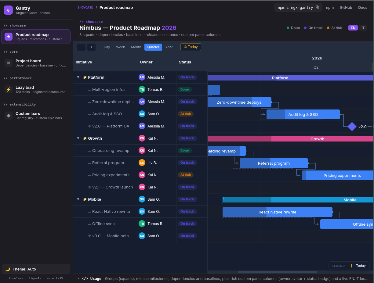
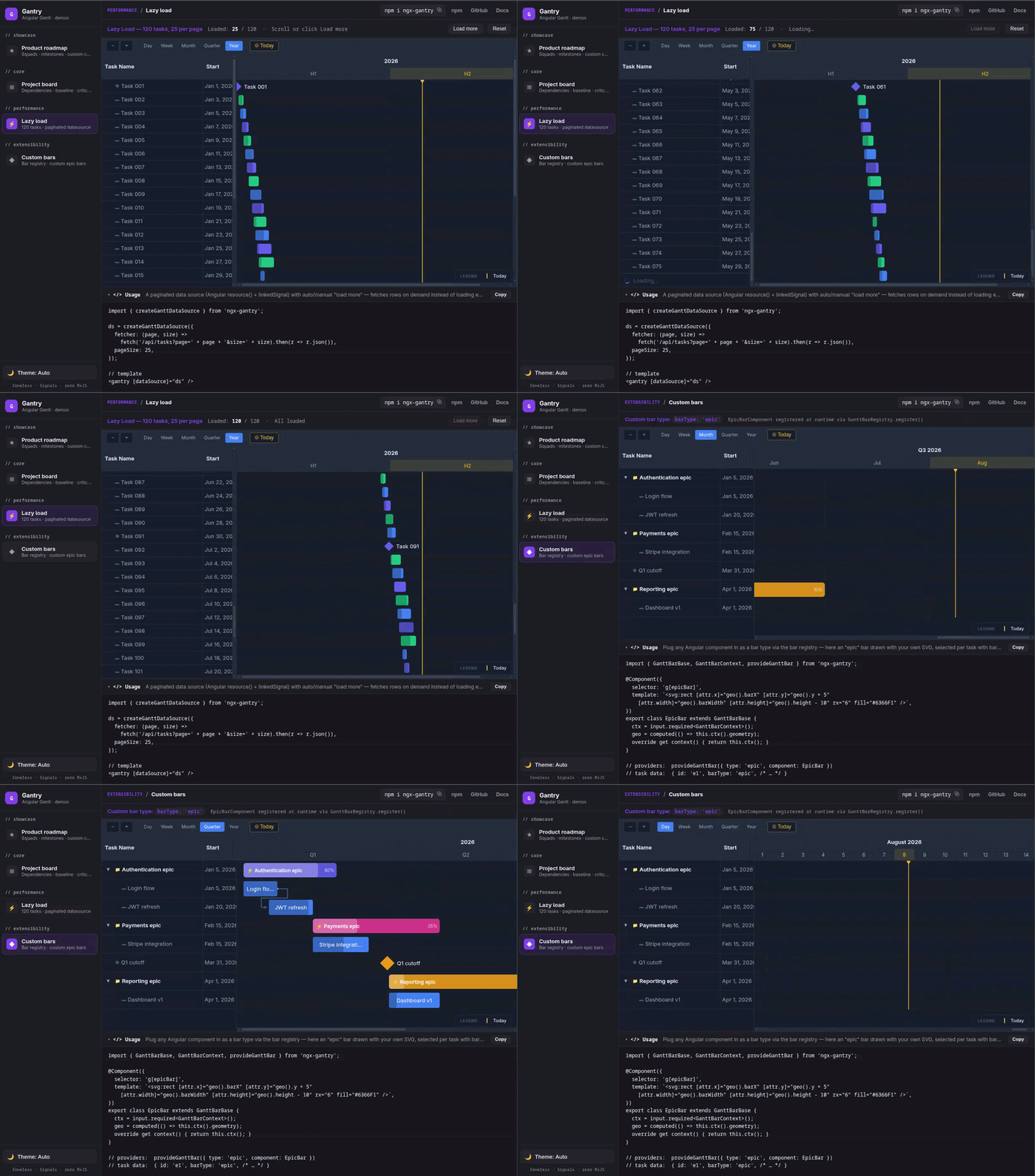
projects/gantry-demo is a small custom showcase (a "semi-Storybook"): an
IDE-style sidebar lists the demos, each renders the live <gantry>, and a
docs panel shows a copy-pasteable Usage snippet plus install/GitHub/npm links.
It doubles as living documentation and as the site you can deploy next to the blog.
pnpm start                 # dev server (ng serve gantry-demo)
pnpm build:demo            # static build → dist/gantry-demo (relative base href)
Deploy dist/gantry-demo/browser to any static host (GitHub Pages, Netlify,
Vercel). For deep-link refresh on a static host, add an SPA fallback
(404.html = index.html, or a _redirects / rewrite rule) — landing on /
and navigating via the sidebar works without it.
Development tooling
Testing
The framework-free core (gantt-math / gantt-data / gantt-cpm + the i18n
formatters) is unit-tested with Vitest in plain Node — no Angular TestBed,
no browser.
pnpm test          # run once
pnpm test:watch    # watch mode
Specs live in projects/gantry/src/lib/__tests__/*.test.ts and cover
date↔pixel math, tree flattening, the Critical Path Method, timeline-range
padding, and i18n (locale, labels, header/date formats).
Angular workspace vs Storybook preview
The demo app (gantry-demo) is built with @angular-devkit/build-angular:application (esbuild-based application builder). That is not Vite and it is not the same pipeline as Storybook.
Storybook 10 runs via the Angular CLI targets @storybook/angular:start-storybook and @storybook/angular:build-storybook, which compile the preview with Webpack 5 (@storybook/builder-webpack5). Expect two parallel toolchains: ng build / ng serve for the app vs ng run …:storybook for the component workshop. Missing a Vite dependency next to Angular does not indicate a misconfiguration for Storybook.
Storybook commands
| Script | Effect |
|---|---|
pnpm storybook | ng run gantry-demo:storybook — dev server; uses browserTarget gantry-demo:build:development (see angular.json). |
pnpm build:storybook | Static Storybook under storybook-static; uses gantry-demo:build:production unless you change the target. |
pnpm and Webpack
package.json sets pnpm.overrides.webpack to a single Webpack 5 version so hoisted installs do not load two copies of webpack (which breaks plugins that rely on instanceof Compilation). The Storybook config may also merge DefinePlugin definitions for process.env.NODE_ENV when both Angular and Storybook inject it; see .storybook/main.ts.
Chromatic (optional)
The Chromatic addon is disabled by default. To load it locally, set STORYBOOK_CHROMATIC=1 (see .storybook/main.ts).
Optional: regenerate Storybook from the CLI
If configuration drift becomes hard to maintain, create a branch, run pnpm create storybook@latest, compare the generated .storybook/ and angular.json architect blocks with this repo, then copy back only stories, preview providers, and any project-specific options (e.g. compodoc, browserTarget).
Optional: Vite-based Storybook
After ng build gantry and Storybook builds are stable, you can spike @storybook/builder-vite following Storybook’s builder docs. Treat it as an optional performance experiment, not a prerequisite for fixing library TypeScript errors.
Dependencies
| Package | License | Size |
|---|---|---|
dayjs | MIT | 7KB |
Zero zone.js required. Zero @angular/animations. Zero CDK (tooltip uses native Popover API).
📋 Changelog
Recent Releases (Click to expand)
[1.0.1] — 2026-08-08
- Scroll Tearing & Ping-Pong: Resolved visual bar duplication during vertical scrolling by replacing fragile microtask lock with a robust scroll-source timeout lock.
- Vertical Scroll Alignment: Synchronized task list and SVG canvas vertical scroll positions 1:1 without header height distortion.
- Today Marker: Removed top vertical line from header to avoid obscuring date labels, and updated positioning to reflect exact time-of-day.
- Hit Testing: Fixed
_geoFromPointpointer event row lookup for virtual scrolled rows. - Group Bar Defaults: Ensured
TaskType.Groupresolves to'group'bar type by default.
[1.0.0] — 2026-07-25
- Initial Public Release: Zoneless, signal-based Angular 20+ Gantt chart.
For complete release history, view the full CHANGELOG.md.