README.md
May 17, 2024 · View on GitHub
Vue Functional Calendar
Modern calendar and datepicker module for Vue.js


Sponsors
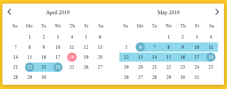
Demo
Demo: https://y3jnxov469.codesandbox.io/

- Lightweight, high-performance calendar component based on Vue.js
- Small memory usage, good performance, good style, and high scalability
- Native js development, no third-party library introduced
- Date Picker, Date Range, Multiple Calendars, Modal Calendar
Browser Support
 |  |  |  |  |  |
|---|---|---|---|---|---|
| 39+ ✔ | 28+ ✔ | 10.1+ ✔ | 27+ ✔ | 15+ ✔ | Latest ✔ |
Install
npm i vue-functional-calendar --save
Usage
Vue.use()
// Introduced in vue file
import FunctionalCalendar from 'vue-functional-calendar';
Vue.use(FunctionalCalendar, {
    dayNames: ['Mo', 'Tu', 'We', 'Th', 'Fr', 'Sa', 'Su']
});
Import Component
// Introduced in vue file
import { FunctionalCalendar } from 'vue-functional-calendar';
Component Settings
export default {
    components: {
        FunctionalCalendar
    },
    data() {
        return {
            calendarData: {}
        }
    }
}
Template Usage
<FunctionalCalendar
      // v-model="calendarData"

      // v-on:changedMonth="changedMonth"
      // v-on:changedYear="changedYear"

      // :sundayStart="true"
      // :date-format="'dd/mm/yyyy'"
      // :is-date-range="true"
      // :is-date-picker="true"
       :...:
></FunctionalCalendar>
Usage With Configs
Component Settings
export default {
    components: {
        FunctionalCalendar
    },
    data() {
        return {
            calendarData: {},
            calendarConfigs: {
                sundayStart: false,
                dateFormat: 'dd/mm/yyyy',
                isDatePicker: false,
                isDateRange: false
            }
        }
    },
}
Template Usage
<FunctionalCalendar
      // v-model="calendarData"
      // :configs="calendarConfigs"
></FunctionalCalendar>
A note on markDates
The markedDates property must be in JavaScript Date format, e.g, no leading zeroes on month and days.
✅ Correct: 1/12/2019 ❎ Incorrect: 01/12/2019
Available props
| Prop | Type | Default | Example | Description |
|---|---|---|---|---|
| sundayStart | Boolean | false | true | Week start sunday |
| newCurrentDate | Date | new Date() | new Date(2019,10,11) | Calendar Current Date |
| limits | [Object, Boolean] | false | {min: '31/10/2019', max: '31/12/2019'} | Set calendar show, and marked dates limits. |
| minSelDays | [Number, Boolean] | false | 3 | Set minimum selected days count. |
| maxSelDays | [Number, Boolean] | false | 10 | Set maximum selected days count. |
| placeholder | [String, Boolean] | false | 'yyyy/mm/dd' | Date input placeholder |
| dateFormat | String | 'dd/mm/yyyy' | 'yyyy/mm/dd' | Date formatting string |
| isDatePicker | Boolean | false | true | Enable or disable date picker |
| isMultipleDatePicker | Boolean | false | true | Enable or disable multiple date picker |
| isMultipleDateRange | Boolean | false | true | Enable or disable multiple date range |
| isDateRange | Boolean | false | true | Enable or disable date range |
| withTimePicker | Boolean | false | true | Enable or disable time picker |
| isMultiple | Boolean | false | true | Enable multiple calendar function |
| calendarsCount | Number | 1 | 3 | Count of calendars, working only is prop isMultiple |
| isSeparately | Boolean | false | true | Enable separately calendars |
| isModal | Boolean | false | true | Enable modal calendar function |
| isAutoCloseable | Boolean | false | true | Hide picker(calendar) if date has been selected |
| isTypeable | Boolean | false | true | Enable manually date typing function, working only with prop isModal |
| changeMonthFunction | Boolean | false | true | Enable changed month with list, function |
| changeYearFunction | Boolean | false | true | Enable changed year with list, function |
| changeYearStep | Number | 12 | 6 | Change year list step count |
| changeMonthStep | Number | 1 | 3 | How many months to jump forward with NextMonth() |
| markedDates | Array | [] | ['10/12/2020', '12/12/2020'] OR [{date: '10/1/2020', class: 'marked-class'},{date: '12/1/2020', class: 'marked-class-2'}] | Marked dates array |
| markedDateRange | Object | {start: false, end: false} | {start: '12/12/2020', end: '20/12/2020'} OR [{start: '12/12/2020', end: '20/12/2020'}, {start: '24/12/2020', end: '28/12/2020'}] | Marked date ranges |
| disabledDayNames | Array | [] | ['Su','We'] | Disabled Days Of Week |
| disabledDates | Array | [] | ['24/12/2020','27/12/2020'] OR ['beforeToday', 'afterToday', '24/12/2020','27/12/2020'] | Disabled Dates |
| enabledDates | Array | [] | ['24/12/2020','27/12/2020'] | Reversal of Disabled Dates |
| dayNames | Array | ['Mo', 'Tu', 'We', 'Th', 'Fr', 'Sa', 'Su'] | ['Monday', 'Tu', 'We', 'Th', 'Fr', 'Sa', 'Sunday'] | Week Day Names |
| monthNames | Array | ["January", "February", "March", "April", "May", "June", "July", "August", "September", "October", "November", "December"] | ["Jan.", "Feb.", "Mar", "Apr.", "May", "Jun.", "Jul.", "Aug.", "Sept.", "Oct.", "Nov.", "Dec."] | Month names |
| shortMonthNames | Array | ["Jan", "Feb", "Mar", "Apr", "May", "Jun", "Jul", "Aug", "Sep", "Oct", "Nov", "Dec"] | ["Jan.", "Feb.", "Mar", "Apr.", "May", "Jun.", "Jul.", "Aug.", "Sept.", "Oct.", "Nov.", "Dec."] | Short month names |
| showWeekNumbers | Boolean | false | true | Display week numbers. |
| transition | Boolean | true | false | Calendar animations |
| hiddenElements | Array | [] | ['dayNames', 'navigationArrows', 'leftAndRightDays', 'month'] | Hide calendar elements |
| titlePosition | String | center | left, right, center | Set title position |
| arrowsPosition | String | space-between | left, right, space-between | Set arrows position |
| isDark | Boolean | false | true | Dark theme |
| isLayoutExpandable | Boolean | false | true | Enable expanding the calendar layout |
| alwaysUseDefaultClasses | Boolean | false | true | Always add default classes to Day element, even when overriding with a slot |
| activeHours | Array | [] | [8, 9,10, 18, 19, 20] | The hours you want to be shown in the timepicker (by default all of them are shown) |
| activeMinutes | Array | [] | [0, 15, 30, 45] | The minutes you want to be shown in the timepicker (by default all of them are shown) |
Slots
| Name | Description | Props |
|---|---|---|
| Default | Default slot responsible for the day component | {week: Object, day: Object} |
| datePickerInput | This slot responsible for the modal date picker input | {selectedDate: String, isTypeable: Boolean} |
| dateRangeInputs | This slot responsible for the modal date range inputs | {startDate: String, endDate: String, isTypeable: Boolean} |
| footer | This slot responsible for the calendar footer | {} |
Events
| Event | Output | Description |
|---|---|---|
| dayClicked | Object | Get clicked day object |
| choseDay | Object | Get the object of the selected day |
| changedMonth | Date | Month page has been changed |
| changedYear | Date | Year page has been changed |
| selectedDaysCount | Number | Get number of days between date range dates |
| dayMouseOver | Date | Mouse over day |
| opened | The picker is opened | |
| closed | The picker is closed |
Add the ref attribute to the calendar component and use these methods to do more.
For example: <FunctionalCalendar ref="Calendar"></FunctionalCalendar>

    ✅ this.$refs.Calendar.PreMonth();  //Call method implementation to go to previous month
    ✅ this.$refs.Calendar.NextMonth(); //Call method implementation to go to next month
    ✅ this.$refs.Calendar.PreYear(); //Call method implementation to go to previous year
    ✅ this.$refs.Calendar.NextYear(); //Call method implementation to go to next year
    ✅ this.$refs.Calendar.ChooseDate('today'); //Call method implementation to go to today
    ✅ this.$refs.Calendar.ChooseDate('25/09/2020'); //Call method implementation to go to a date