Blazor-Knob
October 13, 2021 · View on GitHub
Knob control for Blazor
Install-Package Knob
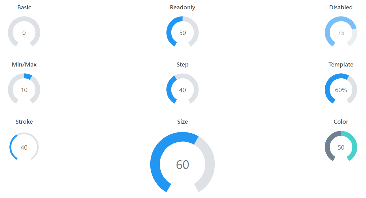
Properties
| Option | Type | Description | Default |
|---|---|---|---|
| Value | Number | Use the value attribute to set the value of the control | none |
| Min | Number | Minimum value of the control | 0 |
| Max | Number | Maximum value of the control | 100 |
| Step | Number | Smallest increment the value can change by | 1 |
| Disabled | Boolean | Set to true to disable the knob | false |
| ReadOnly | Boolean | Set to true to readonly the knob | false |
| ShowValue | Boolean | Set to false to hide the value | true |
| Size | Number | Visual size of the control in px (or % if responsive is true) | 100 |
| ValueColor | String | Color of the value arc | #409eff |
| RangeColor | String | Color of the range | #dcdfe6 |
| TextColor | String | Color of the value text | #000000 |
| StrokeWidth | Number | Thickness of the arcs | 17 |