Blood Map
June 8, 2023 · View on GitHub
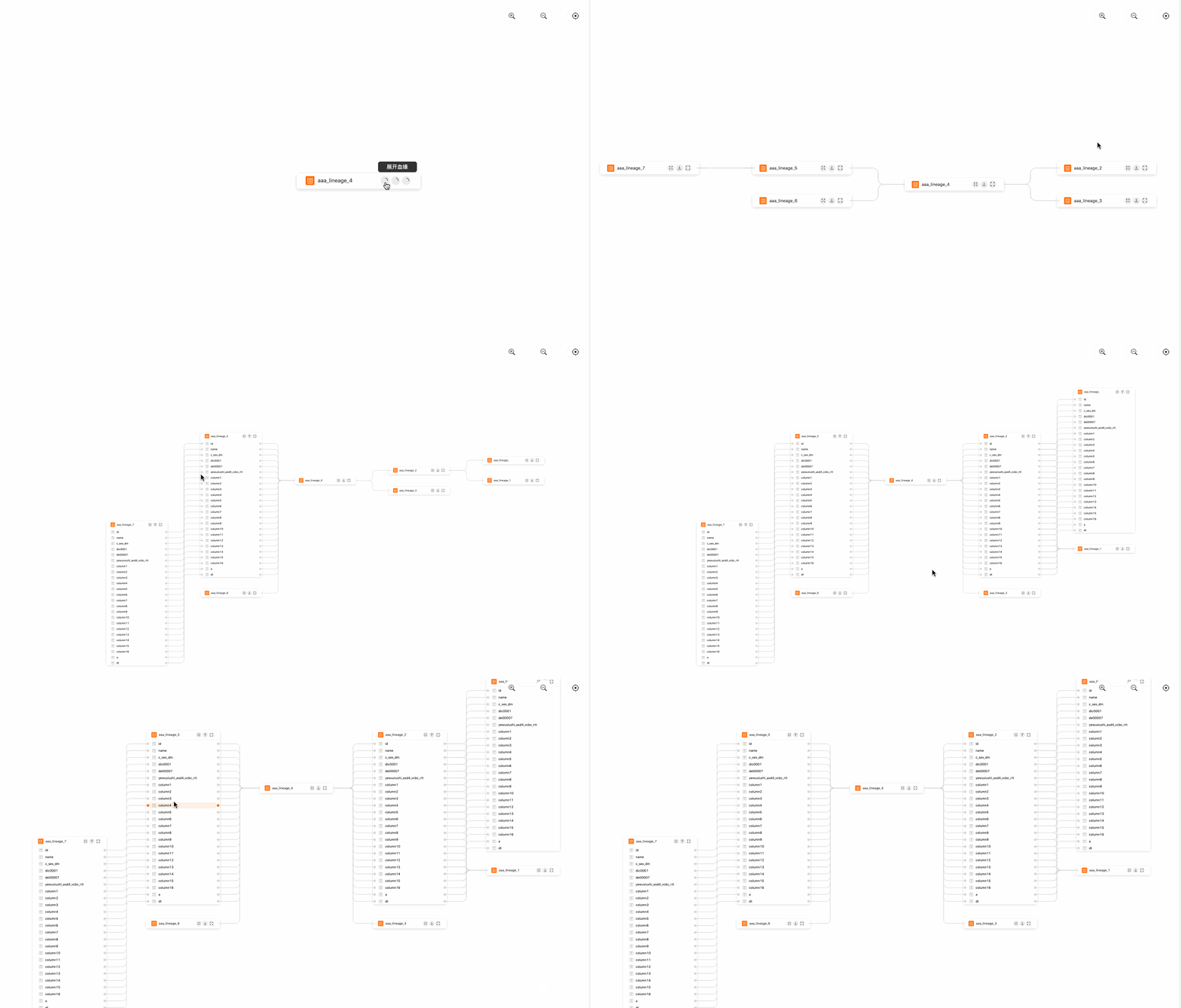
A diagram used to represent relationships between tables and between table and other related entities
English | 简体中文
✨ Features
- relational diagram out of the box
- support custom operations and custom node events
- elegant, natural interaction design
Usage
$ npm install react-lineage-dag@2.x
import LineageDag from 'react-lineage-dag';
// need to import styles
import 'react-lineage-dag/dist/index.css';

const columns = [{
  key: 'name',
  primaryKey: true
}, {
  key: 'title',
}];

const data = {
  columns: [{
    key: 'name',
    primaryKey: true
  }, {
    key: 'title',
  }],
  tables: [
    {
      id: '1',
      name: 'table-1',
      fields: [
        {
          name: 'id',
          title: 'id'
        },
        {
          name: 'age',
          title: 'age'
        }
      ]
    },
    {
      id: '2',
      name: 'table-2',
      fields: [
        {
          name: 'id',
          title: 'id'
        },
        {
          name: 'age',
          title: 'age'
        }
      ]
    },
    {
      id: '3',
      name: 'table-3',
      fields: [
        {
          name: 'id',
          title: 'id'
        },
        {
          name: 'age',
          title: 'age'
        }
      ]
    }
  ],
  relations: [
    {
      srcTableId: '1',
      tgtTableId: '2',
      srcTableColName: 'id',
      tgtTableColName: 'age'
    },
    {
      srcTableId: '1',
      tgtTableId: '3',
      srcTableColName: 'id',
      tgtTableColName: 'age'
    }
  ]
}

const App = () => {
  return (
    <LineageDag {...data} />
  )
}
Props
| Property | Type | Default | Description |
|---|---|---|---|
| width | number | 100% | Canvas width |
| height | number | 100% | Canvas height |
| tables | ITable[] | [] | Nodes data, the detailed description is below the table |
| relations | IRelation[] | [] | Relations data, the detailed description is below the table |
| column | column[] | [] | Property configuration of the column (similar to the concept of column in antd table), the detailed description is below the table |
| centerId | string | undefined | Center point, when the center point changes, the canvas will focus on the point |
| operator | operator[] | [] | Render configuration of operation buttons on each node, the detailed description is below the table |
| className | string | undefined | Class name of canvas |
| actionMenu | action[] | [] | Operation button in the upper right corner (zoom in, zoom out, center), the detailed description is below the table |
| config | config | {} | Configuration of the canvas, the detailed description is below the table |
| onLoaded | Function | noop | Triggered when the butterfly is loaded |
  interface ITable {
    id: string;                 // table ID
    name: string;               // table name
    isCollapse: boolean;        // whether to collapse all the columns
    fields: []                  // data stored in columns
  }

  interface IRelation {
    id?: string;                 // relation ID, not required, but recommended
    srcTableId: string;          // source table ID
    tgtTableId: string;          // target table ID
    srcTableColName: string;     // field name of source table
    tgtTableColName: string;     // field name of target table
  }

  interface operator {
    id: string;                  // unique identification of the button
    name: string;                // chinese name of the button
    icon: JSX.Element            // rendering of the operator
    onClick: (node: any): void   // click event
  }

  interface column {
    key: string,                                              // unique identification of the column
    width?: number,                                           // column width
    primaryKey: boolean,                                      // whether the value corresponding to the key of this column is a key-value pair, corresponding to the primary key concept of the column in antd
    render?(text: any, record: any, index: number): void      // rendering method of the column
  }

  interface config {
    delayDraw: number; // Delayed rendering, this component must ensure that the canvas container rendering (including animation execution) is completed before rendering, otherwise the coordinates will be offset, such as: antd's modal animation
    titleRender?: () => void;                         // title render of custom node
    showActionIcon?: boolean,                        // whether to display the operation icons: zoom in, zoom out, focus
    enableHoverChain: boolean,                       // whether to enable highlight the chain when hovering
    minimap?: {                                      // whether to enable thumbnail
      enable: boolean,
      config: {
        nodeColor: any
      }
    }
  }
Dev
# after clone this project
$ npm install
$ cd example
$ npm install
$ npm start