Styling guide
August 17, 2022 · View on GitHub
This is a short guide to customising the slider using CSS that covers the most frequently asked questions.
Slider anatomy
Let's start with exploring the elements that make up the slider.
Labels
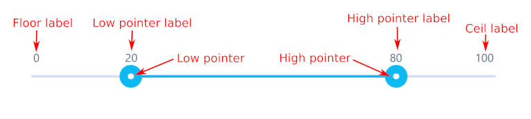
A range slider displays the following labels:
- floor label - text showing the lowest value,
- ceil label - text showing the highest value,
- low pointer label - text showing the current low value,
- high pointer label - text showing with the current high value.
A simple slider is the same, except it doesn't have the high pointer value.
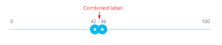
There is also a special case where low and high pointer labels would normally overlap, and so instead, a single combined label is displayed.
Bars
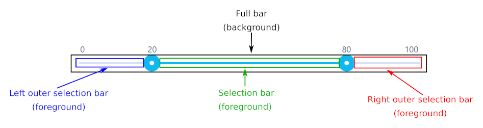
Normally a slider features two selection bars:
- full bar - the gray element in background,
- selection bar - the blue element in foreground, marking current selection.
For certain use cases, you may want to style the left and right side of full bar differently. If you specify showOuterSelectionBars: true in slider options, the following elements will also be displayed:
- left outer selection bar - element in the foreground to the left of low pointer,
- right outer selection bar - element in the foreground to the right of high pointer.
Ticks
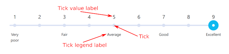
When using ticks, the slider features additional elements:
- ticks - small circles on the slider bar,
- tick value labels - showing values associated with ticks,
- tick legend labels - showing additional legend for the ticks.
Tooltips
Tooltips are associated with ticks and their labels (value or legend). The slider allows users to customise how to display tooltips. For more details, see TOOLTIPS.md.
Overriding default style
Slider is normally styled using a bundled style sheet, but it's possible to override it.
As a starting point, it's good idea to have a look at the SCSS source file of the bundled style sheet to have an idea of how the CSS is structured by default.
The hierarchy slider elements and their CSS classes is:
ngx-sliderclass is applied to thengx-sliderelementngx-slider-pointerclass is applied to slider pointers:ngx-slider-pointer-minis applied to low pointerngx-slider-pointer-maxis applied to high pointer
ngx-slider-bubbleclass is applied to all labels:ngx-slider-floorclass is applied to floor labelngx-slider-ceilclass is applied to ceil labelngx-slider-model-valueclass is applied to low pointer labelngx-slider-model-highclass is applied to high pointer labelngx-slider-combinedclass is appied to combined label
ngx-slider-barclass is applied to all bar elements:- no additional class is applied to full bar
ngx-slider-selectionis applied to selection barngx-slider-left-out-selectionis applied to left outer selection barngx-slider-right-out-selectionis applied to right outer selection bar
ngx-slider-tickclass is applied to each tick element:ngx-slider-tick-valueis applied to tick value labelngx-slider-tick-legendis applied to tick legend label
Example
Say we want to change the selection bar colour to yellow for a specific slider.
An easy way to achieve this is to first add a custom class to a container of the slider element:
<div class="custom-slider">
  <ngx-slider [(value)]="minValue" [(highValue)]="maxValue" [options]="options"></ngx-slider>
</div>
Then apply the following stylesheet (using SCSS syntax):
.custom-slider {
  .ngx-slider {
    .ngx-slider-selection {
      background: rgb(255, 255, 0) !important;
    }
  }
}
Or, if you prefer plain CSS:
.custom-slider .ngx-slider .ngx-slider-selection {
  background: rgb(255, 255, 0) !important;
}
Note that the above code is an example of a global stylesheet, applied across your app (styles.css or styes.scss). If you want to apply this stylesheet in a specific component of your app (*.component.scss or *.component.css), you will need to surround it with ::ng-deep {} selector to overcome shadow DOM encapsulation:
::ng-deep {
  .custom-slider {
    .ngx-slider {
      .ngx-slider-selection {
        background: rgb(255, 255, 0) !important;
      }
    }
  }
}
For a complete example, see the slider with custom style demo on official site.