ink-virtual-list
August 12, 2026 · View on GitHub
A virtualized list component for Ink terminal applications. Only renders visible items for optimal performance with large datasets.
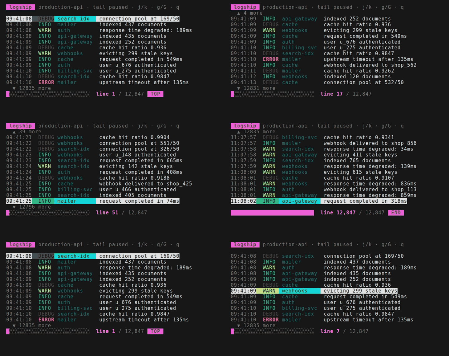
Built with ink-virtual-list — see the examples gallery for this and four more runnable apps.
Features
- Virtualized rendering - Only renders items visible in the viewport
- Automatic scrolling - Keeps selected item in view as you navigate
- Terminal-aware - Responds to terminal resize events
- Flexible height - Fixed height or auto-fill available terminal space
- Customizable indicators - Override default overflow indicators ("▲ N more")
- TypeScript first - Full type safety with generics
- Imperative API - Programmatic scrolling via ref
Installation
# npm
npm install ink-virtual-list

# jsr
npx jsr add @archcorsair/ink-virtual-list

# bun
bun add ink-virtual-list
Compatibility
Works with Ink ^6.0.0 || ^7.0.0. Both majors are tested in CI on every push.
The react peer is ^19.0.0, but Ink imposes its own floor on top of that: Ink 6 needs React ^19,
while Ink 7 requires React >=19.2 and Node >=22. Install whichever Ink major you want and let its
peers pull in the React/Node versions it needs.
JSR note: JSR's manifest parser only accepts a single version requirement per import — it rejects both
^6.0.0 || ^7.0.0and>=6.0.0 <8.0.0.jsr.jsontherefore pinsnpm:ink@^6.0.0, so JSR consumers resolve against Ink 6. The npm package carries the full^6 || ^7peer range, and the library's source works with either major.
Usage
Basic Example
import { VirtualList } from 'ink-virtual-list';
import { Text } from 'ink';
import { useState } from 'react';

function App() {
  const [selectedIndex, setSelectedIndex] = useState(0);
  const items = Array.from({ length: 1000 }, (_, i) => `Item ${i + 1}`);

  return (
    <VirtualList
      items={items}
      selectedIndex={selectedIndex}
      height={10}
      renderItem={({ item, isSelected }) => (
        <Text color={isSelected ? 'cyan' : 'white'}>
          {isSelected ? '> ' : '  '}
          {item}
        </Text>
      )}
    />
  );
}
Auto-fill Terminal Height
<VirtualList
  items={items}
  height="auto"
  reservedLines={5}  // Reserve space for header/footer
  renderItem={({ item }) => <Text>{item}</Text>}
/>
Custom Overflow Indicators
<VirtualList
  items={items}
  renderOverflowTop={(count) => <Text dimColor>↑ {count} hidden</Text>}
  renderOverflowBottom={(count) => <Text dimColor>↓ {count} hidden</Text>}
  renderItem={({ item }) => <Text>{item}</Text>}
/>
Imperative Scrolling
import { useRef } from 'react';
import type { VirtualListRef } from 'ink-virtual-list';

function App() {
  const listRef = useRef<VirtualListRef>(null);

  const scrollToTop = () => {
    listRef.current?.scrollToIndex(0, 'top');
  };

  return (
    <VirtualList
      ref={listRef}
      items={items}
      renderItem={({ item }) => <Text>{item}</Text>}
    />
  );
}
API
Props
Required
items: T[]- Array of items to renderrenderItem: (props: RenderItemProps<T>) => ReactNode- Render function for each visible item- Receives:
{ item: T, index: number, isSelected: boolean }
- Receives:
Optional
selectedIndex?: number- Index of currently selected item (default:0)keyExtractor?: (item: T, index: number) => string- Custom key extractor for list items. If omitted, automatically falls back toitem.id,item.key, or the array index.height?: number | "auto"- Fixed height in lines or"auto"to fill terminal (default:10)reservedLines?: number- Lines to reserve when usingheight="auto"(default:0)itemHeight?: number- Height of each item in lines (default:1)showOverflowIndicators?: boolean- Show "N more" indicators (default:true)overflowIndicatorThreshold?: number- Minimum overflow count before showing indicators (default:1)renderOverflowTop?: (count: number) => ReactNode- Custom top overflow indicatorrenderOverflowBottom?: (count: number) => ReactNode- Custom bottom overflow indicatorrenderScrollBar?: (viewport: ViewportState) => ReactNode- Custom scrollbar rendereronViewportChange?: (viewport: ViewportState) => void- Callback when viewport changes
Height Budget
height is the total rendered height of the list. When overflow indicators are enabled they are
part of that budget: they consume 2 of height's lines (one at the top, one at the bottom), leaving
height - 2 lines for items. A hidden indicator — at the list edges, or below
overflowIndicatorThreshold — still occupies its line as a blank placeholder, so the list never
changes height while you scroll and surrounding UI stays put.
If height is too small to fit both indicator lines plus one item (i.e. height - 2 < itemHeight),
indicators are automatically disabled for that render and the full height goes to items, so tiny
heights such as height={1} still render an item instead of nothing.
Ref Methods
interface VirtualListRef {
  scrollToIndex: (index: number, alignment?: 'auto' | 'top' | 'center' | 'bottom') => void;
  getViewport: () => ViewportState;
  remeasure: () => void;
}
scrollToIndex(index, alignment?)- Scroll to bring an index into view'auto'(default) - Only scroll if needed'top'- Align item to top of viewport'center'- Center item in viewport'bottom'- Align item to bottom of viewport
getViewport()- Get current viewport state ({ offset, visibleCount, totalCount })remeasure()- Force recalculation of viewport dimensions
Types
interface RenderItemProps<T> {
  item: T;
  index: number;
  isSelected: boolean;
}

interface ViewportState {
  offset: number;       // Items scrolled past
  visibleCount: number; // Items currently visible
  totalCount: number;   // Total items
}
Advanced Example
import { VirtualList } from 'ink-virtual-list';
import { Box, Text } from 'ink';
import { useRef, useState } from 'react';
import type { VirtualListRef } from 'ink-virtual-list';

interface Todo {
  id: string;
  title: string;
  completed: boolean;
}

function TodoApp() {
  const [todos] = useState<Todo[]>([
    { id: '1', title: 'Learn Ink', completed: true },
    { id: '2', title: 'Build CLI', completed: false },
    // ... 1000s more
  ]);
  const [selectedIndex, setSelectedIndex] = useState(0);
  const listRef = useRef<VirtualListRef>(null);

  return (
    <Box flexDirection="column">
      <Text bold>My Todos ({todos.length})</Text>

      <VirtualList
        ref={listRef}
        items={todos}
        selectedIndex={selectedIndex}
        height="auto"
        reservedLines={3}
        keyExtractor={(todo) => todo.id}
        renderItem={({ item, isSelected }) => (
          <Box>
            <Text color={isSelected ? 'cyan' : 'white'}>
              {isSelected ? '❯ ' : '  '}
              {item.completed ? '✓' : '○'} {item.title}
            </Text>
          </Box>
        )}
      />

      <Text dimColor>
        {selectedIndex + 1} / {todos.length}
      </Text>
    </Box>
  );
}
Related Projects
- ink-stepper - A step-by-step wizard/stepper component for Ink terminal applications, from the same author (docs)
License
MIT