Moveable Handbook
December 22, 2022 · View on GitHub
This document explains how to use moveable.
Table of Contents
- API Documentation
- Introduction
- Basic Support
- Events
- Ables
- How to use Group
- When the event starts while changing the target
- How to use custom css
Introduction
Moveable
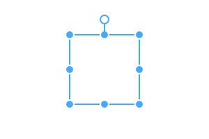
Moveable makes the target draggable, resizable, scalable, warpable, rotatable, pinchable and snappable.
The reason for creating a moveable is to create an editor. Main Project is scenejs-editor.
Another reason for this is the transform.
If the transform overlaps from the root element to the parent element, the distance it moves is not equal to the amount actually moved. So I made it to calculate the distance actually moved.
Basic Support
- Support Major Browsers
- Support SVG Elements (Not Support Resizable, Use scaleable instead of resizable.)
- Support 3d Transform
- Support Group
If you have any questions or requests or want to contribute to moveable or other packages, please write the issue or give me a Pull Request freely.
Events
Able events are divided into dragStart, drag, and dragEnd types.
- If you start to press the mouse (or touch),
dragStarttype events occur. - If you drag with the mouse (or touch),
dragtype events occur. - If dragging is stopped and the mouse (or touch) is released,
dragEndtype events occur.
The first in the sequence of events is the event with the beforeRender prefix.
The last in the sequence of events is the event with the render prefix.
After the render event is over, all values such as the target's size, position, and css are updated.
Event Sequences (ex: Draggable)
- dragStart: beforeRenderStart => dragStart => renderStart
- drag: beforeRender => drag => render
- dragEnd: beforeRenderEnd => dragEnd => renderEnd
Group Events
In Moveable, events that can be targeted individually and events that can be targeted as a group are divided.
Events of a group are appended with group as a suffix. (ex: dragGroupStart, dragGroup, dragGroupEnd)
Single Moveable Sequences (ex: Resizable)
- dragStart: beforeRenderStart => resizeStart => renderStart
- drag: beforeRender => beforeResize => resize => render
- dragEnd: beforeRenderEnd => resizeEnd => renderEnd
Group Moveable Sequences (ex: Resizable)
- start: beforeRenderGroupStart => resizeGroupStart => renderGroupStart
- move: beforeRenderGroup => beforeResizeGroup => resizeGroup => renderGroup
- end: beforeRenderGroupEnd => resizeGroupEnd => renderGroupEnd
Event Parameter
All events in moveable have the following properties by default:
See: https://daybrush.com/moveable/release/latest/doc/Moveable.html#.OnEvent
- currentTarget: An instance of Moveable that occur an event.
- target: The target of the event where the MouseEvent or TouchEvent occurred.
- clientX: The x coordinate where the MouseEvent or TouchEvent occurred.
- clientY: The y coordinate where the MouseEvent or TouchEvent occurred.
- datas: Information can be shared between the same event. (ex:
dragStart,drag,dragEnd) - inputEvent: MouseEvent or TouchEvent source where the event occurred.
Ables
You can Drag, Resize, Scale, Rotate, Warp, Pinch, Snap, etc.
See all Able APIs: https://daybrush.com/moveable/release/latest/doc/index.html
See all able demos: https://daybrush.com/moveable/storybook
How to use Group
Groupable indicates Whether the targets can be moved in group with draggable, resizable, scalable, rotatable.
If you want to use a group, set multiple targets(type: Array<HTMLElement | SVGElement>).
When using group, event name changes. (ex: dragStart => dragGroupStart, pinchStart => pinchGroupStart)
The drag event always occurs with the group event.(Resizable, Scalable, Rotatable)
In a group, Pinchable and Snappable are the same as they used to be. But warpable is not available.
When the event starts while changing the target
methods
- dragStart: You can drag start the Moveable through the external
MouseEventorTouchEvent. (Angular: ngDragStart) - setState: You can change options or properties dynamically.
Vanilla Exmaple
import Moveable from "moveable";


const moveable = new Moveable(document.body, {
    target: document.querySelector(".target1")
});

window.addEventListener("mousedown", e => {
    moveable.setState({
        target: e.target,
    }, () => {
        moveable.dragStart(e);
    });
});
React, Preact Example
import Moveable from "react-moveable"; // preact-moveable

<div onMouseDown={onMouseDown}></div>
<Moveable ref={e => { this.moveable = e; }} target={this.state.target} />

onMouseDown(e) {
    // Use nativeEvent if you are using react event handling
    const nativeEvent = e.nativeEvent

    this.setState({
        target: nativeEvent.target,
    }, () => {
        this.moveable.dragStart(nativeEvent);
    });
}
Angular Example
@Component({
    selector: 'AppComponent',
    template: `
<div (mousedown)="onMouseDown($event)">
    <div class="target">target</div>
    <div class="target">target2</div>
</div>
<ngx-moveable
    #moveable
    [target]="target"
    />
`,
})
export class AppComponent {
    targert = null;
    @ViewChild('moveable', { static: false })  moveable;
    onMouseDown(e) {
        this.target = e.target;
        setTimeout(() => {
            this.moveable.ngDragStart(e);
        });
    }
}
Svelte Example
<script>
    import Moveable from "svelte-moveable";
    import { onMount } from "svelte";

    let moveable;
    let target;

    function onMouseDown(e) {
        target = e.target;

        setTimeout(() => {
            moveable.dragStart(e);
        });
    }
</script>
<div class="target" on:mousedown={onMouseDown}>Target1</div>
<div class="target" on:mousedown={onMouseDown}>Target2</div>
<div class="target" on:mousedown={onMouseDown}>Target3</div>
<Moveable
    bind:this={moveable}
    target={target}
    />
✨ How to use custom CSS
Show Partial Control Box
Options
- renderDirections : Set directions to show the control box. (default: ["n", "nw", "ne", "s", "se", "sw", "e", "w"])
Vanilla Example
import Moveable from "moveable";

const moveable = new Moveable(document.body, {
    renderDirections: ["n", "nw", "ne", "s", "se", "sw", "e", "w"],
});

moveable.renderDirections = ["nw", "ne", "sw", "se"];
Set className
Options
- className : You can specify the className of the moveable controlbox. (default: "")
Vanilla Example
import Moveable from "moveable";

const moveable = new Moveable(document.body, {
    className: "moveable1",
});

moveable.classname = "moveable2";
Use important
- If you want to custom CSS, use
!important.
.moveable-control {
    width: 20px!important;
    height: 20px!important;
    margin-top: -10px!important;
    margin-left: -10px!important;
}
Moveable's Default CSS
moveable-line
.moveable-line {
    position: absolute;
    width: 1px;
    height: 1px;
    background: #4af;
    transform-origin: 0px 0.5px;
}

.moveable-line.moveable-rotation-line {
    height: 40px;
    width: 1px;
    transform-origin: 0.5px 39.5px;
}
moveable-control
.moveable-control {
    position: absolute;
    width: 14px;
    height: 14px;
    border-radius: 50%;
    border: 2px solid #fff;
    box-sizing: border-box;
    background: #4af;
    margin-top: -7px;
    margin-left: -7px;
    z-index: 10;
}

moveable-rotataion
/* moveable-rotation */
.moveable-line.moveable-rotation-line .moveable-control {
    border-color: #4af;
    background:#fff;
    cursor: alias;
}
moveable-origin
.moveable-control.moveable-origin {
    border-color: #f55;
    background: #fff;
    width: 12px;
    height: 12px;
    margin-top: -6px;
    margin-left: -6px;
    pointer-events: none;
}
moveable-direction
.moveable-direction.moveable-e, .moveable-direction.moveable-w {
    cursor: ew-resize;
}
.moveable-direction.moveable-s, .moveable-direction.moveable-n {
    cursor: ns-resize;
}
.moveable-direction.moveable-nw, .moveable-direction.moveable-se, .moveable-reverse .moveable-direction.moveable-ne, .moveable-reverse .moveable-direction.moveable-sw {
    cursor: nwse-resize;
}
.moveable-direction.moveable-ne, .moveable-direction.moveable-sw, .rCSckyn7i.moveable-reverse .moveable-direction.moveable-nw, moveable-reverse .moveable-direction.moveable-se {
    cursor: nesw-resize;
}
Default CSS
rCS4nn8ekis The hash value of the class name, which can be changed at any time.- All classes have a prefix of
moveable-.
.rCS4nn8ek {
	position: fixed;
	width: 0;
	height: 0;
	left: 0;
	top: 0;
	z-index: 3000;
}
.rCS4nn8ek .moveable-control-box{
    z-index: 0;
}
.rCS4nn8ek .moveable-line, .rCS4nn8ek .moveable-control{
	left: 0;
    top: 0;
    will-change: transform;
}
.rCS4nn8ek .moveable-control{
	position: absolute;
	width: 14px;
	height: 14px;
	border-radius: 50%;
	border: 2px solid #fff;
	box-sizing: border-box;
	background: #4af;
	margin-top: -7px;
    margin-left: -7px;
    z-index: 10;
}
.rCS4nn8ek .moveable-line{
	position: absolute;
	width: 1px;
	height: 1px;
	background: #4af;
	transform-origin: 0px 0.5px;
}
.rCS4nn8ek .moveable-line.moveable-dashed{
    box-sizing: border-box;
    background: transparent;
}
.rCS4nn8ek .moveable-line.moveable-dashed.moveable-horizontal{
    border-top: 1px dashed #4af;
}
.rCS4nn8ek .moveable-line.moveable-dashed.moveable-vertical{
    border-left: 1px dashed #4af;
}
.rCS4nn8ek .moveable-line.moveable-dashed:before{
    position: absolute;
    content: attr(data-size);
    color: #4af;
    font-size: 12px;
    font-weight: bold;
}
.rCS4nn8ek .moveable-line.moveable-dashed.moveable-horizontal:before{
    left: 50%;
    transform: translateX(-50%);
    bottom: 5px;
}
.rCS4nn8ek .moveable-line.moveable-dashed.moveable-vertical:before{
    top: 50%;
    transform: translateY(-50%);
    left: 5px;
}
.rCS4nn8ek .moveable-line.moveable-rotation-line{
	height: 40px;
	width: 1px;
    transform-origin: 0.5px 39.5px;
    top: -40px;
}
.rCS4nn8ek .moveable-line.moveable-rotation-line .moveable-control{
	border-color: #4af;
	background:#fff;
	cursor: alias;
}
.rCS4nn8ek .moveable-line.moveable-vertical{
    transform: translateX(-50%);
}
.rCS4nn8ek .moveable-line.moveable-horizontal{
    transform: translateY(-50%);
}
.rCS4nn8ek .moveable-line.moveable-vertical.moveable-bold{
    width: 2px;
}
.rCS4nn8ek .moveable-line.moveable-horizontal.moveable-bold{
    height: 2px;
}
.rCS4nn8ek .moveable-control.moveable-origin{
	border-color: #f55;
	background: #fff;
	width: 12px;
	height: 12px;
	margin-top: -6px;
	margin-left: -6px;
	pointer-events: none;
}
.rCS4nn8ek .moveable-group{
    z-index: -1;
}
.rCS4nn8ek .moveable-area{
    position: absolute;
}
.rCS4nn8ek .moveable-area-pieces{
    position: absolute;
    top: 0;
    left: 0;
    display: none;
}
.rCS4nn8ek .moveable-area.moveable-avoid{
    pointer-events: none;
}
.rCS4nn8ek .moveable-area.moveable-avoid+.moveable-area-pieces{
    display: block;
}
.rCS4nn8ek .moveable-area-piece{
    position: absolute;
}