svelte-pivottable
March 30, 2026 · View on GitHub
svelte-pivottable is a Svelte 5 pivot table library with drag-and-drop data exploration, grouping, and subtotals — similar to the pivot table experience in older versions of Microsoft Excel.
It is a Svelte port of react-pivottable-grouping, itself a fork of react-pivottable by Nicolas Kruchten, which is a React port of his jQuery-based PivotTable.js.
What does it do?
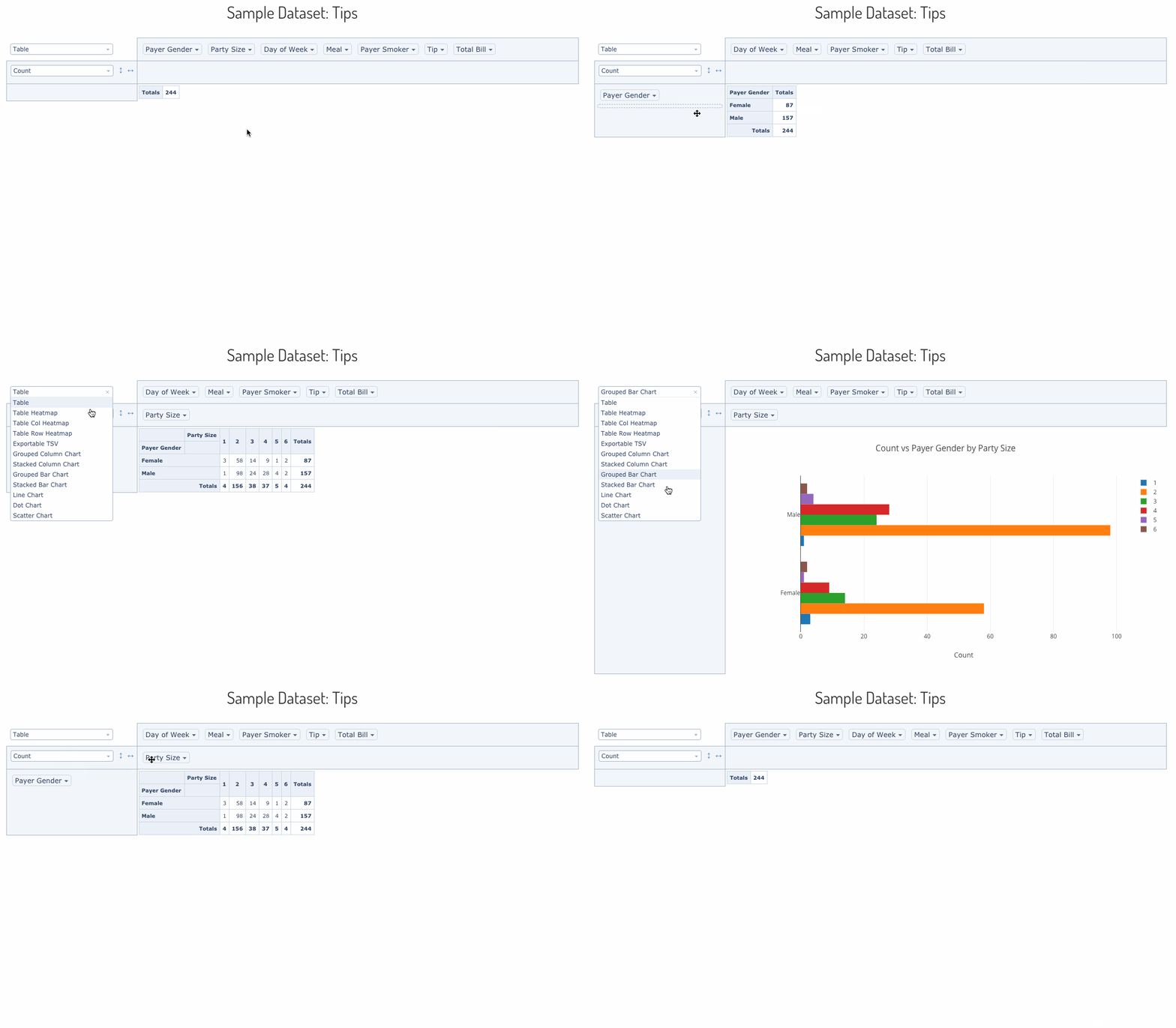
svelte-pivottable lets you summarize a dataset into a cross-tabulated table or a Plotly.js chart using a drag-and-drop interface. You can move attributes between rows, columns, filters, and aggregation slots interactively.
A live demo is available here.
Installation
npm install svelte-pivottable
Basic usage
Interactive UI with table output
PivotTableUI is the full drag-and-drop component. It manages its own UI state but delegates data rendering to PivotTable.
<script>
    import { PivotTableUI } from 'svelte-pivottable';

    const data = [
        { name: 'Alice', department: 'Engineering', salary: 95000 },
        { name: 'Bob',   department: 'Marketing',   salary: 72000 },
        { name: 'Carol', department: 'Engineering', salary: 105000 },
        // ...
    ];
</script>

<PivotTableUI {data} rows={['department']} cols={[]} />
Data can also be provided as an array of arrays (first row is headers):
<script>
    import { PivotTableUI } from 'svelte-pivottable';

    const data = [
        ['name', 'department', 'salary'],
        ['Alice', 'Engineering', 95000],
        ['Bob',   'Marketing',   72000],
    ];
</script>

<PivotTableUI {data} />
Non-interactive snapshot rendering
PivotTable renders a saved configuration without any drag-and-drop UI. Use it for embedding fixed pivot views in dashboards.
<script>
    import { PivotTable, TableRenderers, aggregators } from 'svelte-pivottable';

    const data = [ /* ... */ ];
</script>

<PivotTable
    {data}
    rows={['department']}
    cols={['year']}
    aggregator={aggregators['Sum']}
    vals={['salary']}
    renderers={TableRenderers}
    rendererName="Table Heatmap"
/>
Renderers
Table renderers
TableRenderers is the default renderer set. Import it from svelte-pivottable or the svelte-pivottable/TableRenderers subpath.
| Key | Description |
|---|---|
Table | Plain cross-tabulation table |
Table Heatmap | Table with full color scale across all cells |
Table Col Heatmap | Heatmap scaled per column |
Table Row Heatmap | Heatmap scaled per row |
TsvExport | Tab-separated values export view |
<script>
    import { PivotTable, TableRenderers } from 'svelte-pivottable';
</script>

<PivotTable {data} rows={['region']} cols={['quarter']} renderers={TableRenderers} rendererName="Table Col Heatmap" />
Plotly renderers
Plotly.js is injected as a dependency to avoid mandatory bundling. Pass the Plotly object to PlotlyRenderers() to get the renderer map.
<script>
    import { PivotTableUI, TableRenderers, PlotlyRenderers } from 'svelte-pivottable';
    import Plotly from 'plotly.js';

    const renderers = { ...TableRenderers, ...PlotlyRenderers(Plotly) };
</script>

<PivotTableUI {data} {renderers} />
If you load Plotly via a <script> tag rather than bundling it:
<script>
    import { onMount } from 'svelte';
    import { PivotTableUI, TableRenderers, PlotlyRenderers } from 'svelte-pivottable';

    let renderers = { ...TableRenderers };

    onMount(() => {
        renderers = { ...TableRenderers, ...PlotlyRenderers(window.Plotly) };
    });
</script>

<svelte:head>
    <script src="https://cdn.plot.ly/plotly-basic-latest.min.js"></script>
</svelte:head>

<PivotTableUI {data} {renderers} />
Aggregators
Built-in aggregators
The aggregators export is a ready-to-use map of aggregation functions. Pass it (or a subset) to PivotTableUI via the aggregators prop, or use individual entries as the aggregator prop on PivotTable.
<script>
    import { PivotTable, aggregators } from 'svelte-pivottable';
</script>

<!-- Render a Sum table directly -->
<PivotTable
    {data}
    rows={['department']}
    cols={['year']}
    aggregator={aggregators['Sum']}
    vals={['salary']}
/>
Available built-in aggregators:
| Key | Description |
|---|---|
Count | Number of records |
Count Unique Values | Number of distinct values |
List Unique Values | Comma-separated distinct values |
Sum | Sum of a numeric field |
Integer Sum | Sum formatted as integer |
Average | Mean |
Median | Median |
Sample Variance | Sample variance |
Sample Standard Deviation | Sample standard deviation |
Minimum | Minimum value |
Maximum | Maximum value |
First | First value seen |
Last | Last value seen |
Sum over Sum | Ratio of two sums |
Sum as Fraction of Total | Each cell as % of grand total |
Sum as Fraction of Rows | Each cell as % of its row total |
Sum as Fraction of Columns | Each cell as % of its column total |
Count as Fraction of Total | Count as % of grand total |
Count as Fraction of Rows | Count as % of row total |
Count as Fraction of Columns | Count as % of column total |
Limiting the aggregator dropdown
Pass a subset of aggregators to restrict what appears in the UI:
<script>
    import { PivotTableUI, aggregators } from 'svelte-pivottable';

    const myAggregators = {
        Count:   aggregators['Count'],
        Sum:     aggregators['Sum'],
        Average: aggregators['Average'],
    };
</script>

<PivotTableUI {data} aggregators={myAggregators} />
Custom aggregators with aggregatorTemplates
Use aggregatorTemplates as building blocks for your own aggregation logic:
<script>
    import { PivotTableUI, aggregators, aggregatorTemplates, fmtInt } from 'svelte-pivottable';

    // Count records where a field exceeds a threshold
    const countAbove = (threshold) =>
        ([attr]) =>
            () => ({
                count: 0,
                push(record) {
                    if (Number(record[attr]) > threshold) this.count++;
                },
                value() { return this.count; },
                format: fmtInt,
                numInputs: 1,
            });

    const myAggregators = {
        ...aggregators,
        'High Earners': countAbove(100000),
    };
</script>

<PivotTableUI {data} aggregators={myAggregators} aggregatorName="High Earners" vals={['salary']} />
Derived attributes
Use derivedAttributes to compute new fields on the fly without modifying the source data. The built-in derivers helper provides common patterns:
<script>
    import { PivotTableUI, derivers } from 'svelte-pivottable';

    const data = [
        { name: 'Alice', born: '1990-06-15', salary: 95000 },
        // ...
    ];

    const derivedAttributes = {
        // Bin a numeric field into buckets of 10
        'Salary Band': derivers.bin('salary', 10000),

        // Extract year from a date string
        'Birth Year': derivers.dateFormat('born', '%y'),

        // Fully custom computed field
        'Senior': (record) => record.salary > 100000 ? 'Yes' : 'No',
    };
</script>

<PivotTableUI {data} {derivedAttributes} rows={['Salary Band']} />
Sorting
Custom sort order with sortAs
Use sortAs to enforce a fixed value ordering (e.g. month names, priority levels):
<script>
    import { PivotTableUI, sortAs } from 'svelte-pivottable';

    const sorters = {
        quarter: sortAs(['Q1', 'Q2', 'Q3', 'Q4']),
        priority: sortAs(['Low', 'Medium', 'High', 'Critical']),
    };
</script>

<PivotTableUI {data} {sorters} cols={['quarter']} />
Grouping and subtotals
Set grouping={true} to display hierarchical row and column groups with subtotals at each level. This is the main feature added over the original react-pivottable.
<script>
    import { PivotTableUI } from 'svelte-pivottable';
</script>

<PivotTableUI
    {data}
    rows={['continent', 'country', 'city']}
    cols={['year', 'quarter']}
    grouping={true}
    rowGroupBefore={true}
    colGroupBefore={false}
    compactRows={true}
/>
| Prop | Type | Default | Description |
|---|---|---|---|
grouping | boolean | false | Enable hierarchical grouping with subtotals |
compactRows | boolean | true | Render row group headers inline rather than as separate rows |
rowGroupBefore | boolean | true | Show row subtotals above their children |
colGroupBefore | boolean | false | Show column subtotals to the left of their children |
All properties
The component stack passes props downward: PivotTableUI → PivotTable → Renderer → PivotData.
| Layer | Prop | Type | Default | Description |
|---|---|---|---|---|
PivotData | data | array or function | (required) | Dataset to summarize — see accepted formats |
PivotData | rows | string[] | [] | Attribute names to pre-populate in the row area |
PivotData | cols | string[] | [] | Attribute names to pre-populate in the column area |
PivotData | vals | string[] | [] | Attribute names passed to the aggregator function |
PivotData | aggregator | function | aggregators['Count'] | Aggregation function (see aggregators) |
PivotData | valueFilter | Record<string, Record<string, boolean>> | {} | Values to exclude per attribute; populates the filter menus |
PivotData | sorters | object or function | {} | Per-attribute sort functions; defaults to natural sort |
PivotData | rowOrder | string | "key_a_to_z" | Row sort order: key_a_to_z, value_a_to_z, or value_z_to_a |
PivotData | colOrder | string | "key_a_to_z" | Column sort order: key_a_to_z, value_a_to_z, or value_z_to_a |
PivotData | derivedAttributes | object of functions | {} | Functions that add computed fields to each record |
PivotData | grouping | boolean | false | Enable subtotal rows and columns |
PivotData | rowGroupBefore | boolean | true | Place row subtotals above their group |
PivotData | colGroupBefore | boolean | false | Place column subtotals to the left of their group |
PivotTable | renderers | object | TableRenderers | Map of renderer name → Svelte component |
PivotTable | rendererName | string | first key in renderers | Which renderer to use |
PivotTableUI | aggregators | object | aggregators from Utilities | Map of aggregator name → function, shown in the dropdown |
PivotTableUI | aggregatorName | string | first key in aggregators | Which aggregator to use initially |
PivotTableUI | hiddenAttributes | string[] | [] | Attributes to hide from the entire UI |
PivotTableUI | hiddenFromAggregators | string[] | [] | Attributes to hide from the aggregator field picker |
PivotTableUI | hiddenFromDragDrop | string[] | [] | Attributes to hide from the drag-and-drop zone |
PivotTableUI | menuLimit | number | 500 | Maximum number of values to show in a filter menu |
PivotTableUI | unusedOrientationCutoff | number | 85 | Total character length of attribute names above which unused attributes are shown vertically instead of horizontally. 0 = always vertical, Infinity = always horizontal |
PivotTableUI | compactRows | boolean | true | Compact rendering for grouped row headers |
Accepted formats for data
Array of objects
const data = [
    { attr1: 'value1', attr2: 'value2' },
    { attr1: 'value3', attr2: 'value4' },
];
Array of arrays
First row is treated as headers. Compatible with CSV parser output (e.g. PapaParse).
const data = [
    ['attr1', 'attr2'],
    ['value1', 'value2'],
    ['value3', 'value4'],
];
Callback function
The function receives a record callback and calls it once per record. Useful for streaming or lazy data sources.
const data = (callback) => {
    callback({ attr1: 'value1', attr2: 'value2' });
    callback({ attr1: 'value3', attr2: 'value4' });
};
Missing attributes and null values are treated as the string "null" in all formats.
Component architecture
PivotTableUI        — stateful drag-and-drop UI
  └─ PivotTable     — stateless renderer selector
       └─ Renderer  — TableRenderer, PlotlyRenderer, TSVExportRenderer, etc.
            └─ PivotData  — aggregation, filtering, sorting, subtotal tree
License
MIT