README.md
December 2, 2025 · View on GitHub
Vue Select Sides


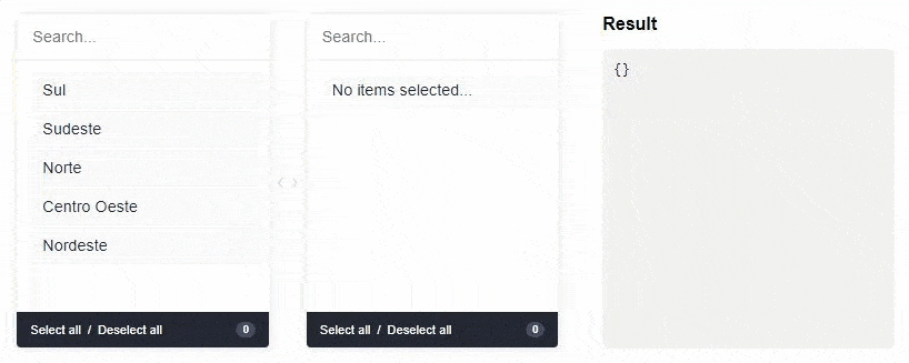
A component for Vue.js to select double-sided data. The customer can select one or more items and ship them from side to side. Values can be displayed grouped or ungrouped.
From version v2.0.0 it is only compatible with Vue 3.
For Vue 2, see version v1.1.6.
Live DEMO
Installation
First install it using:
npm install --save vue-select-sides
or
yarn add vue-select-sides
Usage with Vue 3
Component Registration
Local component:
<script setup>
import vueSelectSides from "vue-select-sides";
</script>

<template>
  <vue-select-sides
    type="mirror"
    v-model="selected"
    :list="list"
  ></vue-select-sides>
</template>
Or using Options API:
import vueSelectSides from "vue-select-sides";

export default {
  components: {
    vueSelectSides,
  },
};
Global component:
// main.js
import { createApp } from "vue";
import App from "./App.vue";
import vueSelectSides from "vue-select-sides";

const app = createApp(App);

// Optional: Set global locale
app.use(vueSelectSides, {
  locale: "en_US", // Default locale
});

app.component("vue-select-sides", vueSelectSides);
app.mount("#app");
Script tag (UMD):
<script src="dist/vue-select-sides.umd.js"></script>
Import a Theme
You have three pre-built themes available:
Using SCSS (recommended):
// Soft theme (default - orange accent)
@use "vue-select-sides/styles/themes/soft.scss" as *;

// Dark theme
@use "vue-select-sides/styles/themes/dark.scss" as *;

// Light theme
@use "vue-select-sides/styles/themes/light.scss" as *;
Customizing the Soft theme:
// Override default variables
@use "vue-select-sides/styles/themes/soft.scss" with (
  $selected-color: #ff0000,
  $default-item-background: #f0f0f0,
  $border-radius-base: 0.5rem
) as *;
Using CSS (pre-compiled):
// In your main.js or component
import "vue-select-sides/dist/css/soft.css";
// or
import "vue-select-sides/dist/css/dark.css";
// or
import "vue-select-sides/dist/css/light.css";
Component Types
The component has support for two types: mirror and grouped.
Grouped
Warning: v-model must be of type Object
<template>
  <vue-select-sides
    type="grouped"
    v-model="selected"
    :list="list"
  ></vue-select-sides>
</template>

<script setup>
import { ref } from "vue";
import vueSelectSides from "vue-select-sides";

const selected = ref({});
const list = ref([
  {
    value: "sul",
    label: "Sul",
    disabled: false,
    children: [
      {
        value: "santa-catarina",
        label: "Santa Catarina",
        disabled: false,
      },
      {
        value: "parana",
        label: "Paraná",
        disabled: false,
      },
    ],
  },
  {
    value: "sudeste",
    label: "Sudeste",
    disabled: false,
    children: [
      {
        value: "minas-gerais",
        label: "Minas Gerais",
        disabled: false,
      },
      {
        value: "sao-paulo",
        label: "São Paulo",
        disabled: false,
      },
    ],
  },
]);
</script>
Mirror
Warning: v-model must be of type Array
<template>
  <vue-select-sides
    type="mirror"
    v-model="selected"
    :list="list"
  ></vue-select-sides>
</template>

<script setup>
import { ref } from "vue";
import vueSelectSides from "vue-select-sides";

const selected = ref([]);
const list = ref([
  {
    value: "afghanistan",
    label: "Afghanistan",
    disabled: true,
  },
  {
    value: "brazil",
    label: "Brazil",
  },
  {
    value: "fiji",
    label: "Fiji",
    disabled: true,
  },
  {
    value: "ghana",
    label: "Ghana",
  },
]);
</script>
Language/Locales
List of locales available for the plugin:
en_US- [English] - Defaultpt_BR- [Portuguese] - Contributed by @juliorosseties_ES- [Spanish] - Contributed by @etrepatfr_FR- [French] - Contributed by @MajuTotr_TR- [Turkish] - Contributed by @Abdulsametileripl_PL- [Polish] - Contributed by @jzapalcz_CZ- [Czech] - Contributed by @DuchVladimirsk_SK- [Slovak] - Contributed by @DuchVladimir
Set Global Locale
// main.js
import { createApp } from "vue";
import vueSelectSides from "vue-select-sides";

const app = createApp(App);

app.use(vueSelectSides, {
  locale: "pt_BR",
});

app.component("vue-select-sides", vueSelectSides);
Props
These are all the props you can pass to the component:
| name | type | example | notes |
|---|---|---|---|
| v-model | Array or Object | ["xyz"] or {xyz: ["abc", "def"]} | Use Object if type is grouped else uses Array |
| type | String | grouped or mirror | |
| list | Array | [{ value: "xyz", label: "Label xyz 01", disabled: true/false }] | You can add the children key to type grouped |
| search | Boolean | true or false | To show/hide search input. Default is visible (true) |
| total | Boolean | true or false | To show/hide total selected in footer. Default is visible (true) |
| toggle-all | Boolean | true or false | To show/hide toggle in footer. Default is visible (true) |
| sort-selected-up | Boolean | true or false | Show first the pre-selected. Default does not visible (false). Available only grouped type |
| order-by | String | asc or desc | Show first the pre-selected. Default is natural order |
String | en_US, pt_BR, es_ES or fr_FR | Use Set Global Locale | |
| placeholder-search-left | String | "Yay! Search items..." | Placeholder on the left search field. Default is "" |
| placeholder-search-right | String | "Or search children items..." | Placeholder on the right search field. Default is "" |
Available SCSS Variables for Customization
When using @use with the soft theme, you can override these variables:
$font-size-base: 0.9rem;
$border-radius-base: 0.25rem;
$selected-color: #f57f1e;
$white: #fff;
$gray: #e1e1e1;
$dark: #242934;
$default-item-background: #fafafa;
$default-item-color-selected: $white;
$default-item-background-selected: $selected-color;
$default-text-color: $dark;
$default-footer-text-color: $white;
$default-footer-background: $dark;
$badge-background: rgba($dark, 0.15);
Example:
@use "vue-select-sides/styles/themes/soft.scss" with (
  $selected-color: #3498db,
  $border-radius-base: 8px,
  $font-size-base: 1rem
) as *;
Bugs and Feature Requests
If your problem or idea is not addressed yet, please open a new issue.
Sponsor / Creator

Contribution / Development
Install Dependencies
yarn install
Dev Server
yarn run serve
Build
yarn run build
Run Tests
yarn test
Donate
You can help with a donation on Paypal
License
Vue select sides is open-sourced software licensed under the MIT license.