About
July 5, 2026 · View on GitHub



About
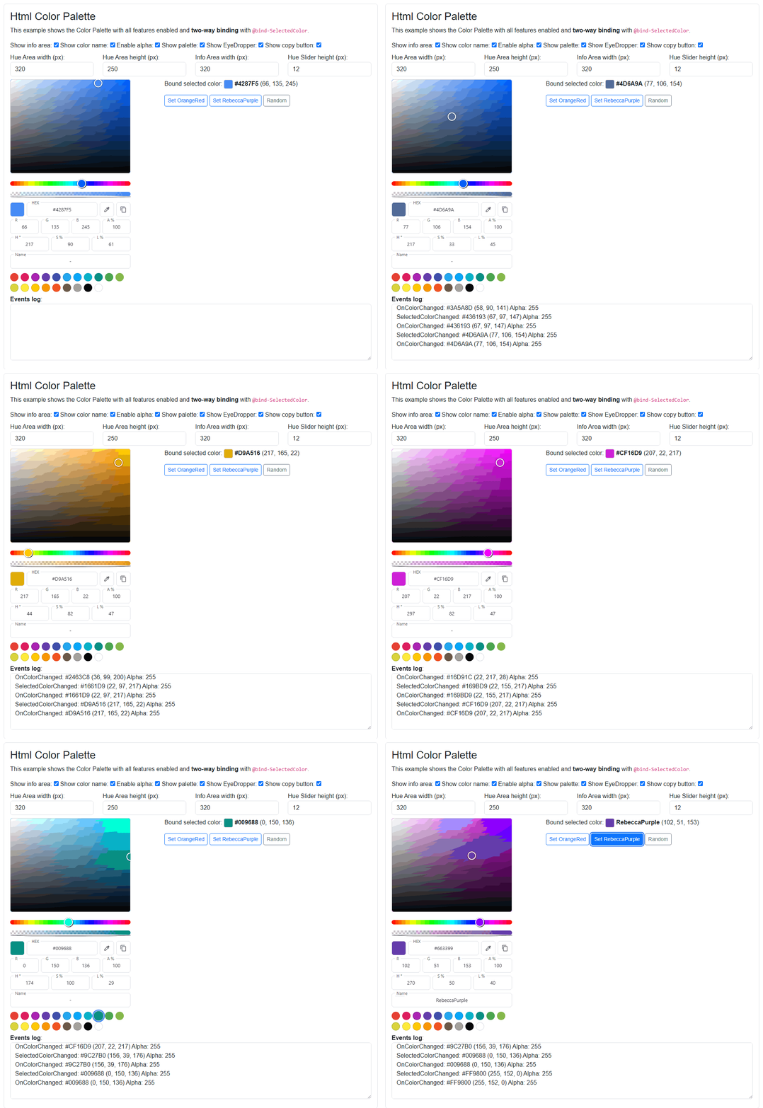
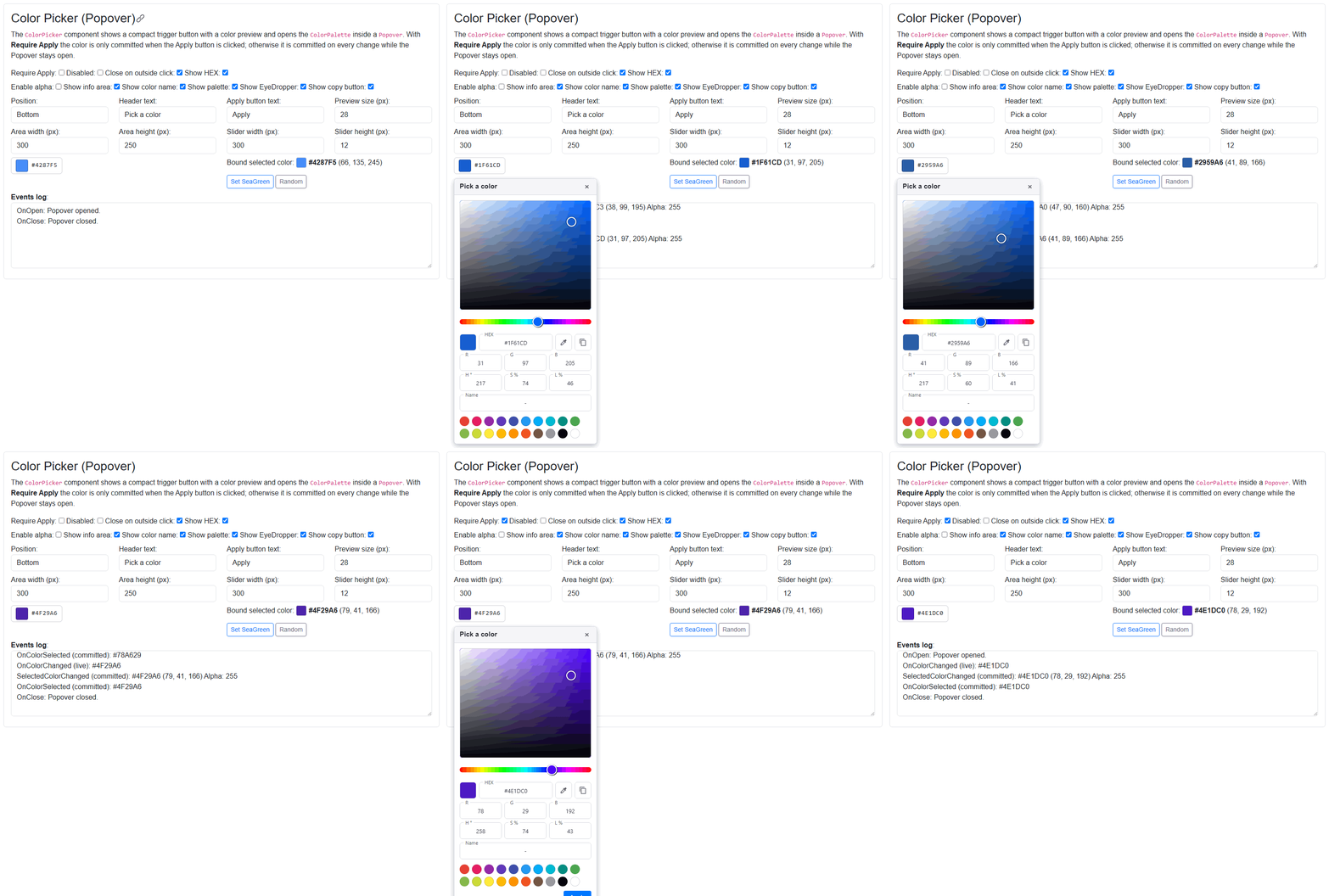
Blazor components that render a fully featured HTML Color Picker control: an HSV Saturation/Brightness selection area, Hue and Alpha (opacity) sliders, editable HEX/RGB/HSL inputs, a known color name, a copy-to-clipboard button, a screen color picker (EyeDropper) and a predefined color palette. It comes in two flavours: an always-visible ColorPalette and a compact, click-triggered ColorPicker that hosts the palette inside a Popover.
All components work with WebAssembly and Server hosted models.
For code examples see usage.
You can try it out by using the demo app.
Features
- HSV Saturation/Brightness selection area with a draggable handle.
- Hue slider and optional Alpha (opacity) slider with ARGB output.
- Editable HEX, RGB(A) and HSL inputs, all kept in sync.
- Known color name field (e.g.
RebeccaPurple) for named HTML colors. - Copy to clipboard button for the current HEX value.
- Screen color picker (EyeDropper) button — rendered only when the browser supports the EyeDropper API.
- Predefined color palette of swatches, customizable via
PaletteColors. - Works with the standard
System.Drawing.Colortype and supports two-way binding with@bind-SelectedColor. - Fully sizable areas (picker area, info area, slider height).
ColorPickeradds a compact trigger button with a color preview, a Popover host, Apply support and open/close events.
Components
ColorPalette: renders the full, always-visible color selector (HSV area, sliders, HEX/RGB/HSL info and palette).ColorPicker: renders a compact trigger button showing the selected color and opens aColorPaletteinside a Popover, with optional Apply-to-commit behavior.
Both components work with the System.Drawing.Color type. Add @using System.Drawing and (for the ToHtmlHex() / ToRgbString() helpers used in the examples) @using Majorsoft.Blazor.Components.Core.HtmlColors.
ColorPalette component (See: demo app)
The always-visible color selector. Pick a color in the HSV area, drag the Hue/Alpha sliders or type a HEX/RGB/HSL value; every change raises OnColorChanged and updates the two-way bound SelectedColor.
Properties
SelectedColor:Color { get; set; }(default: Color.FromArgb(66, 135, 245))
Currently selectedSystem.Drawing.Color. Supports two-way binding with@bind-SelectedColor.HueAreaWidth:int { get; set; }(default: 300, min: 200)
Width of the Saturation/Brightness selection area in pixels.HueAreaHeight:int { get; set; }(default: 250, min: 100)
Height of the Saturation/Brightness selection area in pixels.InfoAreaWidth:int { get; set; }(default: 300, min: 200)
Width of the info area (Hue/Alpha sliders, color info and predefined palette) in pixels.HueSliderHeight:int { get; set; }(default: 12)
Height of the Hue and Alpha sliders in pixels.ShowInfoArea:bool { get; set; }(default: true)
Shows or hides the HEX/RGB/HSL info and input area.ShowColorName:bool { get; set; }(default: true)
Shows or hides the known color Name field. RequiresShowInfoArea.EnableAlpha:bool { get; set; }(default: false)
Enables the Alpha (opacity) slider and ARGB output.ShowPalette:bool { get; set; }(default: true)
Shows or hides the predefined color palette (swatches).ShowEyeDropper:bool { get; set; }(default: true)
Shows or hides the screen color picker (EyeDropper) button. Only rendered when the browser supports the EyeDropper API.ShowCopyButton:bool { get; set; }(default: true)
Shows or hides the 'copy to clipboard' button.PaletteColors:IEnumerable<Color>? { get; set; }(default: null)
Predefined color swatches to show. When not set a default Material-style palette is used.Class:string? { get; set; }(default: null)
Custom CSS class applied to the root element.Style:string? { get; set; }(default: null)
Custom inline style applied to the root element.
Arbitrary HTML attributes e.g.: id="palette1" will be passed to the corresponding rendered root HTML element <div>.
Events
SelectedColorChanged:EventCallback<Color>delegate
Callback for two-way binding. Invoked with the newColorwhen the selection changes. Used by@bind-SelectedColor.OnColorChanged:EventCallback<Color>delegate
Notification callback invoked with the newColorwhen the selection changes.
ColorPicker component (See: demo app)
A compact trigger button that shows a color preview (and optional HEX text) and opens a ColorPalette inside a Popover. By default every change is committed immediately while the Popover stays open; set RequireApply to only commit when the Apply button is clicked. Most ColorPalette options are forwarded to the inner palette.
Properties
SelectedColor:Color { get; set; }(default: Color.FromArgb(66, 135, 245))
Currently selected (committed)System.Drawing.Color. Supports two-way binding with@bind-SelectedColor.RequireApply:bool { get; set; }(default: false)
Whentruethe selected color is only committed (and the Popover closed) after the Apply button is clicked. Whenfalseevery change is committed immediately and the Popover stays open.ApplyButtonText:string { get; set; }(default: "Apply")
Text shown on the Apply button. Only used whenRequireApplyistrue.HeaderText:string { get; set; }(default: "Pick a color")
Header text shown on the color selector Popover.Position:TooltipPositions { get; set; }(default: TooltipPositions.Top)
Position of the Popover relative to the trigger button. Values:{ Top, Right, Bottom, Left }.CloseOnOutsideClick:bool { get; set; }(default: true)
Whentruethe Popover closes when the user clicks outside of it.Disabled:bool { get; set; }(default: false)
Whentruethe picker is disabled and cannot be opened.ShowHex:bool { get; set; }(default: true)
Shows or hides the HEX value text next to the color preview on the trigger button.PreviewSize:int { get; set; }(default: 28)
Size (width and height) of the color preview square on the trigger button, in pixels.IsOpen:bool { get; set; }(default: false)
Gets or sets whether the color selector Popover is open. Supports two-way binding with@bind-IsOpen. Set totrueto open it,falseto close it.
The following properties are forwarded to the inner ColorPalette and behave exactly as documented above: EnableAlpha (default: false), ShowInfoArea (default: true), ShowColorName (default: true), ShowPalette (default: true), ShowEyeDropper (default: true), ShowCopyButton (default: true), HueAreaWidth (default: 300), HueAreaHeight (default: 250), InfoAreaWidth (default: 300), HueSliderHeight (default: 12) and PaletteColors (default: null). Class and Style are applied to the root (trigger) container element.
Arbitrary HTML attributes e.g.: id="picker1" will be passed to the corresponding rendered root HTML element.
Events
SelectedColorChanged:EventCallback<Color>delegate
Callback for two-way binding. Invoked with the committedColor(on Apply whenRequireApplyistrue, otherwise on every change). Used by@bind-SelectedColor.OnColorSelected:EventCallback<Color>delegate
Notification callback invoked with the committedColor(on Apply whenRequireApplyistrue, otherwise on every change).OnColorChanged:EventCallback<Color>delegate
Notification callback invoked with the liveColoron every change inside the palette, even before it is applied.OnOpen:EventCallbackdelegate
Callback function called when the color selector Popover is opening.OnClose:EventCallbackdelegate
Callback function called when the color selector Popover is closing.IsOpenChanged:EventCallback<bool>delegate
Callback for two-way binding. Invoked with the new open/closed state whenever the Popover opens or closes. Used by@bind-IsOpen.
Configuration
Installation
Majorsoft.Blazor.Components.ColorPicker is available on NuGet.
dotnet add package Majorsoft.Blazor.Components.ColorPicker
Use the --version option to specify a preview version to install.
Usage
Add using statement to your Blazor <component/page>.razor file. Or globally reference it into _Imports.razor file.
@using Majorsoft.Blazor.Components.ColorPicker
Dependences
Majorsoft.Blazor.Components.ColorPicker package depends on other Majorsoft Nuget packages:
- Majorsoft.Blazor.Components.Common.JsInterop which handles JS Interop for the drag handle (global mouse events), the copy-to-clipboard button and the Popover outside-click detection.
- Majorsoft.Blazor.Components.Tooltips
which provides the
Popoverused by theColorPicker.
Register services
Both components rely on the JS Interop extensions (global mouse events, clipboard and outside-click handling), so register them once during application startup.
In case of WebAssembly project register services in your Program.cs file:
using Majorsoft.Blazor.Components.Common.JsInterop;
...
public static async Task Main(string[] args)
{
	var builder = WebAssemblyHostBuilder.CreateDefault(args);

	//Register dependencies
	builder.Services.AddJsInteropExtensions();
}
In case of Server hosted project register services in your Startup.cs file:
using Majorsoft.Blazor.Components.Common.JsInterop;
...

public void ConfigureServices(IServiceCollection services)
{
	//Register dependencies
	services.AddJsInteropExtensions();
}
ColorPalette usage
Following code example shows how to use the ColorPalette component with all features enabled and two-way binding via @bind-SelectedColor.
@using System.Drawing
@using Majorsoft.Blazor.Components.Core.HtmlColors

<ColorPalette @bind-SelectedColor="_selectedColor"
			  ShowInfoArea="true"
			  ShowColorName="true"
			  EnableAlpha="true"
			  ShowPalette="true"
			  ShowEyeDropper="true"
			  ShowCopyButton="true"
			  HueAreaWidth="320"
			  HueAreaHeight="250"
			  InfoAreaWidth="320"
			  HueSliderHeight="12"
			  OnColorChanged="@OnColorChanged" />

<p>
	Selected color:
	<span style="display:inline-block; width:24px; height:24px; vertical-align:middle; border:1px solid #ccc; background:@_selectedColor.ToHtmlHex();"></span>
	<strong>@_selectedColor.ToHtmlHex()</strong> (@_selectedColor.ToRgbString())
</p>

@code {
	private Color _selectedColor = Color.FromArgb(66, 135, 245);

	private void OnColorChanged(Color color)
	{
		//Write your event handling code here...
	}
}
You can also supply your own palette swatches through PaletteColors:
<ColorPalette @bind-SelectedColor="_selectedColor"
			  PaletteColors="_swatches" />

@code {
	private Color _selectedColor = Color.Red;
	private readonly Color[] _swatches = new[]
	{
		Color.Red, Color.Green, Color.Blue, Color.Orange, Color.Purple, Color.Black, Color.White,
	};
}
ColorPicker usage
Following code example shows how to use the compact ColorPicker component. With RequireApply the color is only committed when the Apply button is clicked; otherwise it is committed on every change while the Popover stays open.
@using System.Drawing
@using Majorsoft.Blazor.Components.Core.HtmlColors

<ColorPicker @bind-SelectedColor="_color"
			 RequireApply="true"
			 ApplyButtonText="Apply"
			 HeaderText="Pick a color"
			 Position="@TooltipPositions.Bottom"
			 CloseOnOutsideClick="true"
			 ShowHex="true"
			 PreviewSize="28"
			 EnableAlpha="false"
			 OnColorSelected="@OnColorSelected"
			 OnColorChanged="@OnColorChanged"
			 OnOpen="@OnOpen"
			 OnClose="@OnClose" />

<p>
	Selected color:
	<span style="display:inline-block; width:24px; height:24px; vertical-align:middle; border:1px solid #ccc; background:@_color.ToHtmlHex();"></span>
	<strong>@_color.ToHtmlHex()</strong>
</p>

@code {
	private Color _color = Color.FromArgb(66, 135, 245);

	//Committed value (on Apply, or on every change when RequireApply is false)
	private void OnColorSelected(Color color)
	{
		//Write your event handling code here...
	}

	//Live value on every change, even before it is applied
	private void OnColorChanged(Color color)
	{
		//Write your event handling code here...
	}

	private void OnOpen()
	{
		//Write your event handling code here...
	}
	private void OnClose()
	{
		//Write your event handling code here...
	}
}