About
July 5, 2026 · View on GitHub



About
Wrapper components that expose the full HTML Drag and Drop API:
all drag/drop events, strongly-typed payload transfer, effectAllowed/dropEffect,
custom DataTransfer data, a custom drag image and dropped file access.
All components work with WebAssembly and Server hosted models.
For code examples see usage.
You can try it out by using the demo app.
Features
- Wraps any HTML content/component as a drag source (
Draggable) or a drop target (DropZone). - Strongly-typed payload transfer: drop a
DraggablewithItem="@myObject"and receive the same .NET object in the target'sOnItemDropcallback. No string serialization required. - Exposes the full set of HTML drag/drop events:
dragstart,drag,dragend,dragenter,dragover,dragleaveanddrop. - Configurable HTML
effectAllowed(source) anddropEffect(target) for cursor feedback and drop negotiation (copy / move / link). - Per-zone accept condition to reject unwanted items with a visual "reject" style.
- Custom native
DataTransferdata (e.g.text/plain,text/uri-list) for interop with native drops or other applications. - Custom drag image (any element on the page) with X/Y offset.
- Native file drop support: read dropped files from
DragEventArgs.DataTransfer.Files. - Built-in CSS state classes for styling:
bdraggable-dragging,bdropzone-active,bdropzone-reject, etc.
Note: the
EffectAllowed/DropEffectvalues are advisory only — exactly like the native HTML Drag and Drop API. The browser uses them for the cursor and to negotiate whether a drop is allowed, but it never copies, moves or links anything itself. The actual operation (relocating an item forMove, duplicating it forCopy, etc.) is up to you and must be implemented in theOnItemDrop/OnDrophandler.
Components
Draggable<TItem>: wraps content into a drag source (draggable="true") that carries a strongly-typedItempayload and exposes all drag events.DropZone<TItem>: wraps content into a drop target that accepts dragged items (optionally filtered), exposes all drop events and surfaces the dropped payload.
Both components are generic on TItem, the type of the payload transferred between a Draggable and a DropZone. The payload is carried through the scoped IDragDropStateService (see Configuration), so any .NET object can be moved between zones within the same Blazor app. For native file drops or interop set TItem="string" and read the files/data from the OnDrop DragEventArgs.
Draggable<TItem> component (See: demo app)
Wraps its ChildContent into an HTML element with draggable="true". On drag start it publishes the Item payload to the shared drag/drop state so a DropZone can receive it strongly-typed.
Properties
ChildContent:RenderFragmentHTML content - Required
The content rendered inside the draggable element. Can be any text, image or component.Item:TItem? { get; set; }(default: default)
The strongly-typed payload transferred to theDropZonewhen this element is dropped.Disabled:bool { get; set; }(default: false)
Whentruethe element cannot be dragged (draggable="false").EffectAllowed:DragDropEffects { get; set; }(default: DragDropEffects.All)
The kind of operations allowed for this drag source (HTMLeffectAllowed). Advisory only: it drives the cursor feedback and is used to negotiate the drop with a target'sDropEffect. If the target requests an effect not listed here the browser showsno-dropand suppresses the drop. Values:{ None, Copy, CopyLink, CopyMove, Link, LinkMove, Move, All }.Data:IReadOnlyDictionary<string, string>? { get; set; }(default: null)
Optional nativeDataTransferdata set on drag start, keyed by format (e.g.text/plain,text/uri-list). Useful for interoperating with native drops or other applications.DragImageElementId:string? { get; set; }(default: null)
Optionalidof an element to use as the custom drag image (HTMLsetDragImage).DragImageOffsetX:int { get; set; }(default: 0)
Horizontal offset (px) of the custom drag image relative to the pointer.DragImageOffsetY:int { get; set; }(default: 0)
Vertical offset (px) of the custom drag image relative to the pointer.Class:string? { get; set; }(default: null)
Custom CSS class(es) applied to the draggable element.Style:string? { get; set; }(default: null)
Custom inline style applied to the draggable element.Element:ElementReference { get; }
Reference to the rendered draggable HTML element. It can be used e.g. for JS interop, focusing, etc.
Arbitrary HTML attributes e.g.: tabindex="1" will be passed to the corresponding rendered HTML element <div>.
The rendered element gets the bdraggable CSS class, plus bdraggable-dragging while it is being dragged and bdraggable-disabled when Disabled is true.
Events
OnDragStart:EventCallback<DragEventArgs>delegate
Fired when a drag operation starts (HTMLdragstart).OnDrag:EventCallback<DragEventArgs>delegate
Fired continuously while the element is being dragged (HTMLdrag).OnDragEnd:EventCallback<DragEventArgs>delegate
Fired when the drag operation ends, regardless of whether it was dropped (HTMLdragend).
DropZone<TItem> component (See: demo app)
Wraps its ChildContent into a drop target. While a Draggable is dragged over it the zone highlights, and on drop it surfaces the strongly-typed payload via OnItemDrop (and the raw DragEventArgs via OnDrop).
Properties
ChildContent:RenderFragmentHTML content - Required
The content rendered inside the drop target element.Disabled:bool { get; set; }(default: false)
Whentruethe drop target ignores drops.DropEffect:DropEffect { get; set; }(default: DropEffect.Move)
The feedback (cursor) shown by the browser while dragging over this target (HTMLdropEffect). Advisory only: it controls the cursor and takes part in negotiation with the drag source'sEffectAllowed(if it is not permitted the browser forces it tononeand suppresses the drop). It does not make the component copy/move/link anything. Values:{ None, Copy, Move, Link }. The browser-negotiated effect is available asDragEventArgs.DataTransfer.DropEffecton theOnDropcallback.AcceptCondition:Func<TItem?, bool>? { get; set; }(default: null)
Optional predicate evaluated against the currently dragged item to decide whether this zone accepts it. When it returnsfalsethe drop is ignored and the zone shows a "reject" style. Default (null) accepts anything.Class:string? { get; set; }(default: null)
Custom CSS class(es) applied to the drop target element.Style:string? { get; set; }(default: null)
Custom inline style applied to the drop target element.Element:ElementReference { get; }
Reference to the rendered drop target HTML element.IsDragOver:bool { get; }
Returnstruewhile a dragged element is currently over this drop target.
Arbitrary HTML attributes e.g.: id="zone1" will be passed to the corresponding rendered HTML element <div>.
The rendered element gets the bdropzone CSS class, plus bdropzone-active while an item is dragged over it, bdropzone-reject when the hovered item is not accepted and bdropzone-disabled when Disabled is true.
Events
OnDragEnter:EventCallback<DragEventArgs>delegate
Fired when a dragged element enters the drop target (HTMLdragenter).OnDragOver:EventCallback<DragEventArgs>delegate
Fired continuously while a dragged element is over the drop target (HTMLdragover).OnDragLeave:EventCallback<DragEventArgs>delegate
Fired when a dragged element leaves the drop target (HTMLdragleave).OnDrop:EventCallback<DragEventArgs>delegate
Fired when something is dropped on the target (HTMLdrop). Provides the rawDragEventArgsincluding access toDataTransfer(dropped files, items, types and effects).OnItemDrop:EventCallback<TItem?>delegate
Fired when an acceptedDraggableitem is dropped on the target. Provides the strongly-typed payload. This is where you perform the actual operation implied byDropEffect(the component only negotiates the effect and the cursor). Fires immediately afterOnDrop.
Supporting types
DragDropEffects:enum— mirrors the HTMLDataTransfer.effectAllowedvalues used byDraggable.EffectAllowed:{ None, Copy, CopyLink, CopyMove, Link, LinkMove, Move, All }.DropEffect:enum— mirrors the HTMLDataTransfer.dropEffectvalues used byDropZone.DropEffect:{ None, Copy, Move, Link }.IDragDropStateService: scoped service — carries the strongly-typed payload of the current drag operation betweenDraggableandDropZonecomponents. The native HTMLDataTransferobject can only carry strings and cannot be written from managed Blazor code, so this service is used to transfer arbitrary .NET objects within the same Blazor application. It is registered byAddDragAndDrop()and used internally by the components; you rarely need to inject it yourself.
Configuration
Installation
Majorsoft.Blazor.Components.DragAndDrop is available on NuGet.
dotnet add package Majorsoft.Blazor.Components.DragAndDrop
Use the --version option to specify a preview version to install.
Usage
Add using statement to your Blazor <component/page>.razor file. Or globally reference it into _Imports.razor file.
@using Majorsoft.Blazor.Components.DragAndDrop
Register services
The components transfer the strongly-typed payload through a scoped IDragDropStateService, so you must register the Drag and Drop services once during application startup.
In case of WebAssembly project register services in your Program.cs file:
using Majorsoft.Blazor.Components.DragAndDrop;
...
public static async Task Main(string[] args)
{
	var builder = WebAssemblyHostBuilder.CreateDefault(args);

	//Register dependencies
	builder.Services.AddDragAndDrop();
}
In case of Server hosted project register services in your Startup.cs file:
using Majorsoft.Blazor.Components.DragAndDrop;
...

public void ConfigureServices(IServiceCollection services)
{
	//Register dependencies
	services.AddDragAndDrop();
}
Default styles (optional)
The package ships a small stylesheet with the default cursors and drag-over/reject highlights. The components work without it, but to get the built-in styling reference it in your index.html (WebAssembly) or _Host.cshtml/_Layout.cshtml (Server):
<link rel="stylesheet" href="_content/Majorsoft.Blazor.Components.DragAndDrop/dragDrop.css" />
You can also style the bdraggable* / bdropzone* state classes yourself instead of (or on top of) the shipped CSS.
Draggable and DropZone usage
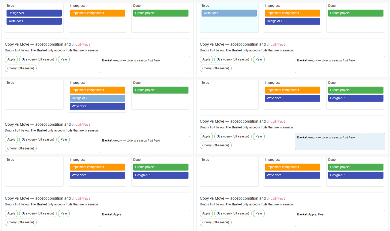
Following code example shows a simple Kanban-style board: drag strongly-typed TaskItem cards between columns. The dropped object is received directly in OnItemDrop.
@foreach (var column in _columns)
{
	<DropZone TItem="TaskItem"
			  DropEffect="DropEffect.Move"
			  OnItemDrop="@(item => MoveTask(item, column.Key))"
			  Class="board-column"
			  Style="min-height: 160px; padding: 8px; border: 1px solid #ddd; border-radius: 6px;">
		<div class="font-weight-bold mb-2">@column.Key</div>

		@foreach (var task in column.Value)
		{
			<Draggable TItem="TaskItem"
					   @key="task"
					   Item="task"
					   EffectAllowed="DragDropEffects.Move"
					   OnDragStart="@(() => Log($"Drag started: '{task.Title}'"))"
					   OnDragEnd="@(() => Log($"Drag ended: '{task.Title}'"))"
					   Class="board-card"
					   Style="@($"padding: 6px 10px; margin-bottom: 6px; background:{task.Color}; color:#fff; border-radius: 4px;")">
				@task.Title
			</Draggable>
		}
	</DropZone>
}

@code {
	public record TaskItem(string Title, string Color);

	private readonly Dictionary<string, List<TaskItem>> _columns = new()
	{
		["To do"] = new() { new("Design API", "#3f51b5"), new("Write docs", "#3f51b5") },
		["In progress"] = new() { new("Implement components", "#ff9800") },
		["Done"] = new() { new("Create project", "#4caf50") },
	};

	private void MoveTask(TaskItem? task, string targetColumn)
	{
		if (task is null)
		{
			return;
		}

		foreach (var column in _columns.Values)
		{
			column.Remove(task);
		}
		_columns[targetColumn].Add(task);
	}
}
Accept condition usage
Use AcceptCondition to reject items the zone should not receive. Rejected items show the bdropzone-reject style and are not dropped.
<DropZone TItem="Fruit"
		  DropEffect="DropEffect.Copy"
		  AcceptCondition="@(f => f is not null && f.InSeason)"
		  OnItemDrop="@(f => { _basket.Add(f!); })"
		  Style="min-height: 90px; padding: 10px; border: 2px dashed #4caf50; border-radius: 6px;">
	<strong>Basket:</strong>
	@string.Join(", ", _basket.Select(b => b.Name))
</DropZone>

@code {
	public record Fruit(string Name, bool InSeason);
	private readonly List<Fruit> _basket = new();
}
Custom drag image usage
Point DragImageElementId to the id of any element on the page to use it as the drag image.
<div id="dragImage" style="display:inline-block; padding:6px 10px; background:#673ab7; color:#fff; border-radius:4px;">
📦 Custom drag image
</div>
<Draggable TItem="string"
Item="@("Box with custom drag image")"
DragImageElementId="dragImage"
DragImageOffsetX="24"
DragImageOffsetY="24"
Style="padding: 20px; border: 1px solid #999; border-radius: 6px;">
Drag me — I use a custom drag image
</Draggable>
Native file drop usage
A DropZone also accepts files dragged from the operating system. Read them from the OnDrop DragEventArgs.DataTransfer.Files.
<DropZone TItem="string"
		  OnDrop="OnFilesDropped"
		  Style="min-height: 90px; padding: 10px; border: 2px dashed #999; border-radius: 6px;">
	<strong>Drop files from your machine here</strong>
	@if (_droppedFiles.Count > 0)
	{
		<ul>
			@foreach (var file in _droppedFiles)
			{
				<li>@file</li>
			}
		</ul>
	}
</DropZone>

@code {
	private readonly List<string> _droppedFiles = new();

	private void OnFilesDropped(DragEventArgs e)
	{
		var files = e.DataTransfer?.Files;
		if (files is { Length: > 0 })
		{
			foreach (var file in files)
			{
				_droppedFiles.Add(file);
			}
		}
	}
}