qMaruPL.
March 8, 2022 · View on GitHub
qMaruPL
qMaruPL.
Hello
Hi. I'm Katsuaki Maruno of Otsuka Corporation.
This qlik extension enables you to make measures easier to see for non-bi-expert users.
For example, you can make a sheet as below.
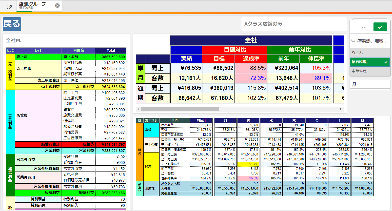
If you are not Japanese, how about this?

Don’t you think it's easy to see? Although I mistook the currency symbol.
So to speak, qMaruPL helps you classify measures by decorating some ruled lines and merged cells. Small and medium-sized businesses in Japan really love such special tables which have excel-like rule lines. I could also call qMaruPL one of the KPI viewers.
What's more, the display speed is very fast in spite of the number of measures. A hundred measures will appear in a second on your dashboards. I'm sure the display speed is key for successful BI.
Get started
こんにちは。大塚商会の丸野です。
このエクステンション qMarPL は、"qMaruPL.YYYY.MM.dd.zip" という形式で置いてありますのでダウンロードしてください。
それと、"qMaruPL extension_sample+日付.qvf" というサンプルファイルもあります。下のチュートリアルで使うデータとサンプルが入っていますので参考にしてください。
Qlik Sense SaaS版の場合、最初にアップロードするときは、「Management Console>コンテンツ>エクステンション」にアップロードしてください。
アップロードするときは、ダウンロードしたzipファイルのままアップロードしてください。ソースコードが見たいとかでない限り、解凍する意味はありません。
qMarPLエクステンションはバージョンアップして機能追加やバグ修正がされることがあります。最新のエクステンションはここに置きますので、日付の新しいものをダウンロードしてください。
更新する場合は、「Management Console>コンテンツ>エクステンション」にあるqMaruPLの「…」を押して「編集」でアップロードすれば置き換えられます。
ダウンロードしたzipファイルのまま、ファイル名もそのままアップロードすれば上書きされます。
Qlik Sense オンプレミス版の場合はQMCのExtensionからになります。
特にマニュアルのようなものは作っておりませんが、普通にQlik Senseアプリを作れる方でしたら、下のチュートリアルをやっていただければ十分使えるようになると思います。
Get the zip file: "qMaruPL.YYYY.MM.dd.zip"
I recommend that you get the latest one.
You can also get "qMaruPL extension_sample.qvf" , which is a sample Qlik Sense app using qMaruPL.
Import the zip file into Qlik Sense Server via your QMC. Then "qMaruPL '' qlik extenstion will be installed in your Qlik Sense environment. The name might be shown as maruPL according to the environment or QMC's version, though.
Note that you don't need to unzip when you import to QMC.
You can take the advantage of qMaruPL on both Qlik Sense SaaS and Qlik Sense on-premise.
Of course, qMaruPL can be used with 漢字.
Overall
Property names are subject to change because I'm not satisfied with the names already due to my poor English. Of course, I try to avoid causing any unfavorable effect to existing apps, though.
Anyway, I named the parts of the extension properties as follows.
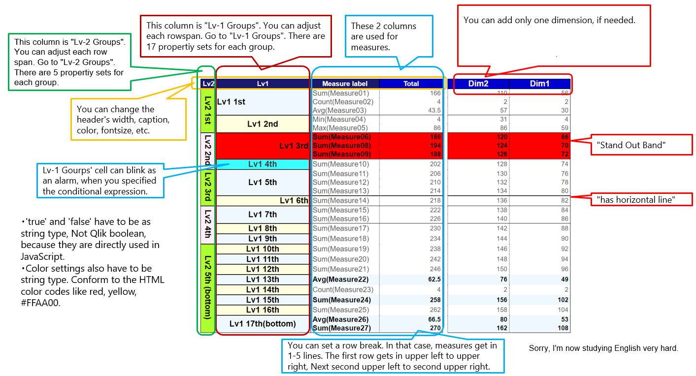
I use these names to explain tutorials.
Basically properties which may affect the width indicates "◆" symbol. Background color is "●", Font color is "〇". Colspan, Rowspan, or repetitive items are "===★".
Tutorial 1
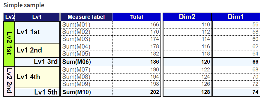
Let's make this. This tutorial would be useful for financial reports.
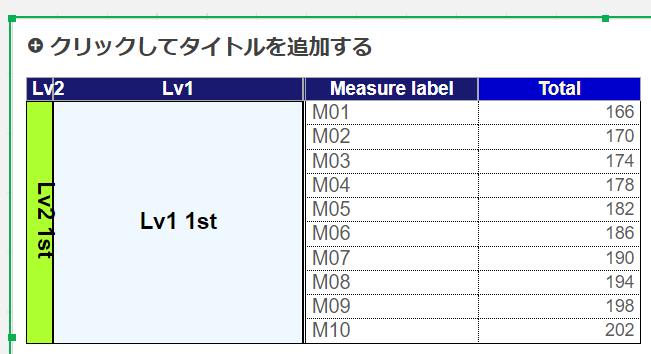
Create a new sheet and put a qMaruPL extension on it.
Add 10 measures, from M01 to M10, to qMaruPL. The order of measures is important. qMaruPL arranges measures sequentially.
Go to the "Lv-1 Groups" property group panel.
In the "Lv-1 Groups" property group panel, you can set each rowspan. This property is separated into 17 sections by "===★" sign.
You might not be familiar with HTML. The rowspan means several rows are merged in a row. Actually this extension has been developed with colgroup instead of obsolete colspan.
Find the "1.===★row span1=======" field. Enter "3" instead of the default value 99. Then "Lv1" column's top 3 cells are merged.
Similarly find the "2.===★row span2=======" field. Enter "2".
Find the "3.===★row span3=======" field. Enter "1".
Set "right" as the "align" radio button in this "3.===★row span3" section.
Set "On" as the "has horizontal line" switch in this "3.===★row span3" section.
Set "On" as the "Stand Out Band" switch in this "3.===★row span3" section. Maybe the name is not appropriate. I wanted to say that the row is highlighted. When it's set on, measure name's alignment also comforms to this alignment.
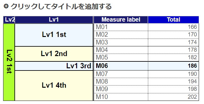
Find the "4.===★row span4=======" field, and Enter "3" instead of the default value 99.
Find the "5.===★row span5=======" field. Enter "1" instead of the default value 99.
Set "right" as the "align" radio button in the same section "5.===★row span5".
Set "On" as the "has horizontal line" switch in this "5.===★row span5" section.
Set "On" as the "Stand Out Band" switch in this "5.===★row span5" section.
In financial reports, adding subtotal lines or total lines would be useful.
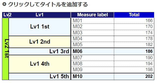
Good. You might want to fold "Lv-1 Groups" property group panel. Or you would be confused as there are a lot of properties.
Go to the "Lv-2 Groups" property group panel. In "Lv-2 Groups", the set of properties is separated into 5 sections by "===★Lv2...".
Find the "1.===★Lv2 row span1=======" field. And Enter "6" instead of the default value 99. Then "Lv2" column's top 6 cells are merged.
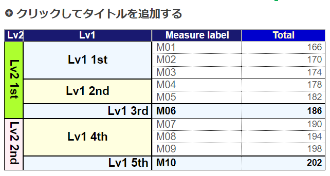
Add dimension "Dim1" to the extension.
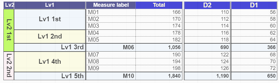
Completed!
Tutorial 2
Let's make this.

I found that I mistook "Actual" and "Budget" in these images, and I'm not willing to correct them. I like programming but I hate making documents. I don't have such time. So, don't mind the values or labels of this tutorial. They are not important. Focus on operations.
Create a new sheet and put a qMaruPL on it.
Add measures, [M01], [M02], [M02/M01], [M03], [M04], and [M04/M03] to qMaruPL. The order is quite important to take advantage of aMaruPL. You could imagine two sets of a budget, an actual, and the ratio. The sample data of this tutorial hasn't any business meaning, though.
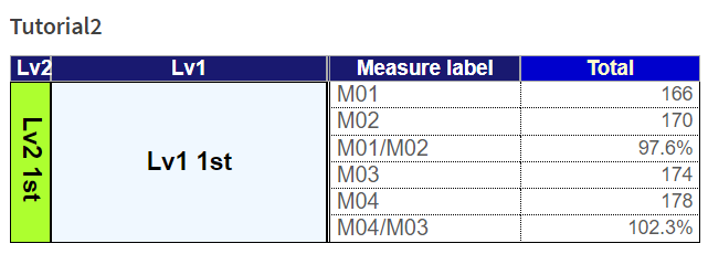
Go to the "Table Overall" property group panel.
Find the "■Row Break Col(From 1-5)" slider. And set it to "3" instead of the default value 1.
 Measures get in 3 columns. The width is too wide. Let's reduce the width and narrow it down. The order will be like the numbers written in red on the image above.
Go to the "Header for Measure text, width, color" property group panel and unfold it.
Find "◆Width(px) of Meas Label if 0 then hidden", and enter 80.
Find "◆Width(px) of Meas Value 'Total' Col " and enter 60.
Go to the "Lv-1 Groups" property group panel and unfold it.
Find "Col Width(px) if 0 then hidden", and enter 80.
Go to the "Lv-2 Groups" property group panel and unfold it.
Find "◆Width(px) of Lv-2 col if 0 then hidden", and enter 0. It means the very left column becomes invisible. But now, you can also hide the Lv-2 column by the "Table Overall" → "◆Hide Lv2 Column" property switch, and it's an easier way.
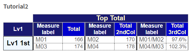
Add the dimension "Dim1" to qMaruPL. You could imagine departments or years. You can also specify the dimension's sort order if you want to do so.

Go to the "Table Overall" property group panel again.
Set "On" as "Repeat Measure Name in dimension cols" switch that is among the best functions of qMaruPL.

If "Repeat Measure Name in dimension cols" is "On", the table becomes very wide. But for now, I just wanted to explain the function. If the '◆Width(px) if 0...' property is 0, the column won't appear, anyway.
Now, turn the switch off.
Now, I don't want to use the measure labels (names) in this tutorial.
Go to the "Header for Measure text, width, color" property group panel again.
Find "◆Width(px) of Meas Label if 0 then hidden", and enter 0. Then the measure name (label) column disappeared. But now, you can also hide the Measure Name by the "Table Overall" → "◆Hide or Show Measure Name" property switch, and it's an easier way.

You change the caption of each measure value's header so that we can recognise the meaning of each col.
Find "Header Text Total 1st", and enter "Budget" instead of the default value 'Total'.
Find "Header Text Total 2nd", and enter "Actual" instead of the default value 'Total 2ndCol'.
Find "Header Text Total 3rd", and enter "Ratio" instead of the default value 'Total 3rdCol'.

We still can't recognise the meaning of each row. Let's change the Lv-1 group's captions like "Sales" and "Profit".
Go to the "Lv-1 Groups" property group panel and unfold it.
Find the "1.===★rowspan1★" field, and enter "1" instead of the default value 99.
Find the "Lv1 caption 1st row", and enter "Sales" instead of the default value "Lv1 1st".
Find the "Stand Out Band" switch, and set it on.
Find the "2.===★rowspan2★" field, and enter "1" instead of the default value 99.
Find the "Lv1 caption 2nd row" field, and enter "Profit" instead of the default value "Lv1 2nd".
Find the "Stand Out Band" switch, and set it on.

By the way, if you want to see the original names of the measures, remember, even though you set the "Repeat Measure Name in dimension cols" switch as "on", as long as the width of measure labels is set 0, you can't see them. You need to set around 50px as the width at the "◆Meas Name Width(px) if 0 then hidden" field on the "Header for Measure text, width, color" property group panel.
I would like to separate cols into amount and ratio by changing their back ground color.
Go to the "Table Overall" property group panel and unfold it.
Turn the "Use Measure Groups" switch on.
Find the "1.===★Colspan1 (1-4) of measures1★=======" field. And enter "2" instead of the default value 1.

Find the "BackGroudColor1" field in the "1.===★Colspan1 (1-4) of measures1★=======" section.
Enter "darkred" instead of the default value "mediumblue".
Find the "BackGroudColor2" in the "2.===★Colspan2 (1-3) of measures2★=======" section.
Enter "darkgreen" instead of the default value "mediumblue". You can also input an expression, but that's a bit complicated.

I changed the specification with regard to color with measure group, December 22th, 2021, so that a header can take over the color of the measure group header above.
Thus, you can separate measures into some groups, by ruled lines and colors.
Both the top header and the left header are drawn regardless of dimensions. You can input the string directly.
Instead, you need to prepare a good number of measures as master items.
Go to the "Table Overall" property group panel again.
Set "On" as the "Vertical Dimension" switch.
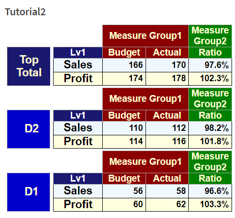
You can arrange the dimension vertically so that you might show the chart in narrower width.
When the "Vertical Dimension" switch is ON, you can hide header of dimension by the "Repeat Measure Name in dimension" switch.
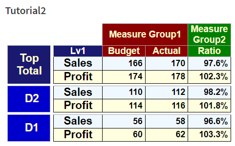
Measures can have some good properties.
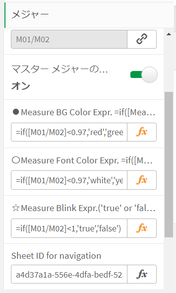
From December 28th, 2021, qMaruPL can set conditional background color, font color, and blink as the one of the measure properties.
When you input an expression to a measure, I recommend that you start with an equal sign ='red', ='true', =if([M01]>100,'red','yellow'), and so on.
Although you can also omit the equal sign, you still need to enclose the value in apostrophes like 'red', 'true', if([M01]>100,'red','yellow'), and so on.
If you want to use master items in the expression, they have to be enclosed in square brackets, like [M01].
Those are originally the specifications of Qlik Sense. Look into the help for more information.
You could be advised that you can directly input the color name like aliceblue, lightyellow, without apostrophes as well as equal sign, in place other than measure properties.
As you saw in this tutorial 2, you could enter "darkred" and "darkgreen" in qMaruPL properties.
Color codes are displayed here, "https://www.colordic.org/".
From December 29th, 2021, qMaruPL can be set navigation sheet id as the one of the measure properties.
While hovering on the measure that has the navigation sheet id property, a mouse cursor indicates that the cell can be clicked.
The sheet id is here, the part of bold italic, after "sheet/" enclosed in "/".
"ttps://qlikserver/sense/app/29ff211c-3be3-4523-a26c-44e09577e69e/sheet/a4d37a1a-556e-4dfa-bedf-525ca36a4fe2/state/edit"
You can input a sheet id string directly without an equal sign nor apostrophes. You can also input an expression. I don't know the reason. Anyway, you need to use an expression when you want to set a background color, font color, and a blink for measure's property besides a sheet id.
Tutorial 3
Let's make this. This tutorial would be useful for financial reports. But first, you should pass the tutorial 1 and 2 in advance.
I’ve already created financial master items which start with a character “x” so that you can find them easily.
Put those measures on qMaruPL like this.
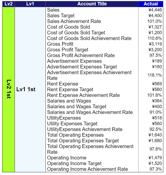
That’s exhausting.
You can adjust the width and the header text of the measure at the "◆Width(px) of Meas label if 0 then hidden" property group panel.
Find the "■Row Break Col(From 1 To 5)" slider in “Table Overall” property panel, and set it to 3.

Write the header texts of Actual, Target, and Rate appropriately at the "◆Width(px) of Meas label if 0 then hidden" property group panel. If you don't have time, you can skip it.
Turn the "horizontal line style" radio button in the same property panel to “none”.
Turn the "◆Hide or Show Measure Name" radio button to “hide except very left”. Then you can only get the account tile col.
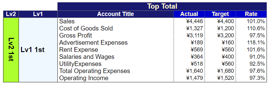
We need to make the total rows stand out.
Go to the "Lv-1 Groups" property group panel.
Find the "1.===★row span1=======" field. Enter "1" instead of the default value 99.
Set “Align” to “left”.
Turn the “Stand Out Band” switch on.
Find the "2.===★row span2=======" field. Enter "1".
Set “Align” to “right”.
Turn the “has horizontal line” switch on.
Find the "3.===★row span3=======" field. Enter "1".
Set “Align” to “right”.
Turn the “Stand Out Band” switch on.
Find the "4.===★row span4=======" field. Enter "4".
Set “Align” to “left”.
Find the "5.===★row span5=======" field. Enter "1".
Set “Align” to “right”.
Turn the “has horizontal line” switch on.
Find the "6.===★row span6=======" field. You can enter any natural number because this is the bottom line.
Set “Align” to “right”.
Turn the “Stand Out Band” switch on.
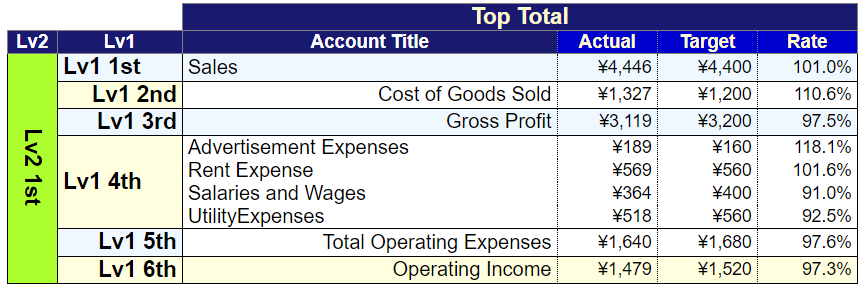
We don’t need Lv1 and Lv2 columns this time. But If you take care of Ordinary income and Net income, you might need to use Lv1 and Lv2 in order to categorize.
Turn on the "◆Hide Lv1 Column"* and *"◆Hide Lv2 Column" switch in “Table Overall” property panel.
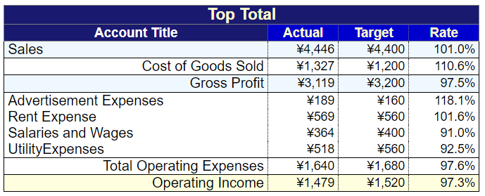
Add “xDivision” dimension on qMaruPL.
I recommend that the measure be “red” when the actual couldn’t meet the target. And if a user clicks it, it’s favorable that he would be able to navigate to another related sheet. Try if you have time.
Completed!.
Tips
I need to enrich this document because qMaruPL has too many properties to explain. Looking for a property in a narrow area is really tough. I wish Qlik Sense's property panel could've been customized.
Even though qMaruPL supports Excel export, as you know, Qlik Sense API allows us to simply export mere a list of dimensions and measures.
So, usually, we also take advantage of Qlik NPrinting when we need to export to Excel. Anyway, I believe that we want to minimize that situation.
I think you can't believe that qMaruPL is developed by using AngularJS.
qMaruPL generated dynamically an HTML string from the controller. The HTML string has a lot of buttons.
Generally, any onclick events can't be bound between the html template and the controller, though.
Multiple same extensions might be used on the same sheet at once, the template is unaware who I am.
getElementById JavaScript function returns only one element, which was found the first time, even though there are many same elements in the one document model.
Therefore, you can't use that function.
getElementsByClass and getElementsByTag might return several elements. How can we identify them?
The answer is to exploit the cookie. One document has one cookie.
This code would help you find a solution with regard to such issues.
Furthermore, managing to have an extension have measure's property took a lot of effort. Finally, I had to create two HyperCubes to calculate the grand total conditional expression. I spent a good deal of time looking into the specifications.
The most complicated thing is SelectValue() function. At first, as long as you use only simple string dimension, it seems easy. But you will encounter many troubles when you create a dimension consisting of number elements, a master item with an expression starting from an equal sign, a master item with drill down. qMaruPL solves those problems.
So, I believe qMaruPL can be one of the greatest examples to conduct Qlik Sense API with AngularJS. Totally, AngularJS and Qlik Sense's extensibility is great. This development is really fun.
Release note
- March 8th, 2022 - qMaruPL came to destroy old HyperCubes so that it can release memory. That's good. I fixed some minor bug.
- January 14th, 2022 - qMaruPL has come to be able to copy data to the clipboard.
- January 14th, 2022 - qMaruPL has come to be able to show only the very left measure name when row break is set. That will help you make financial reports.
- January 10th, 2022 - I corrected a good number of typo in this readme.
- January 9th, 2022 - Vertical Dimension was released.
- January 8th, 2022 - qMaruPL has come to be able to hide individually each of the Lv2, Lv1, and Measure Name column by the "Table Overall" → "◆Hide ..." property switch, without setting the width as 0. What's more, the "Row Break Cols" can be adjusted by the slider.
- January 4th, 2022 - qMaruPL has come to be able to be changed line styles.
- January 2nd, 2022 - qMaruPL has come to be able to be selected a dimension's value.
- December 30th, 2021 - qMaruPL has come to be able to have 100 measures and 99 elements of a dimension. I think that's enough.
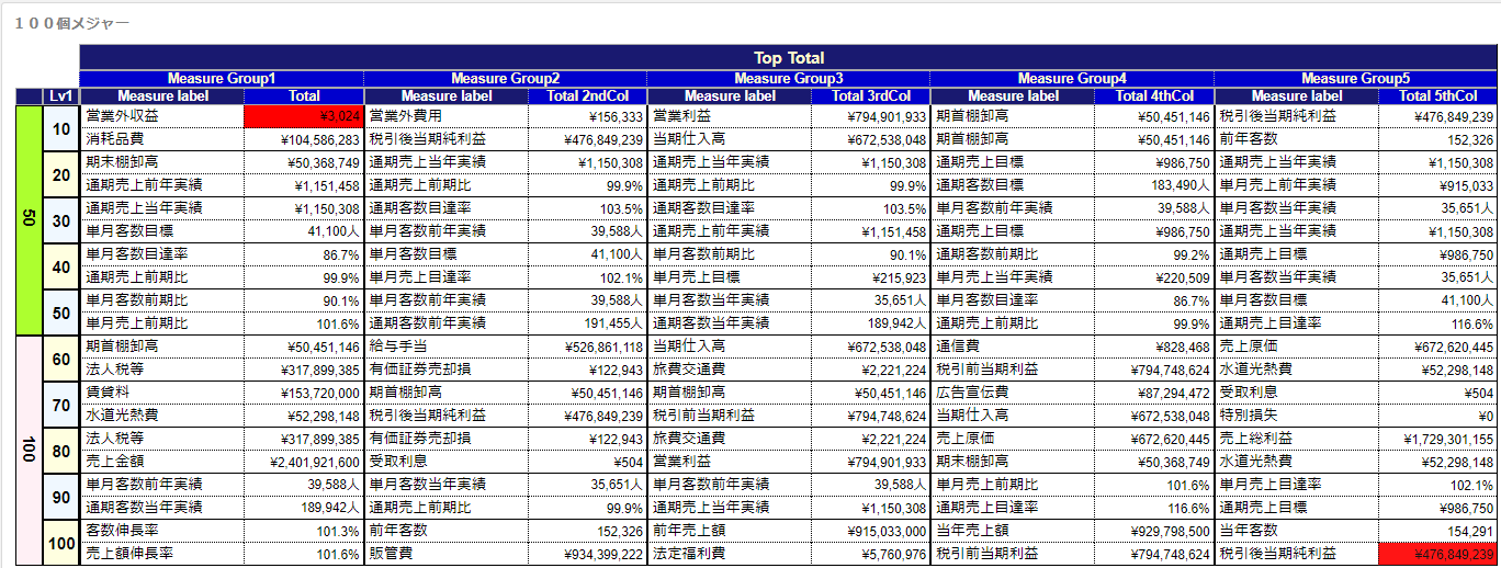
- December 29th, 2021 - I released four measure properties.
- December 26th, 2021 - I fixed a bug that a dimension's header doesn't appear when the number of factors of a dimension equals one.
(There were a great number of bugs before then, so I couldn't record them.)
etc.
I'll continue to revise this document when I have time.
Plan: Arranging dimensions vertically will be available. Although I've understood that dealing with a hypercube consisting of two dimensions is very very tough, I would try someday.
I'm going to write a description in Japanese.
Author
Katsuaki Maruno,
P.E.Jp (Information Engineering),
M.Sc.
Copyright
Copyright ©2021-2022 OTSUKA CORPORATION
License
The source code is licensed MIT. The website content is licensed CC BY 4.0,see LICENSE.