BoxPlot Chart
February 17, 2021 · View on GitHub
API information regarding each chart is not addressed in this document. Refer to the API Guide.
Creating the Chart
There are two different ways to create the BoxPlot chart. The BoxPlot chart can be created through the constructor function or the static function. The two methods both result in returning an instance of the chart. The HTML element in which the chart is drawn el, data data, and the options object options are taken as parameters. If the element in which the chart is drawn contains elements other than the chart itself, it may unintentionally affect the chart. Therefore, it is recommended that you use an empty HTML element.
import { BoxPlotChart } from '@toast-ui/chart';

const chart = new BoxPlotChart({el, data, options});

// or

import Chart from '@toast-ui/chart';

const chart = Chart.boxPlotChart({el, data, options});
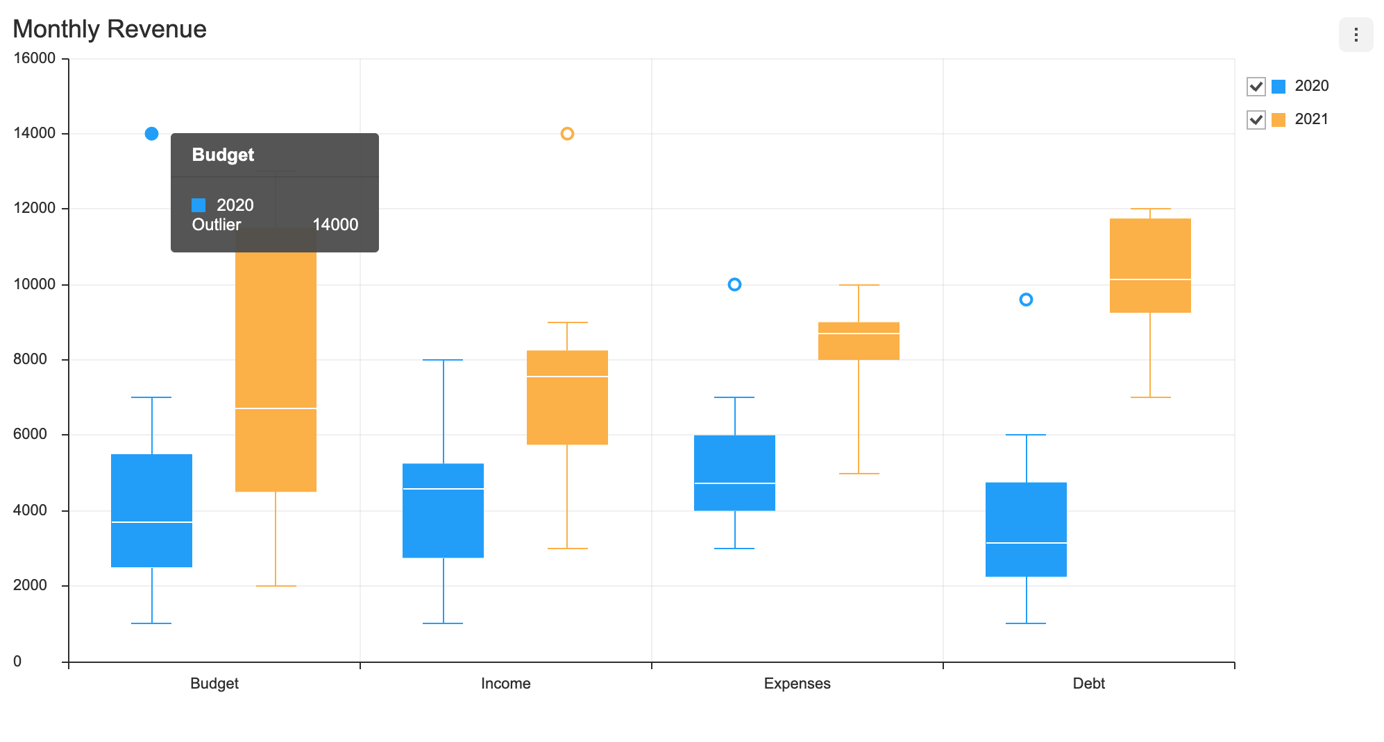
Basic Chart
Data Type
categories values are shown on the x-axis, and the series value must be completed with the name and the data. The outlier data can be used as necessary. The name is used to identify each series and its id must be unique.
const data = {
  categories: ['Budget', 'Income', 'Expenses', 'Debt'],
  series: [
    {
      name: '2020',
      data: [
        [1000, 2500, 3714, 5500, 7000],
        [1000, 2750, 4571, 5250, 8000],
        [3000, 4000, 4714, 6000, 7000],
        [1000, 2250, 3142, 4750, 6000]
      ],
      outliers: [
        [0, 14000],
        [2, 10000],
        [3, 9600]
      ],
    },
    {
      name: '2021',
      data: [
        [2000, 4500, 6714, 11500, 13000],
        [3000, 5750, 7571, 8250, 9000],
        [5000, 8000, 8714, 9000, 10000],
        [7000, 9250, 10142, 11750, 12000]
      ],
      outliers: [[1, 14000]]
    },
  ],
};
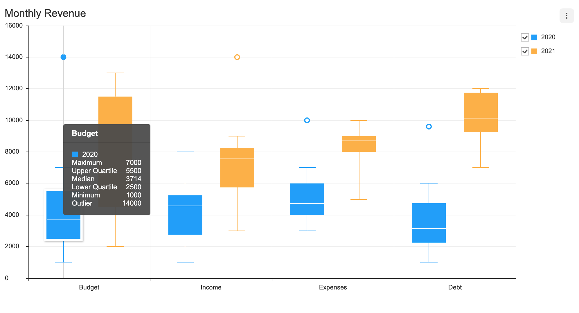
visible
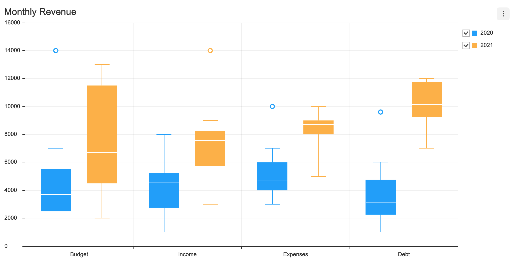
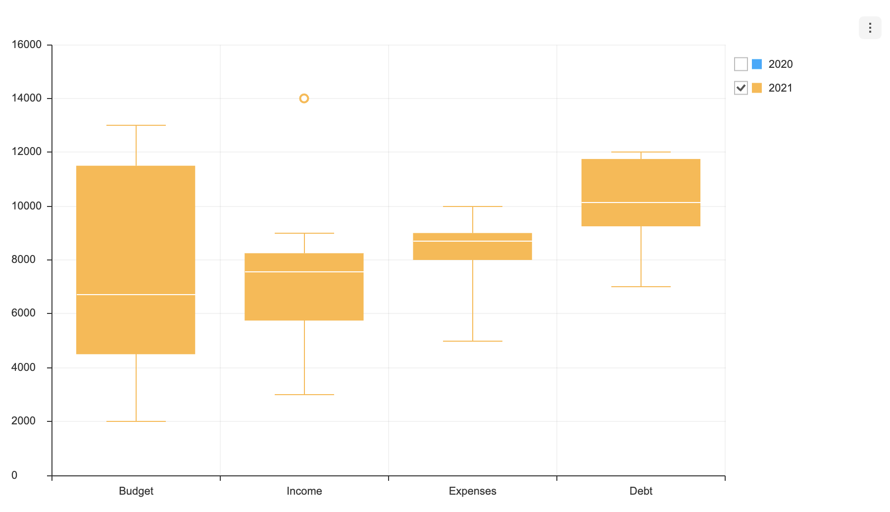
Each series can have visible option. The visible option determines whether the series is displayed when the chart is first drawn. The default is true.
const data = {
  categories: ['Budget', 'Income', 'Expenses', 'Debt'],
  series: [
    {
      name: '2020',
      data: [
        [1000, 2500, 3714, 5500, 7000],
        [1000, 2750, 4571, 5250, 8000],
        [3000, 4000, 4714, 6000, 7000],
        [1000, 2250, 3142, 4750, 6000]
      ],
      outliers: [
        [0, 14000],
        [2, 10000],
        [3, 9600]
      ],
      visible: false
    },
    {
      name: '2021',
      data: [
        [2000, 4500, 6714, 11500, 13000],
        [3000, 5750, 7571, 8250, 9000],
        [5000, 8000, 8714, 9000, 10000],
        [7000, 9250, 10142, 11750, 12000]
      ],
      outliers: [[1, 14000]]
    },
  ],
}
If you create a chart by applying the above option, you can see that the checkbox is unchecked.
Options
options should be used as an object.
type options = {
  chart?: {
    // ...
  },
  xAxis?: {
    // ...
  },
  yAxis?: {
    // ...
  },
  legend?: {
    // ...
  },
  exportMenu?: {
    // ...
  },
  tooltip?: {
    // ...
  },
  plot?: {
    // ...
  },
  responsive?: {
    // ...
  },
  theme?: {
    // More explanations in the `theme` chapter.
  },
  series?: {
    selectable?: boolean;
    eventDetectType?: 'point' | 'grouped';
  }
};
Common options that can be used with this chart are not addressed in this document. Refer to the respective options guide. (Links:
chartOptions, Axes Legend, Export, Tooltip, Plot,responsiveOptions )
selectable
Makes the series selectable.
- default:
false
const options = {
  series: {
    selectable: true
  }
};
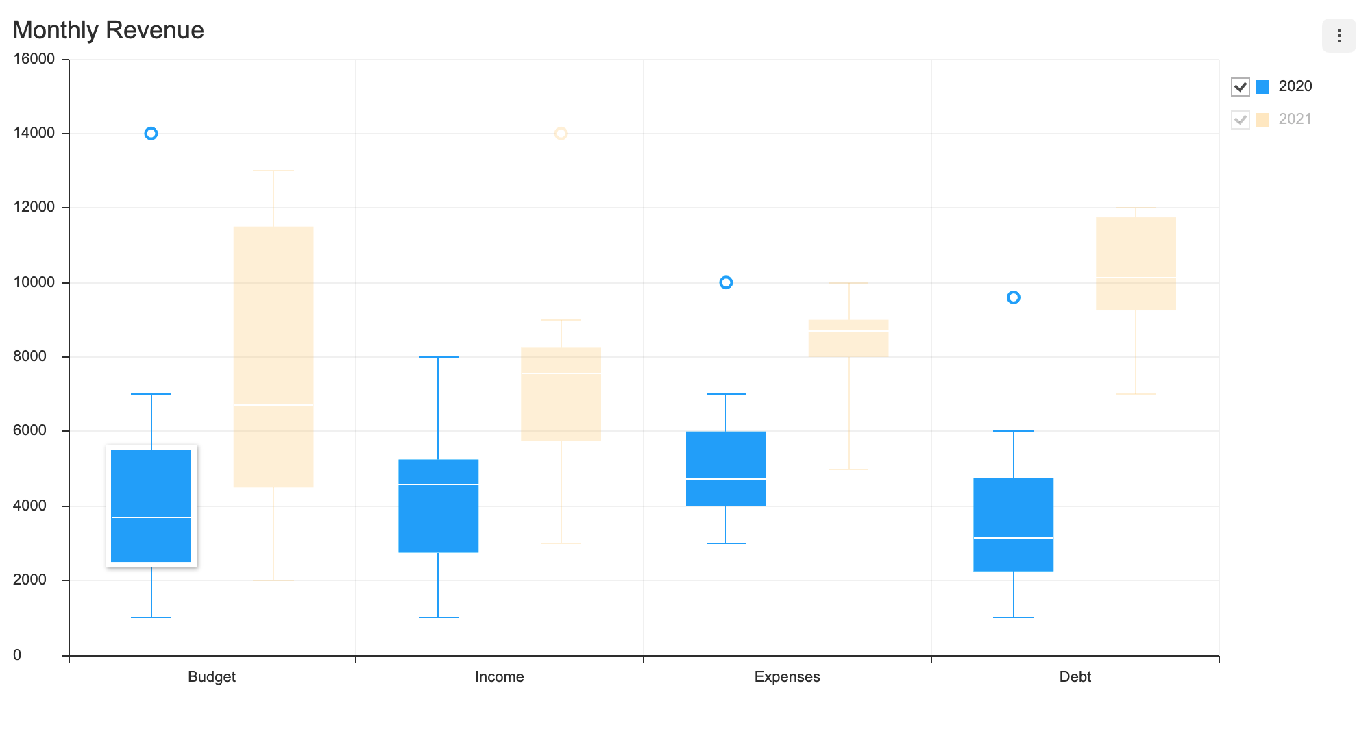
selectable option, accompanied by on API's selectSeries and unselectSeries, grants further control over the series.
eventDetectType
Defines ways to detect data when the cursor hovers over to display the tooltip and when the mouse is clicked to select a series.
| Type | Details |
|---|---|
point | A single series is detected when a mouse comes within the individual series' detectable area. Only a single series is selected with respect to the current position of the cursor. |
grouped | All data that are equal with respect to the x-axis are detected. |
- default:
point
If the eventDetectType is set to 'point', outliers are detected independently aside from the area that displays the median, first and fourth quartile, minimum/maximum values.
If the eventDetectType is set to 'grouped', the series' median, first and fourth quartile, minimum/maximum values, and outliers are all detected.
const options = {
  series: {
    eventDetectType: 'grouped'
  }
};
Series Theme
The following is a list of themes that can be modified in the BoxPlot chart.
interface BoxPlotChartSeriesTheme {
  areaOpacity?: number;
  colors?: string[];
  barWidth?: number | string;
  barWidthRatios?: {
    barRatio?: number;
    minMaxBarRatio?: number;
  };
  dot: {
    color?: string;
    radius?: number;
    borderColor?: string;
    borderWidth?: number;
    useSeriesColor?: boolean;
  };
  line?: {
    whisker?: { lineWidth?: number; color?: string };
    minimum?: { lineWidth?: number; color?: string };
    maximum?: { lineWidth?: number; color?: string };
    median?: { lineWidth?: number; color?: string };
  };
  rect?: {
    borderColor?: string;
    borderWidth?: number;
  };
  hover?: {
    color?: string;
    rect?: {
      borderColor?: string;
      borderWidth?: number;
    };
    dot?: {
      color?: string;
      radius?: number;
      borderColor?: string;
      borderWidth?: number;
      useSeriesColor?: boolean;
    };
    line?: {
      whisker?: { lineWidth?: number; color?: string };
      minimum?: { lineWidth?: number; color?: string };
      maximum?: { lineWidth?: number; color?: string };
      median?: { lineWidth?: number; color?: string };
    };
    shadowColor?: string;
    shadowOffsetX?: number;
    shadowOffsetY?: number;
    shadowBlur?: number;
  };
  select?: {
    color?: string;
    rect?: {
      borderColor?: string;
      borderWidth?: number;
    };
    dot?: {
      color?: string;
      radius?: number;
      borderColor?: string;
      borderWidth?: number;
      useSeriesColor?: boolean;
    };
    line?: {
      whisker?: { lineWidth?: number; color?: string };
      minimum?: { lineWidth?: number; color?: string };
      maximum?: { lineWidth?: number; color?: string };
      median?: { lineWidth?: number; color?: string };
    };
    shadowColor?: string;
    shadowOffsetX?: number;
    shadowOffsetY?: number;
    shadowBlur?: number;
    areaOpacity?: number;
    restSeries?: {
      areaOpacity?: number;
    };
  };
}
| Name | Type | Details |
|---|---|---|
colors | string[] | Series colors |
areaOpacity | number | Area opacity of the entire chart when all series have been activated |
barWidth | number | string | Series box width |
barWidthRatios | object | Length ratio between box width and min/max calues |
barWidthRatios.barRatio | number | Box width ratio (default: 1) |
barWidthRatios.minMaxBarRatio | number | Min/max length ratio (default: 0.5) |
dot | object | Styles used for dots to display outliers |
dot.color | string | Dot background color |
dot.radius | number | Dot radius |
dot.borderColor | string | Dot border color |
dot.borderWidth | number | Dot border width |
dot.useSeriesColor | boolean | Whether to use the series colors for the dots |
line | object | Styles for the line that connects the median, min/max values, and the whiskers (the line that connects the maximum value to the minimum value) |
line.whisker | object | Styles for the line that connects the maximum value to the minimum value |
line.whisker.lineWidth | number | Whisker line width |
line.whisker.color | string | Whisker line color |
line.minimum | object | Styles for the line that represents the minimum |
line.maximum | object | Styles for the line that represents the maximum |
line.median | object | Styles for the line that represents the median |
rect | object | Styles for the boxes that represent the first and fourth quartile |
rect.borderColor | string | Box border color |
rect.borderWidth | number | Box border width |
hover | object | Styles for when the cursor hovers over the data |
select | object | Styles for when series.selectable: true and a series is selected |
select.areaOpacity | number | Opacity of the selected series area |
select.restSeries | object | Styles for the series that have not been selected |
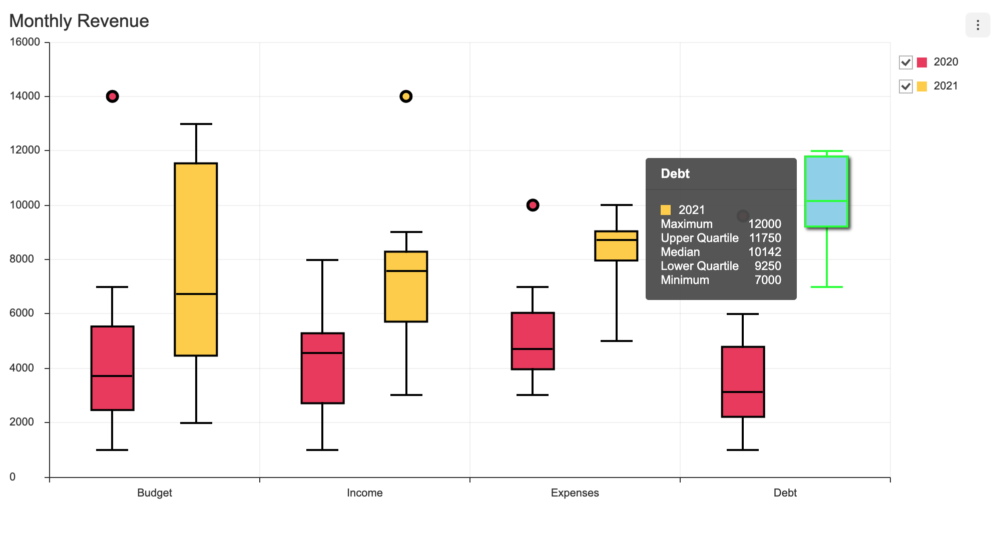
The theme is configured using the theme option, and the series theme is configured using the theme.series. The following example changes the color, width, and the on-hover style for a boxPlot series.
const options = {
  theme: {
    series: {
      colors: ['#EE4266', '#FFD23F'],
      barWidth: 40,
      barWidthRatios: {
        barRatio: 1,
        minMaxBarRatio: 0.8,
      },
      dot: {
        radius: 5,
        borderWidth: 3,
        borderColor: '#000000',
        useSeriesColor: true,
      },
      rect: {
        borderWidth: 2,
        borderColor: '#000000',
      },
      line: {
        whisker: {
          lineWidth: 2,
          color: '#000000',
        },
        maximum: {
          lineWidth: 2,
          color: '#000000',
        },
        minimum: {
          lineWidth: 2,
          color: '#000000',
        },
        median: {
          lineWidth: 2,
          color: '#000000',
        },
      },
      hover: {
        color: '#96D6ED',
        rect: { borderColor: '#00ff00', borderWidth: 2 },
        dot: { radius: 6 },
        shadowColor: 'rgba(0, 0, 0, 0.7)',
        shadowOffsetX: 4,
        shadowOffsetY: 4,
        shadowBlur: 6,
        line: {
          whisker: {
            lineWidth: 2,
            color: '#00ff00',
          },
          maximum: {
            lineWidth: 2,
            color: '#00ff00',
          },
          minimum: {
            lineWidth: 2,
            color: '#00ff00',
          },
          median: {
            lineWidth: 2,
            color: '#00ff00',
          },
        },
      }
    }
  }
};
The code above results as shown below.