Heatmap Chart
January 26, 2021 · View on GitHub
API information regarding each chart is not addressed in this document. Refer to the API Guide.
Creating the Chart
There are two different ways to create the Heatmap chart. The Heatmap chart can be created through the constructor function or the static function. The two methods both result in returning an instance of the chart. The HTML element in which the chart is drawn el, data data, and the options object options are taken as parameters. If the element in which the chart is drawn contains elements other than the chart itself, it may unintentionally affect the chart. Therefore, it is recommended that you use an empty HTML element.
import { HeatmapChart } from '@toast-ui/chart';

const chart = new HeatmapChart({el, data, options});

// or

import Chart from '@toast-ui/chart';

const chart = Chart.heatmapChart({el, data, options});
Basic Chart
Data Type
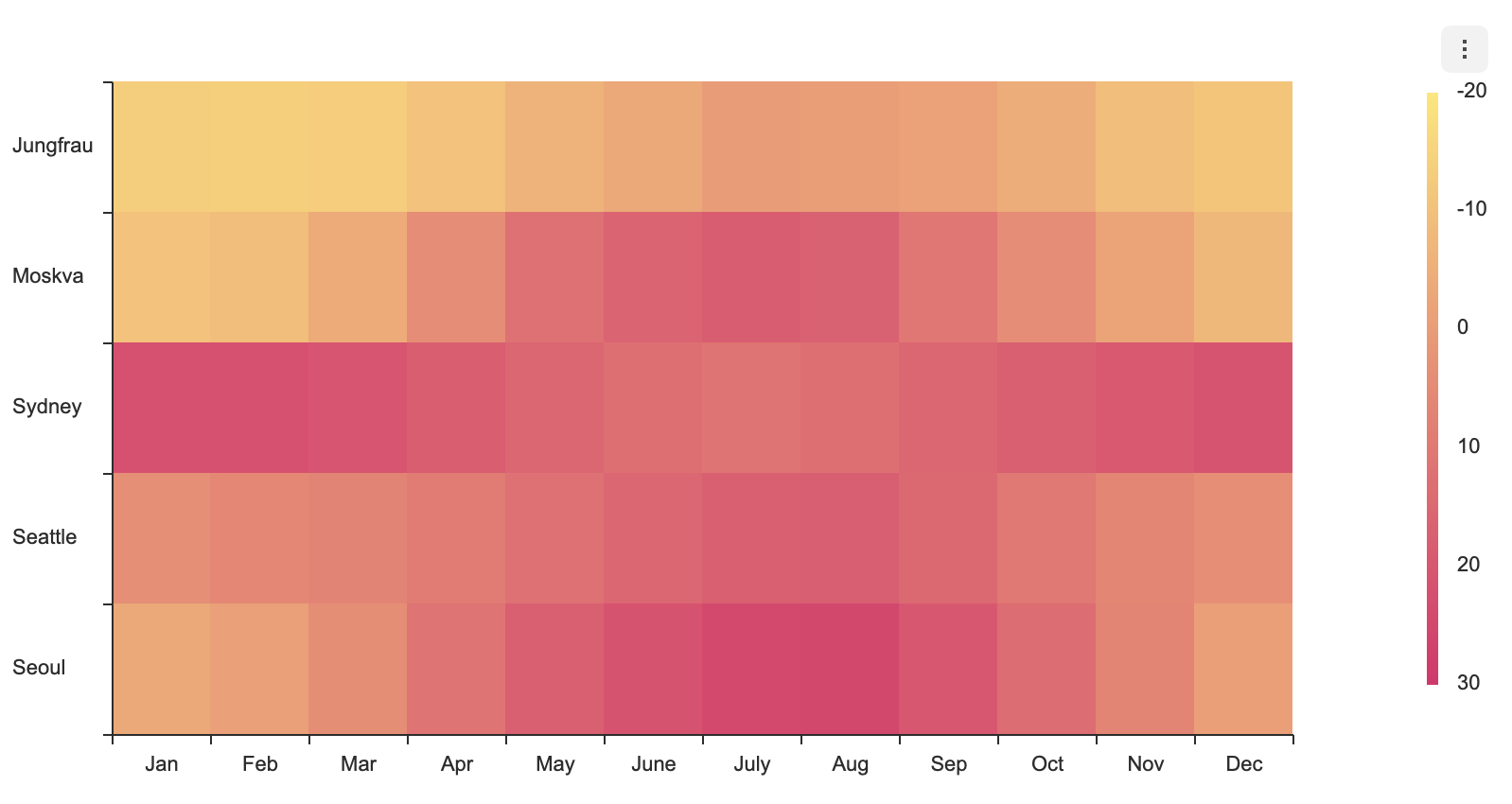
The data is entered as series and categories. The categories represent the labels for the x-axis and the y-axis, and the series represent the numeric array that corresponds to the x-axis and the y-axis.
const data = {
  categories: {
    x: ['Jan', 'Feb', 'Mar', 'Apr', 'May', 'June', 'July', 'Aug', 'Sep', 'Oct', 'Nov', 'Dec'],
    y: ['Seoul', 'Seattle', 'Sydney', 'Moskva', 'Jungfrau'],
  },
  series: [
    [-3.5, -1.1, 4.0, 11.3, 17.5, 21.5, 24.9, 25.2, 20.4, 13.9, 6.6, -0.6],
    [3.8, 5.6, 7.0, 9.1, 12.4, 15.3, 17.5, 17.8, 15.0, 10.6, 6.4, 3.7],
    [22.1, 22.0, 20.9, 18.3, 15.2, 12.8, 11.8, 13.0, 15.2, 17.6, 19.4, 21.2],
    [-10.3, -9.1, -4.1, 4.4, 12.2, 16.3, 18.5, 16.7, 10.9, 4.2, -2.0, -7.5],
    [-13.2, -13.7, -13.1, -10.3, -6.1, -3.2, 0.0, -0.1, -1.8, -4.5, -9.0, -10.9],
  ],
}
Options
options should be used as an object.
type options = {
  chart?: {
    //...
  }
  xAxis?: {
    //...
  }
  yAxis?: {
    //...
  }
  legend?: {
    //...
  }
  exportMenu?: {
    //...
  }
  tooltip?: {
    //...
  }
  responsive?: {
    //...
  }
  theme?: {
    // More explanations in the `theme` chapter.
  }
  series?: {
    selectable?: boolean;
    shift?: boolean;

    dataLabels?: {
      visible?: boolean;
      anchor?: DataLabelAnchor;
      offsetX?: number;
      offsetY?: number;
      formatter?: Formatter;
    }
  }
}
Common options that can be used with this chart are not addressed in this document. Refer to the respective options guide. (Links:
chartOptions, Axis, Legend, Export, Tooltip,responsiveOptions )
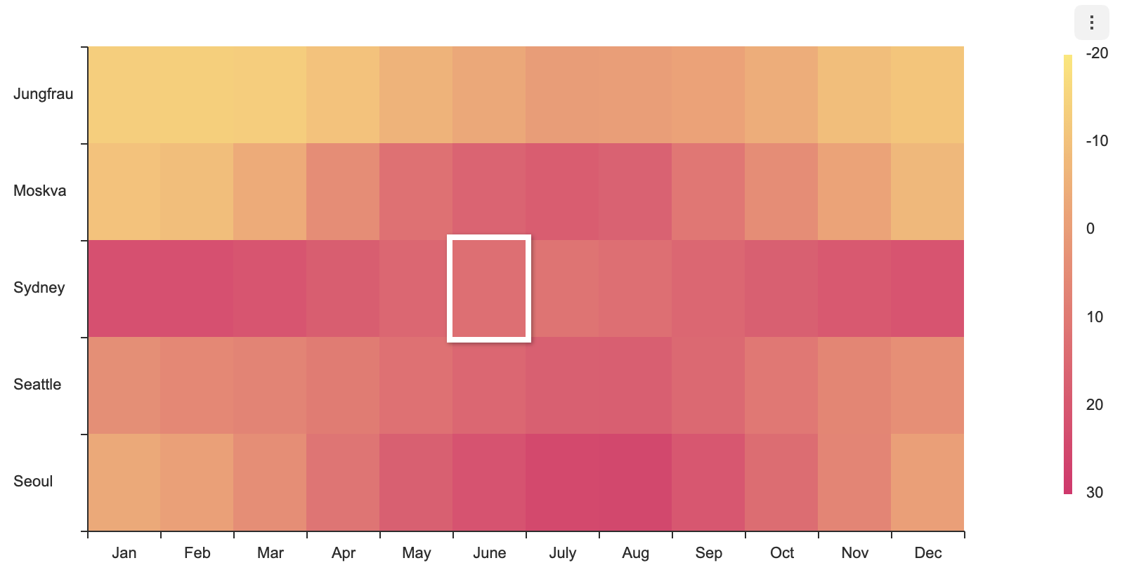
selectable
- default:
false
Makes the series selectable.
const options = {
  series: {
    selectable: true
  }
};
selectable option, accompanied by on API's selectSeries and unselectSeries, grants further control over the series.
dataLabels
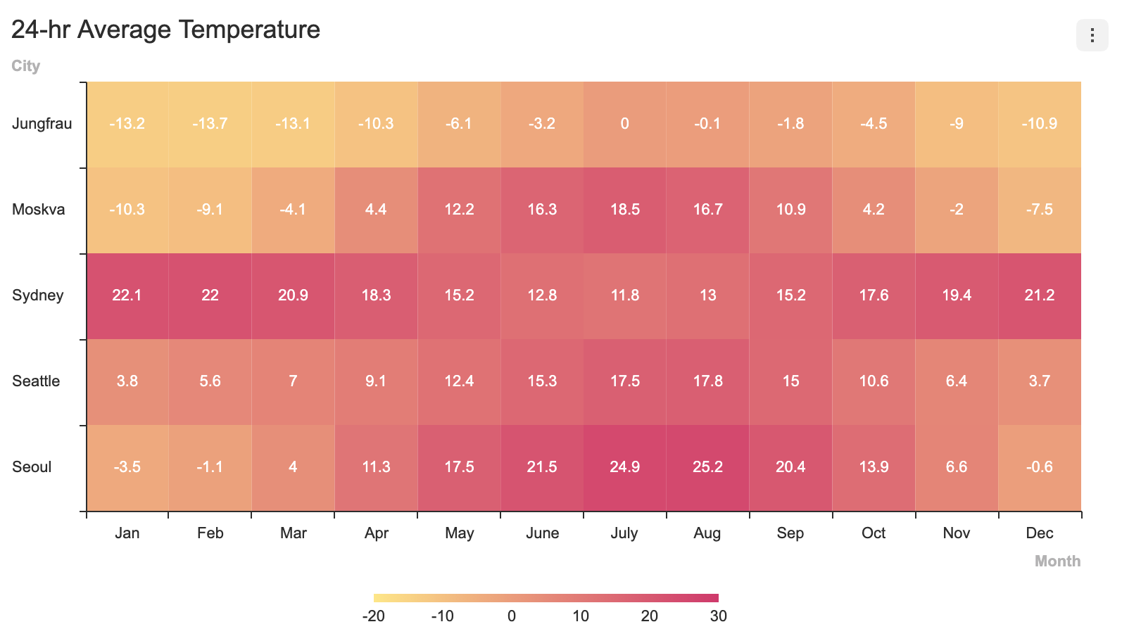
Data labels display information regarding the series on the chart.
The following are the options for dataLabels.
type options = {
  ...
  series?: {
    dataLabels?: {
      visible?: boolean;
      offsetX?: number;
      offsetY?: number;
      formatter?: (value) => string;
    }
  }
};
| Name | Type | Details |
|---|---|---|
visible | boolean | Whether to make the data label visible |
offsetX | number | X offset of the data label position |
offsetY | number | Y offset of the data label position |
formatter | function | Takes the value of the data as its parameter and defines the format to be displayed |
// basic
const options = {
  series: {
    dataLabels: { visible: true }
  }
};
Series Theme
The following is a list of themes that can be modified in the Heatmap chart.
interface HeatmapChartSeriesTheme {
  startColor: string;
  endColor: string;
  borderColor?: string;
  borderWidth?: number;
  select?: {
    color?: string;
    borderColor?: string;
    borderWidth?: number;
  };
  hover?: {
    color?: string;
    borderColor?: string;
    borderWidth?: number;
  };
  dataLabels?: {
    useSeriesColor?: boolean;
    fontSize?: number;
    fontFamily?: string;
    fontWeight?: string | number;
    color?: string;
    lineWidth?: number;
    textStrokeColor?: string;
    shadowColor?: string;
    shadowBlur?: number;
    textBubble?: {
      visible?: boolean;
      paddingX?: number;
      paddingY?: number;
      backgroundColor?: string;
      borderRadius?: number;
      borderColor?: string;
      borderWidth?: number;
      shadowColor?: string;
      shadowOffsetX?: number;
      shadowOffsetY?: number;
      shadowBlur?: number;
    }
  };
}
| Name | Type | Details |
|---|---|---|
startColor | string | The color of the starting value |
endColor | string | The color of the ending value |
borderColor | string | The color of the series border |
borderWidth | number | The width of the series border |
select | object | The style that is applied to the line when the series is selected and the series.selectable is set to true. |
| hover | object | The style that is applied when the user hovers over the data |
dataLabels | object | Style for the data labels |
dataLabels.useSeriesColor | boolean | Whether to use the series colors for the data label texts |
dataLabels.lineWidth | number | Text stroke width |
dataLabels.textStrokeColor | string | Text stroke color |
dataLabels.shadowColor | string | Text shadow color |
dataLabels.shadowBlur | number | Text shadow blue |
dataLabels.fontSize | number | Font size |
dataLabels.fontFamily | string | Font name |
dataLabels.fontWeight | string | Font weight |
dataLabels.color | string | Text color; does not work when useSeriesColor: true |
dataLabels.textBubble | object | Text bubble configurations |
dataLabels.textBubble.visible | boolean | Whether to use the text bubble |
dataLabels.textBubble.paddingX | number | Horizontal padding |
dataLabels.textBubble.paddingY | number | Vertical padding |
dataLabels.textBubble.backgroundColor | string | Text bubble background color |
dataLabels.textBubble.borderRadius | number | Text bubble border radius |
dataLabels.textBubble.borderColor | string | Text bubble border color |
dataLabels.textBubble.borderWidth | number | Text bubble border width |
dataLabels.textBubble.shadowColor | string | Text bubble shadow color |
dataLabels.textBubble.shadowOffsetX | number | Text bubble shadow x offset |
dataLabels.textBubble.shadowOffsetY | number | Text bubble shadow y offset |
dataLabels.textBubble.shadowBlur | number | Text bubble shadow blur |
startColor and endColor
These values set the standard. The colors used for the data is data are decided with respect to the startColor and endColor values.
For a simple example, let's set the startColor to be #4A76B2,

and the endColor to be #221271. The higher colorValue will lead to a value that is closer to the endColor.

const options = {
  theme: {
    series: {
      startColor: '#4A76B2',
      endColor: '#221271'
    }
  }
}
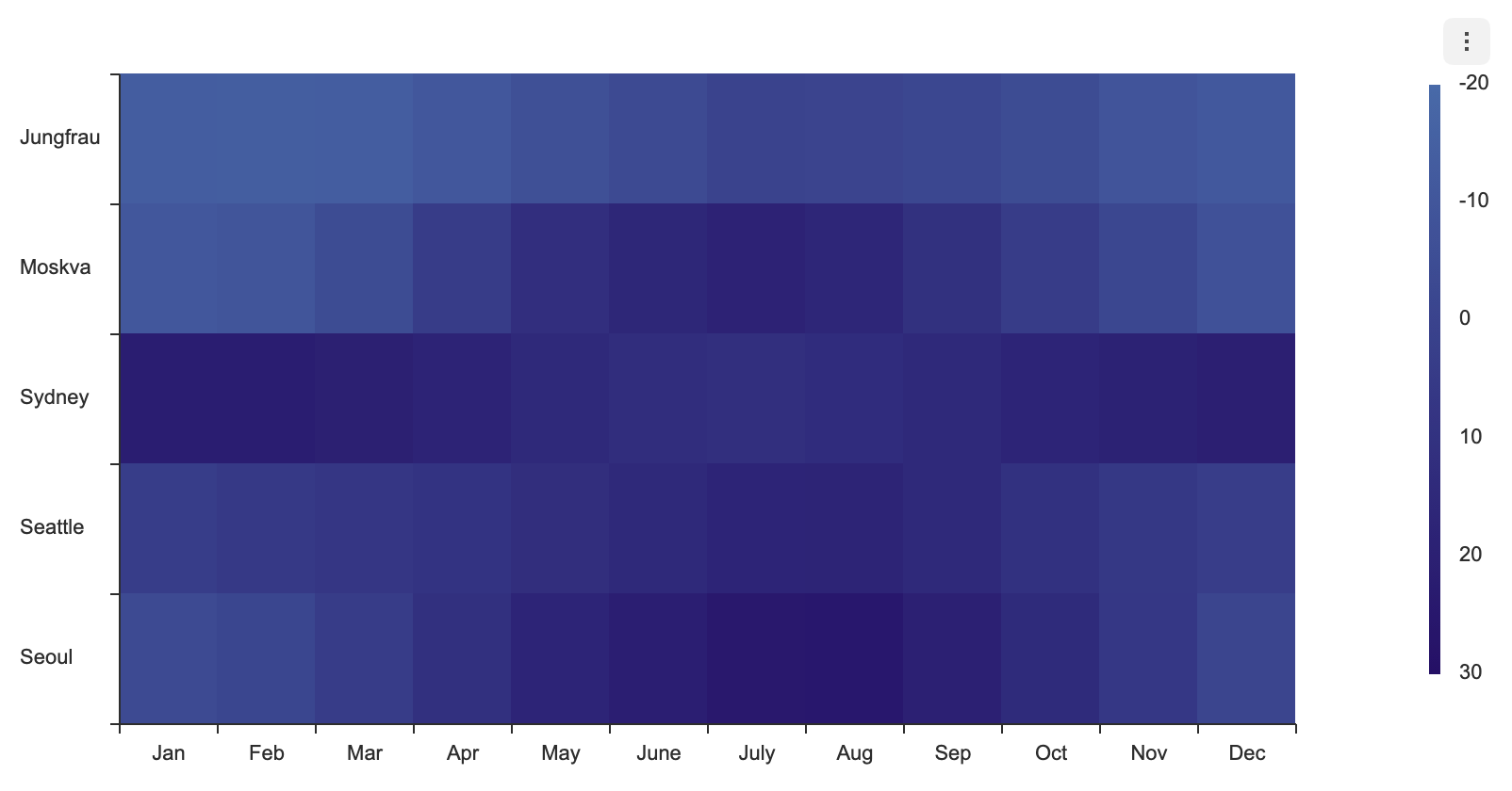
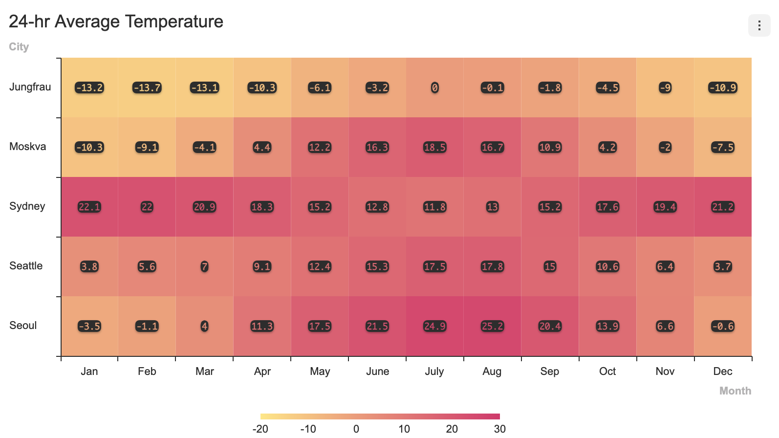
The code below applies a theme to the data label to use text bubbles and to change the text styles.
const options = {
  series: {
    dataLabels: { visible: true }
  },
  theme: {
    series: {
      dataLabels: {
        fontFamily: 'monaco',
        fontSize: 9,
        fontWeight: '600',
        useSeriesColor: true,
        textBubble: {
          visible: true,
          backgroundColor: '#333333',
          paddingX: 1,
          paddingY: 1,
          borderRadius: 5
        }
      }
    }
  }
};