Axes
February 16, 2021 · View on GitHub
축은 보조 눈금과 값의 개요를 나타내 차트 데이터의 이해를 돕는 구성요소다.

TOAST UI Chart의 사용 가능한 축의 종류는 X축, Y축, 보조 Y축이며 차트에 따라 사용 가능한 축의 종류가 다르다.
| 타입 | 차트명 |
|---|---|
| X축, Y축, 보조 Y축 사용 가능 | Area, Bar, ColumnLine, LineArea, Line, LineScatter |
| X축, Y축 사용 가능 | BoxPlot, Bubble, Bullet, Column, Heatmap, Scatter |
| 축이 없는 차트 | Radar, Treemap, Pie, NestedPie |
이 가이드에서는 모든 축을 사용 가능한 차트라는 가정하에 작성되었다.
옵션
축의 변경 가능한 옵션은 다음과 같다.
interface AxisOptions {
  tick?: {
    interval?: number;
  };
  label?: {
    interval?: number;
    formatter?: (
      value: string,
      axisLabelInfo: {
        axisName: 'xAxis' | 'yAxis' | 'secondaryYAxis';
        labels: string[];
        index: number;
      }
    ) => string;
    margin?: number;
  };
  scale?: {
    min?: number;
    max?: number;
    stepSize?: 'auto' | number;
  };
  title?:
    | string
    | {
        text: string;
        offsetX?: number;
        offsetY?: number;
      };
  width?: number;
  height?: number;
}

interface xAxisOptions extends AxisOptions {
  pointOnColumn?: boolean; // Only available on Line, Area Chart
  date?:
    | boolean
    | {
        format: string;
      };
  label?: {
    interval?: number;
    rotatable?: boolean;
    formatter?: (
      value: string,
      axisLabelInfo: {
        axisName: 'xAxis' | 'yAxis' | 'secondaryYAxis';
        labels: string[];
        index: number;
      }
    ) => string;
    margin?: number;
  };
}
tick, label
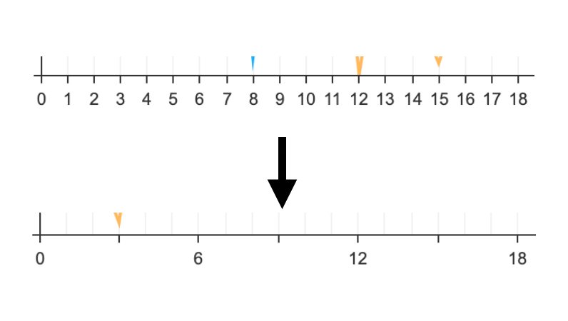
tick과 label을 통해 그려지는 눈금과 눈금에 대한 정보를 나타내는 라벨의 간격을 조절할 수 있다. 각각 interval 값을 옵션으로 가질 수 있으며 이 숫자값을 기준으로 간격이 조절된다.
const options = {
  xAxis: {
    tick: {
      interval: 3,
    },
    label: {
      interval: 6,
    },
  },
};
다음과 같이 예제를 작성할 경우 다음과 같이 나타나던 축을 다음과 같이 좀 더 단순화 할 수 있다.
rotatable
x축 라벨이 겹쳐질 경우 자동으로 라벨을 회전하는 옵션이다. label.rotatable옵션을 false로 설정하면 라벨이 자동으로 회전하지 않는다.
- 기본값:
true
scale
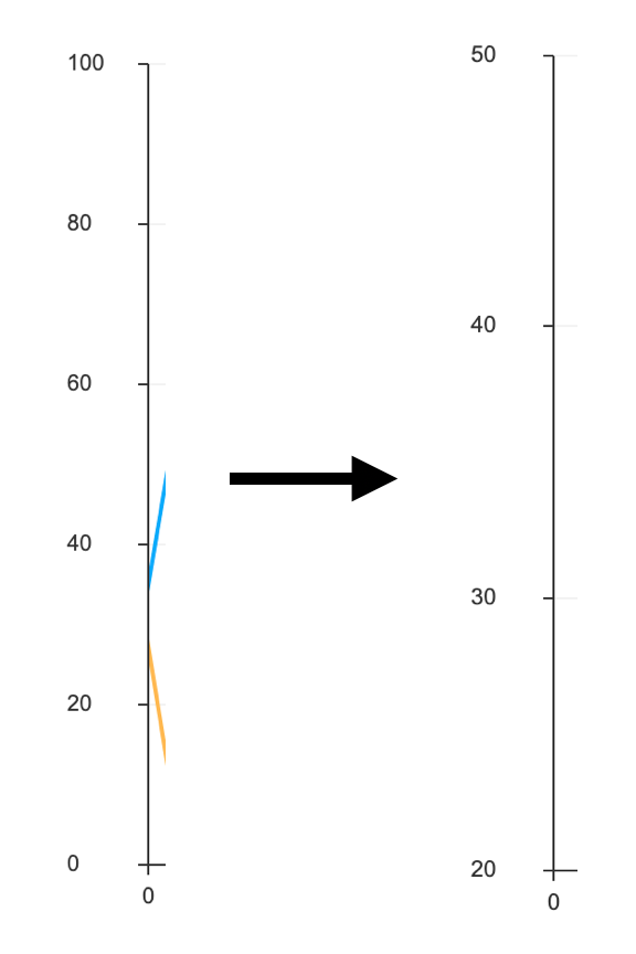
scale 옵션을 통해 축에 나타나는 값의 최대, 최소 값을 지정할 수 있으며 tick과 label이 그려지는 간격의 크기를 정할 수 있다. 각각 scale.min, scale.max, scale.stepSize로 조절할 수 있으며 사용자가 지정하지 않을 경우 차트 내부에서 자동으로 처리한다.
const options = {
  yAxis: {
    scale: {
      min: 20,
      max: 50,
      stepSize: 10,
    },
  },
};
title
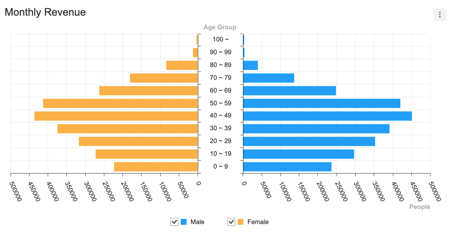
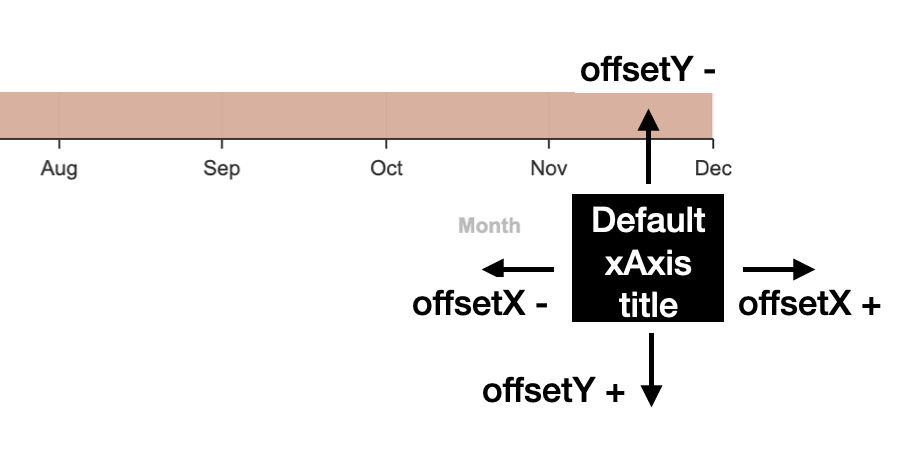
그림에서 파악할 수 있듯이 각 차트는 제목을 갖는다. title 옵션은 문자열로 직접 입력받을 수 있으며 title.text 옵션과 title.offsetX, title.offsetY 옵션을 통해 제목을 지정하며 위치를 변경해 줄 수 있다.
const options = {
  xAxis: {
    title: {
      text: 'new title',
      offsetX: 100,
      offsetY: 100,
    },
  },
};
date
x축의 경우 나타나는 category 값이 Date 객체 또는 날짜를 나타내는 문자열이 될 수 있다. 해당 데이터를 내부에서 처리해주기 위해 날짜 데이터를 사용하는 경우 xAxis.date 객체를 true로 지정하거나 xAxis.date.format을 지정해야 한다.
| 타입 | 사용 가능한 포맷 |
|---|---|
| year | YYYY, YY, yy, yyyy |
| month | MMMM, MMM, MM, M |
| date | D, d, DD, dd |
| hour | hh, HH, h, H |
| minute | m, mm |
| seconds | s, ss |
| meridiem | A, a |
해당 포맷 옵션을 이용하는 간단한 예제를 만들어보자.
const data = {
  categories: [
    '01/01/2020',
    '02/01/2020',
    '03/01/2020',
    '04/01/2020',
    '05/01/2020',
    '06/01/2020',
    '07/01/2020',
    '08/01/2020',
    '09/01/2020',
    '10/01/2020',
    '11/01/2020',
    '12/01/2020',
  ],
  series: [ ... ]
}

const options = {
  xAxis: {
    date: {
      format: 'YY-MM-DD'
    }
  }
}
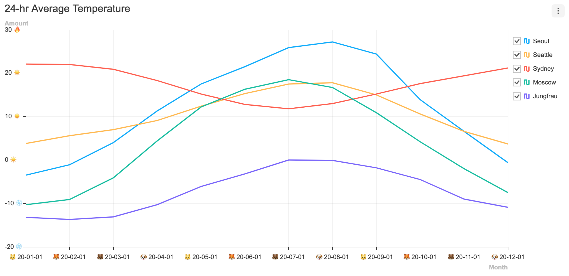
Date 타입의 카테고리가 포맷팅되어 나타나는 것을 확인할 수 있다.

formatter
axis.label.formatter 옵션을 통해 값을 포맷팅 한 뒤 출력할 수 있다. formatter 함수는 데이터 값과 데이터에 대한 정보를 인자로 가지며 포맷팅 된 문자열을 반환하는 함수다.
간단한 예시로 입력되는 값을 비교해 축에 이모지를 추가하는 예제를 만들어 봤다.
const options = {
  xAxis: {
    label: {
      formatter: (value) => {
        const index = Number(value.split('-')[1]);
        const animals = ['🐶', '🐱', '🦊', '🐻'];

        return `${animals[index % animals.length]} ${value}`;
      },
    },
    date: {
      format: 'YY-MM-DD',
    },
  },
  yAxis: {
    label: {
      formatter: (value) => {
        if (value < 0) {
          return `${value} ❄️`;
        }
        if (value > 25) {
          return `${value} 🔥`;
        }

        return `️${value} ☀️`;
      },
    },
  },
};
pointOnColumn
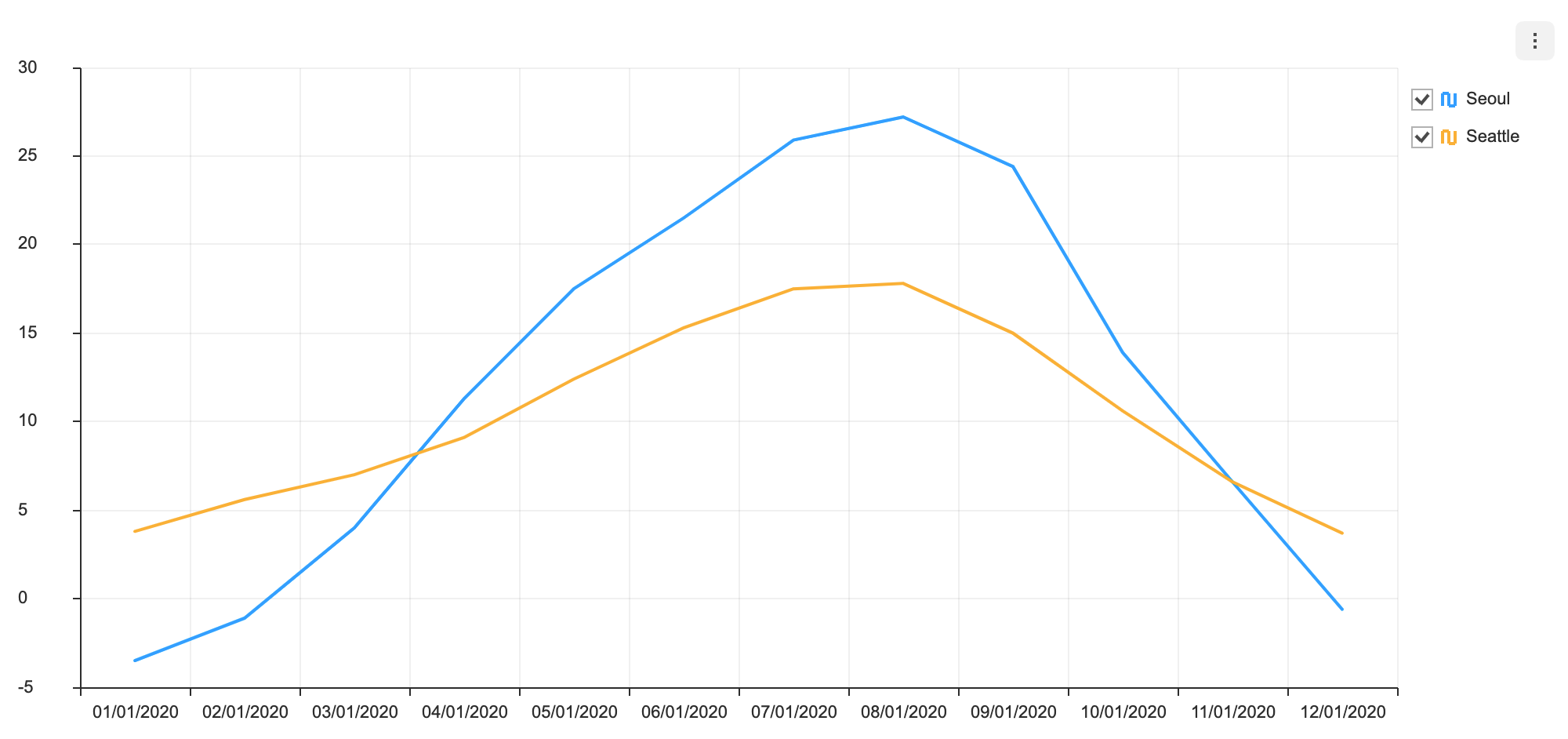
x축을 기준으로 시리즈의 시작 부분을 틱과 틱 가운데로 이동시킬 수 있다. 해당 옵션은 Line 차트와 Area 차트에서만 사용 가능하다.
- 기본값:
false
const options = {
  xAxis: {
    pointOnColumn: true,
  },
};
pointOnColumn: true가 적용된 Line 차트
pointOnColumn: true가 적용된 Area 차트

margin
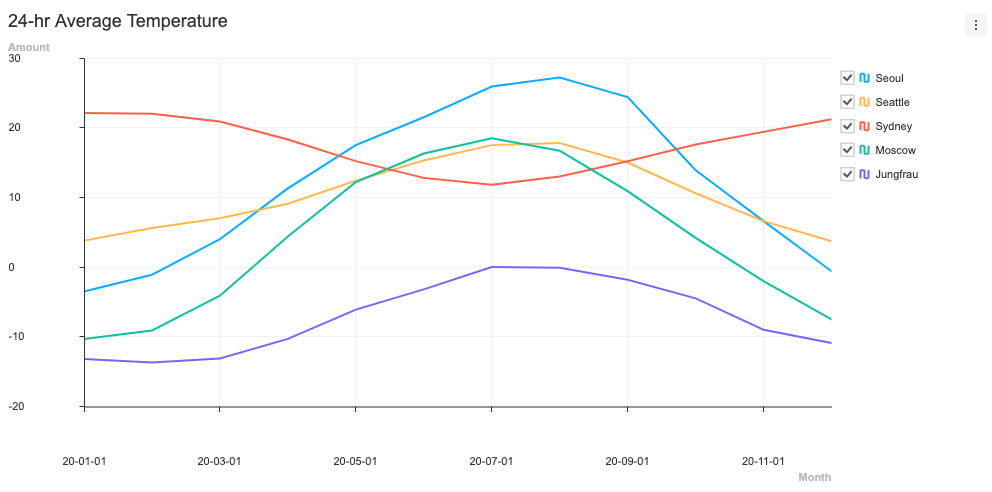
axis.label.margin은 라벨과 축 사이의 여유 공간을 추가할 때 사용하는 옵션이다. 숫자값을 통해 조절할 수 있으며 y축의 경우 양수만 가능하다.
- 기본값:
0
라벨 margin을 변경하는 간단한 예시를 만들어보자.
const options = {
  xAxis: {
    margin: 40
  },
  yAxis: {
    margin: 50
  }
};
theme
Axis를 스타일링 할 수 있는 테마 옵션은 다음과 같다.
interface AxisTheme {
  width?: number;
  color?: string;
  title?: {
    fontSize?: number;
    fontFamily?: string;
    fontWeight?: string | number;
    color?: string;
  };
  label?: {
    fontSize?: number;
    fontFamily?: string;
    fontWeight?: string | number;
    color?: string;
  };
}
| 이름 | 타입 | 설명 |
|---|---|---|
| width | number | 축 라인 두께 |
| color | string | 축 색상 |
| title | object | 축 제목 테마 옵션 |
| label | object | 축 라벨 테마 옵션 |
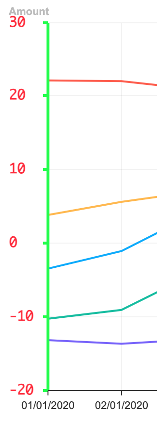
테마는 options의 theme값으로 추가 해준다. Y축의 라벨과 선 두께, 색상을 바꾸는 간단한 예시를 작성해보자.
const options = {
  theme: {
    yAxis: {
      label: {
        color: '#ff2233',
        fontWeight: 600,
        fontFamily: 'monaco',
        fontSize: 14,
      },
      width: 3,
      color: '#00ff32',
    },
  },
};
적용된 스타일은 다음과 같다.
Secondary Y Axis
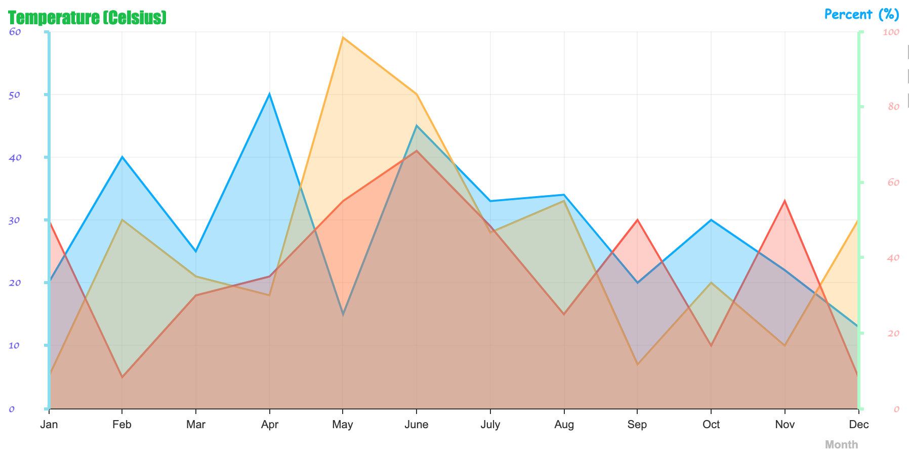
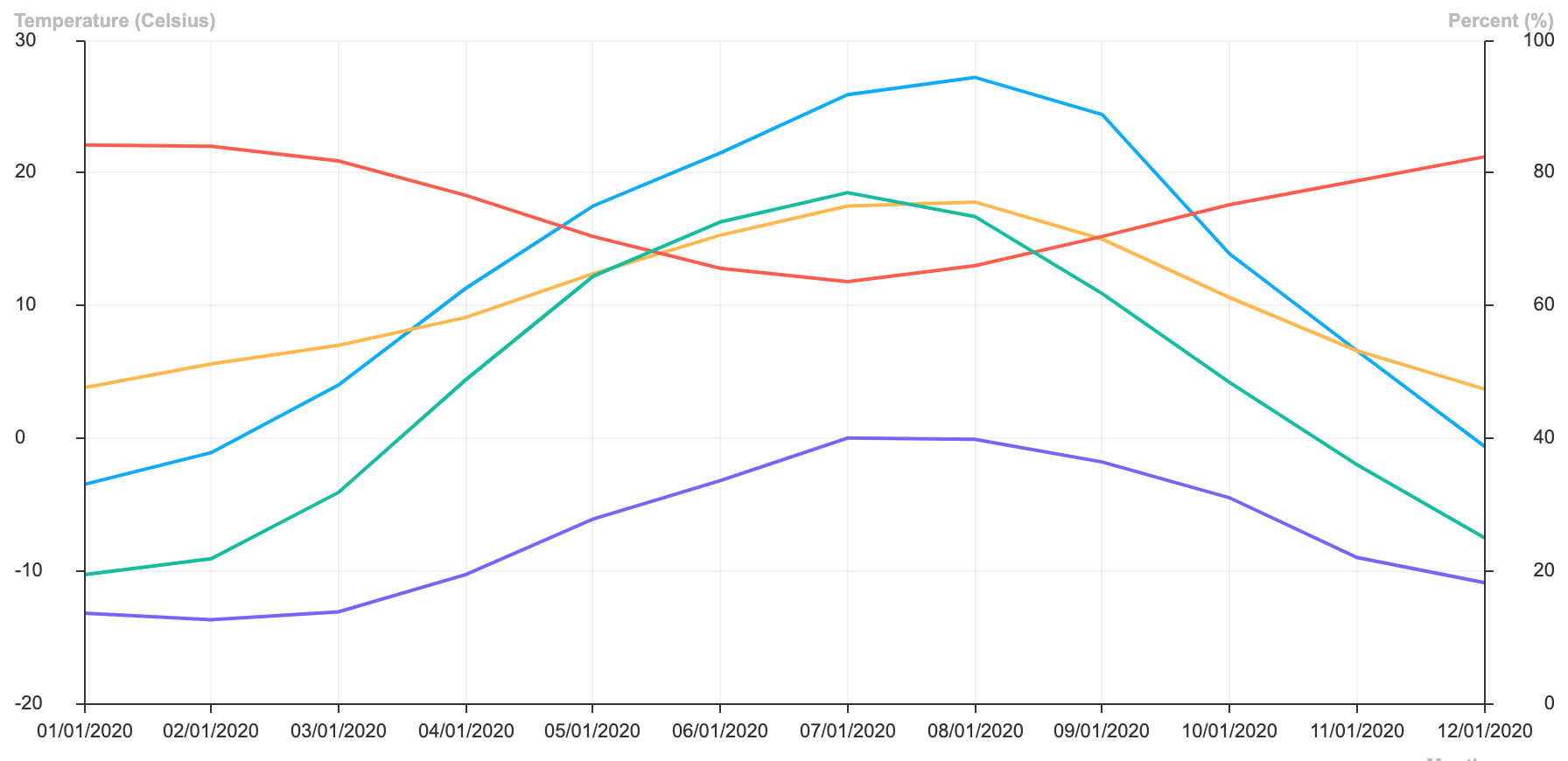
Area, Bar, ColumnLine, LineArea, Line, LineScatter 차트는 보조 축을 사용할 수 있다. 기존에 작성하던 객체 형태의 yAxis 옵션을 배열로 입력하면 첫번째 옵션이 주축에 대한 옵션, 두번째 옵션이 부축에 대한 옵션으로 동작한다.
const options = {
  yAxis: [
    {
      title: 'Temperature (Celsius)',
    },
    {
      title: 'Percent (%)',
      scale: {
        min: 0,
        max: 100,
      },
    },
  ],
};
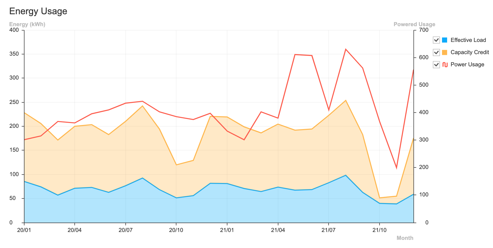
ColumnLine, LineArea, LineScatter 차트의 경우 chartType을 명시해주면 차트 타입에 맞춰 각 축에 값을 나타낼 수 있으며 각각의 scale 또한 지정할 수 있다.
const options = {
  yAxis: [
    {
      title: 'Energy (kWh)',
      chartType: 'line'
    },
    {
      title: 'Powered Usage',
      chartType: 'area',
      scale: {
        min: 0,
        max: 700
      },
    },
  ],
};
테마 또한 동일하게 yAxis의 테마 옵션을 배열로 입력하면 첫번째 테마가 주축, 두 번째 테마가 부축에 적용된다.
const options = {
  theme: {
    yAxis: [
      {
        title: {
          fontFamily: 'Impact',
          fontSize: 17,
          fontWeight: 400,
          color: '#03C03C',
        },
        label: {
          fontFamily: 'cursive',
          fontSize: 11,
          fontWeight: 700,
          color: '#6655EE',
        },
        width: 3,
        color: '#88ddEE',
      },
      {
        title: {
          fontFamily: 'Comic Sans MS',
          fontSize: 13,
          fontWeight: 600,
          color: '#00a9ff',
        },
        label: {
          fontFamily: 'cursive',
          fontSize: 11,
          fontWeight: 700,
          color: '#FFABAB',
        },
        width: 3,
        color: '#AFFCCA',
      },
    ],
  },
};