React UI Components
April 20, 2026 · View on GitHub
@rcaferati/react-awesome-button provides three related React button components:
AwesomeButton- animated base buttonAwesomeButtonProgress- progress flow wrapper on top ofAwesomeButtonAwesomeButtonSocial- social/share wrapper on top ofAwesomeButton
This README is updated for the current 8.2.0 release outputs, including base CSS, bundled theme CSS files, theme mapping modules, animated size transitions, and auto-width text choreography.
Preview
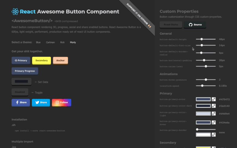
Installation
npm install @rcaferati/react-awesome-button
Quick Start
Import the base stylesheet once, then render a button. This is the plain CSS path for buttons that do not pass a cssModule theme mapping.
import React from 'react';
import { AwesomeButton } from '@rcaferati/react-awesome-button';
import '@rcaferati/react-awesome-button/styles.css';

export default function Example() {
  return (
    <AwesomeButton type="primary" size="medium">
      Button
    </AwesomeButton>
  );
}
Styling With Theme CSS Modules
The React package uses two theme imports together:
- the theme CSS file, which contains the actual rules
- the theme mapping object, which is passed as
cssModule
Blue theme example
import React from 'react';
import { AwesomeButton } from '@rcaferati/react-awesome-button';
import '@rcaferati/react-awesome-button/themes/theme-blue.css';
import themeBlue from '@rcaferati/react-awesome-button/themes/theme-blue';

export default function Example() {
  return (
    <AwesomeButton cssModule={themeBlue} type="primary" size="medium">
      Button
    </AwesomeButton>
  );
}
Plain and themed buttons in the same app
If you mix plain buttons and themed buttons, import both:
import '@rcaferati/react-awesome-button/styles.css';
import '@rcaferati/react-awesome-button/themes/theme-blue.css';
Bundled themes
theme-ambertheme-bluetheme-bojacktheme-brucetheme-c137theme-erictheme-flattheme-indigotheme-redtheme-rickiest
AwesomeButton
Basic button behavior
If href is not provided, AwesomeButton renders button-like behavior and calls onPress on successful activation.
import React from 'react';
import { AwesomeButton } from '@rcaferati/react-awesome-button';
import '@rcaferati/react-awesome-button/themes/theme-blue.css';
import themeBlue from '@rcaferati/react-awesome-button/themes/theme-blue';

export default function Example() {
  return (
    <AwesomeButton
      cssModule={themeBlue}
      type="primary"
      size="medium"
      onPress={() => {
        // do something
      }}>
      Save changes
    </AwesomeButton>
  );
}
Anchor mode (href provided)
If href is provided, the component renders anchor-like behavior and lets native navigation happen. Use containerProps for forwarded root element props such as target, rel, and aria-*.
import React from 'react';
import { AwesomeButton } from '@rcaferati/react-awesome-button';
import '@rcaferati/react-awesome-button/themes/theme-blue.css';
import themeBlue from '@rcaferati/react-awesome-button/themes/theme-blue';

export default function Example() {
  return (
    <AwesomeButton
      cssModule={themeBlue}
      type="link"
      href="https://github.com/rcaferati"
      containerProps={{ target: '_blank', rel: 'noreferrer noopener' }}>
      Open website
    </AwesomeButton>
  );
}
Icons
Use before and after to render icons. For icon-only buttons, pass the icon with before and omit children.
import React from 'react';
import { AwesomeButton } from '@rcaferati/react-awesome-button';
import '@rcaferati/react-awesome-button/themes/theme-blue.css';
import themeBlue from '@rcaferati/react-awesome-button/themes/theme-blue';

function StarIcon() {
  return (
    <svg aria-hidden="true" viewBox="0 0 24 24" width="16" height="16">
      <path d="M12 3l1.9 4.8L19 9.2l-4 3.4 1.3 5.2L12 15l-4.3 2.8L9 12.6 5 9.2l5.1-1.4L12 3z" />
    </svg>
  );
}

function ArrowRightIcon() {
  return (
    <svg aria-hidden="true" viewBox="0 0 24 24" width="16" height="16">
      <path d="M5 12h14" />
      <path d="m13 5 7 7-7 7" />
    </svg>
  );
}

function PlayIcon() {
  return (
    <svg aria-hidden="true" viewBox="0 0 24 24" width="16" height="16">
      <path d="M8 5v14l11-7z" />
    </svg>
  );
}

export default function Example() {
  return (
    <div style={{ display: 'grid', gap: 12 }}>
      <AwesomeButton
        cssModule={themeBlue}
        type="primary"
        size="medium"
        before={<StarIcon />}
        after={<ArrowRightIcon />}>
        Continue
      </AwesomeButton>

      <AwesomeButton
        cssModule={themeBlue}
        type="primary"
        size="medium"
        before={<PlayIcon />}
        containerProps={{ 'aria-label': 'Play' }}
      />
    </div>
  );
}
Sizes and auto width
size="small" | "medium" | "large"uses fixed button dimensionssize={null}uses content-driven auto width- fixed-size changes animate by default
- measured auto-width changes animate by default
animateSize={false}opts out of both fixed-size and measured auto-width animation- fixed-to-auto and auto-to-fixed transitions are intentionally instant in this release
Size animation timing is 125ms cubic-bezier(0.3, 0.05, 0.2, 1).
import React from 'react';
import { AwesomeButton } from '@rcaferati/react-awesome-button';
import '@rcaferati/react-awesome-button/styles.css';

export default function Example() {
  return (
    <div style={{ display: 'grid', gap: 12 }}>
      <AwesomeButton type="primary" size="small">
        Small
      </AwesomeButton>
      <AwesomeButton type="primary" size="medium">
        Medium
      </AwesomeButton>
      <AwesomeButton type="primary" size="large">
        Large
      </AwesomeButton>
      <AwesomeButton type="primary" size={null}>
        Auto width grows with content
      </AwesomeButton>
      <AwesomeButton type="primary" size="large" animateSize={false}>
        Instant fixed-size change
      </AwesomeButton>
    </div>
  );
}
Text transition (string labels only)
Use textTransition when the button label is a plain string and you want label changes to animate.
When combined with size={null}, the current React behavior is:
- larger labels grow width first, then animate the text
- smaller labels animate the text first, then shrink the width
For the parity flow documented in the current stories, drive the label change from an external rerender rather than mutating the same button label from its own onPress.
import React from 'react';
import { AwesomeButton } from '@rcaferati/react-awesome-button';
import '@rcaferati/react-awesome-button/styles.css';

export default function Example() {
  const [expanded, setExpanded] = React.useState(false);
  const label = expanded ? 'Open analytics dashboard' : 'Open';

  return (
    <div style={{ display: 'grid', gap: 12 }}>
      <AwesomeButton type="primary" size={null} textTransition>
        {label}
      </AwesomeButton>

      <button type="button" onClick={() => setExpanded((value) => !value)}>
        Toggle label length
      </button>
    </div>
  );
}
AwesomeButton Props
| Prop | Type | Default | Description |
|---|---|---|---|
type | string | "primary" | Visual variant key, such as primary, secondary, danger, link, or a social visual variant |
size | "small" | "medium" | "large" | null | null | Size key or null for auto width |
active | boolean | false | Controlled pressed/active visual state |
disabled | boolean | false | Disables interactions |
visible | boolean | true | Toggles visible state class |
placeholder | boolean | true | If true and children is empty, renders placeholder/disabled state |
animateSize | boolean | true | Animates fixed-size changes and measured auto-width changes |
textTransition | boolean | false | Animates string-only label changes with a scrambling transition |
between | boolean | false | Uses space-between layout for content |
ripple | boolean | false | Enables ripple effect on successful activation |
moveEvents | boolean | true | Enables pointer move position classes (left / middle / right) |
href | string | null | null | Enables anchor-like mode |
element | React.ElementType | null | null | Custom forwarded root element component |
rootElement | string | "aws-btn" | Base class prefix |
className | string | null | null | Extra class names |
style | React.CSSProperties | {} | Inline styles for the root element |
containerProps | object | {} | Additional props forwarded to the root element |
cssModule | Record<string, string> | null | null | CSS module mapping object for themed usage |
before | React.ReactNode | null | Content rendered before the label |
after | React.ReactNode | null | Content rendered after the label |
extra | React.ReactNode | null | Extra content rendered inside the wrapper |
children | React.ReactNode | null | Main label/content |
onPress | (event) => void | null | Called on successful activation/release |
onPressed | (event) => void | null | Called when the press-in transition completes |
onReleased | (element: HTMLElement) => void | null | Called when the release cycle clears |
onMouseDown | (event) => void | null | Pointer/mouse/touch down callback |
onMouseUp | (event) => void | null | Pointer/mouse/touch up callback |
AwesomeButtonProgress
AwesomeButtonProgress wraps AwesomeButton and manages a guarded progress lifecycle. Its onPress receives a second callback argument:
next(true)starts the success flownext(false, 'Failed')starts the error flow with an optional label override
Basic success flow
import React from 'react';
import { AwesomeButtonProgress } from '@rcaferati/react-awesome-button';
import '@rcaferati/react-awesome-button/themes/theme-blue.css';
import themeBlue from '@rcaferati/react-awesome-button/themes/theme-blue';

const sleep = (ms) => new Promise((resolve) => setTimeout(resolve, ms));

export default function Example() {
  return (
    <AwesomeButtonProgress
      cssModule={themeBlue}
      type="primary"
      loadingLabel="Verifying..."
      resultLabel="Verified!"
      releaseDelay={500}
      onPress={async (_event, next) => {
        await sleep(900);
        next(true);
      }}>
      Verify
    </AwesomeButtonProgress>
  );
}
Error flow
import React from 'react';
import { AwesomeButtonProgress } from '@rcaferati/react-awesome-button';
import '@rcaferati/react-awesome-button/styles.css';

const sleep = (ms) => new Promise((resolve) => setTimeout(resolve, ms));

export default function Example() {
  return (
    <AwesomeButtonProgress
      type="danger"
      loadingLabel="Publishing..."
      resultLabel="Done!"
      onPress={async (_event, next) => {
        await sleep(900);
        next(false, 'Failed');
      }}>
      Publish
    </AwesomeButtonProgress>
  );
}
Text-only progress and custom bar timing
Use showProgressBar={false} to keep the loading/result text flow while hiding the dark loading bar. Use progressLoadingTime to control how long the progress bar takes to advance during the loading phase.
import React from 'react';
import { AwesomeButtonProgress } from '@rcaferati/react-awesome-button';
import '@rcaferati/react-awesome-button/styles.css';

const sleep = (ms) => new Promise((resolve) => setTimeout(resolve, ms));

export default function Example() {
  return (
    <AwesomeButtonProgress
      type="primary"
      loadingLabel="Syncing..."
      resultLabel="Synced!"
      showProgressBar={false}
      progressLoadingTime={1500}
      onPress={async (_event, next) => {
        await sleep(900);
        next(true);
      }}>
      Sync account
    </AwesomeButtonProgress>
  );
}
With icon (before)
import React from 'react';
import { AwesomeButtonProgress } from '@rcaferati/react-awesome-button';
import '@rcaferati/react-awesome-button/themes/theme-blue.css';
import themeBlue from '@rcaferati/react-awesome-button/themes/theme-blue';

function ShieldIcon() {
  return (
    <svg aria-hidden="true" viewBox="0 0 24 24" width="16" height="16">
      <path d="M12 2l8 4v6c0 5-3.4 8.7-8 10-4.6-1.3-8-5-8-10V6l8-4z" />
    </svg>
  );
}

const sleep = (ms) => new Promise((resolve) => setTimeout(resolve, ms));

export default function Example() {
  return (
    <AwesomeButtonProgress
      cssModule={themeBlue}
      type="primary"
      size="medium"
      before={<ShieldIcon />}
      loadingLabel="Verifying..."
      resultLabel="Verified!"
      onPress={async (_event, next) => {
        await sleep(900);
        next(true);
      }}>
      Verify signature
    </AwesomeButtonProgress>
  );
}
AwesomeButtonProgress specific props
AwesomeButtonProgress accepts all AwesomeButton props except public active, and replaces the base onPress payload with the progress version below.
| Prop | Type | Default | Description |
|---|---|---|---|
onPress | (event, next) => void | null | Progress handler. Call next(true) or next(false, label?) |
loadingLabel | string | "Wait.." | Loading phase label |
resultLabel | string | "Success!" | Success label |
releaseDelay | number | 500 | Delay before reset after progress end |
showProgressBar | boolean | true | Hides the dark loading bar when false, while keeping the progress flow |
progressLoadingTime | number | 6000 | Loading-phase progress bar duration in milliseconds |
AwesomeButtonSocial
AwesomeButtonSocial wraps AwesomeButton and builds a share action when no custom onPress is provided.
Behavior summary
On activation, the current React behavior is:
- if you provide
onPress, your handler is called and the built-in sharer logic is skipped - if
hrefis also present, native anchor navigation still happens becausehrefis forwarded to the base button - if there is no
href, mobile-capable environments attemptnavigator.share(...) - otherwise, the built-in sharer uses a type-specific web share URL, direct URL, or centered popup where supported
If you want a pure custom action with no native navigation, avoid combining onPress and href.
Basic share example (LinkedIn)
import React from 'react';
import { AwesomeButtonSocial } from '@rcaferati/react-awesome-button';
import '@rcaferati/react-awesome-button/themes/theme-blue.css';
import themeBlue from '@rcaferati/react-awesome-button/themes/theme-blue';

function LinkedinIcon() {
  return (
    <svg aria-hidden="true" viewBox="0 0 24 24" width="16" height="16">
      <path d="M4 3.5A2.5 2.5 0 1 1 4 8.5a2.5 2.5 0 0 1 0-5zM2 10h4v11H2V10zm7 0h4v1.6c.6-1 1.9-1.9 3.9-1.9 4.2 0 5 2.8 5 6.4V21h-4v-4.4c0-2.1 0-3.8-2.3-3.8-2.3 0-2.6 1.8-2.6 3.7V21H9V10z" />
    </svg>
  );
}

export default function Example() {
  return (
    <AwesomeButtonSocial
      cssModule={themeBlue}
      type="linkedin"
      before={<LinkedinIcon />}
      sharer={{
        url: 'https://example.com',
        message: 'Check this out',
      }}>
      LinkedIn
    </AwesomeButtonSocial>
  );
}
Visual-only social style (GitHub look, link behavior)
github is a visual style in the bundled themes. If you want a GitHub-looking button that opens a profile or repo, use href.
import React from 'react';
import { AwesomeButtonSocial } from '@rcaferati/react-awesome-button';
import '@rcaferati/react-awesome-button/themes/theme-blue.css';
import themeBlue from '@rcaferati/react-awesome-button/themes/theme-blue';

function GithubIcon() {
  return (
    <svg aria-hidden="true" viewBox="0 0 24 24" width="16" height="16">
      <path d="M12 .5a12 12 0 0 0-3.8 23.4c.6.1.8-.3.8-.6v-2c-3.3.7-4-1.4-4-1.4-.6-1.4-1.3-1.8-1.3-1.8-1.1-.7.1-.7.1-.7 1.2.1 1.8 1.2 1.8 1.2 1.1 1.8 2.8 1.3 3.5 1 .1-.8.4-1.3.8-1.6-2.7-.3-5.5-1.3-5.5-5.9 0-1.3.5-2.4 1.2-3.2-.1-.3-.5-1.5.1-3.2 0 0 1-.3 3.3 1.2a11.5 11.5 0 0 1 6 0c2.3-1.5 3.3-1.2 3.3-1.2.7 1.7.2 2.9.1 3.2.8.8 1.2 1.9 1.2 3.2 0 4.6-2.8 5.6-5.5 5.9.4.4.8 1.1.8 2.2v3.3c0 .3.2.7.8.6A12 12 0 0 0 12 .5z" />
    </svg>
  );
}

export default function Example() {
  return (
    <AwesomeButtonSocial
      cssModule={themeBlue}
      type="github"
      href="https://github.com/rcaferati"
      containerProps={{ target: '_blank', rel: 'noreferrer noopener' }}
      before={<GithubIcon />}>
      Open GitHub
    </AwesomeButtonSocial>
  );
}
WhatsApp example
import React from 'react';
import { AwesomeButtonSocial } from '@rcaferati/react-awesome-button';
import '@rcaferati/react-awesome-button/styles.css';

export default function Example() {
  return (
    <AwesomeButtonSocial
      type="whatsapp"
      sharer={{
        phone: '5511999999999',
        message: 'Hello from AwesomeButton',
        url: 'https://example.com',
      }}>
      WhatsApp
    </AwesomeButtonSocial>
  );
}
Instagram-style button (direct URL fallback)
instagram is treated as a direct URL fallback. It does not use a dedicated web popup sharer endpoint.
import React from 'react';
import { AwesomeButtonSocial } from '@rcaferati/react-awesome-button';
import '@rcaferati/react-awesome-button/styles.css';

export default function Example() {
  return (
    <AwesomeButtonSocial
      type="instagram"
      sharer={{
        url: 'https://example.com',
        message: 'Open this link',
      }}>
      Instagram
    </AwesomeButtonSocial>
  );
}
href mode (bypass built-in sharer logic)
If href is present, the component behaves like an anchor and does not execute the built-in share flow.
import React from 'react';
import { AwesomeButtonSocial } from '@rcaferati/react-awesome-button';
import '@rcaferati/react-awesome-button/styles.css';

export default function Example() {
  return (
    <AwesomeButtonSocial
      type="github"
      href="https://github.com/rcaferati"
      containerProps={{ target: '_blank', rel: 'noreferrer noopener' }}>
      Open GitHub
    </AwesomeButtonSocial>
  );
}
AwesomeButtonSocial specific props
AwesomeButtonSocial accepts all AwesomeButton props and adds the props below.
| Prop | Type | Default | Description |
|---|---|---|---|
sharer | object | {} | Share payload source, with page metadata fallbacks where available |
dimensions | { width: number; height: number } | { width: 640, height: 480 } | Popup window dimensions for share flows |
sharer.url | string | current page URL | URL to share, falling back to window.location.href |
sharer.message | string | page title | Share message/text, falling back to the document title |
sharer.image | string | og:image meta | Image URL used by supported sharers such as Pinterest |
sharer.phone | string | null | Phone number for WhatsApp |
sharer.user | string | null | Username for Messenger direct flow |
Supported sharer type values
The built-in sharer recognizes:
facebooktwitterpinterestlinkedinredditwhatsappmessengermailinstagram
You can still use other type values as visual styles if your theme includes them, but the built-in sharer URLs do not exist for unsupported types.
Recommended Patterns
Icon-only buttons
Use before and omit children:
<AwesomeButton before={<svg aria-hidden="true" viewBox="0 0 24 24" width="16" height="16"><path d="M8 5v14l11-7z" /></svg>} />
Auto-width label choreography
For size={null} + textTransition, prefer an external rerender-driven label change:
const label = expanded ? 'Open analytics dashboard' : 'Open';
<AwesomeButton size={null} textTransition>{label}</AwesomeButton>
Progress buttons
Use:
onPress={async (_event, next) => {
  // do work
  next(true);
}}
Do not try to control the progress state manually through active.
Social buttons
Use before for icons, href for visual-only social styles like github, and avoid combining onPress with href unless you explicitly want native navigation to continue.
Package Exports
Root package
import {
  AwesomeButton,
  AwesomeButtonProgress,
  AwesomeButtonSocial,
} from '@rcaferati/react-awesome-button';
Component subpaths
import AwesomeButton from '@rcaferati/react-awesome-button/AwesomeButton';
import AwesomeButtonProgress from '@rcaferati/react-awesome-button/AwesomeButtonProgress';
import AwesomeButtonSocial from '@rcaferati/react-awesome-button/AwesomeButtonSocial';
Base stylesheet
import '@rcaferati/react-awesome-button/styles.css';
Theme CSS files
import '@rcaferati/react-awesome-button/themes/theme-blue.css';
Theme mapping modules
import themeBlue from '@rcaferati/react-awesome-button/themes/theme-blue';
Published subpaths
@rcaferati/react-awesome-button@rcaferati/react-awesome-button/AwesomeButton@rcaferati/react-awesome-button/AwesomeButtonProgress@rcaferati/react-awesome-button/AwesomeButtonSocial@rcaferati/react-awesome-button/styles.css@rcaferati/react-awesome-button/themes/theme-*.css@rcaferati/react-awesome-button/themes/theme-*@rcaferati/react-awesome-button/package.json
Author
Rafael Caferati
Website: https://caferati.dev
LinkedIn: https://linkedin.com/in/rcaferati
Instagram: https://instagram.com/rcaferati
License
MIT