React Native Awesome Button
April 22, 2026 · View on GitHub
@rcaferati/react-native-awesome-button is the current npm package for this repo.
The library exports:
AwesomeButtonas the default exportThemedButtongetTheme- explicit TypeScript types such as
AwesomeButtonProps,ThemedButtonProps,ButtonWidth,ThemeName,ButtonVariant, andButtonSize
 |  |  |
|---|
Install
Try the live package demo on expo.dev.
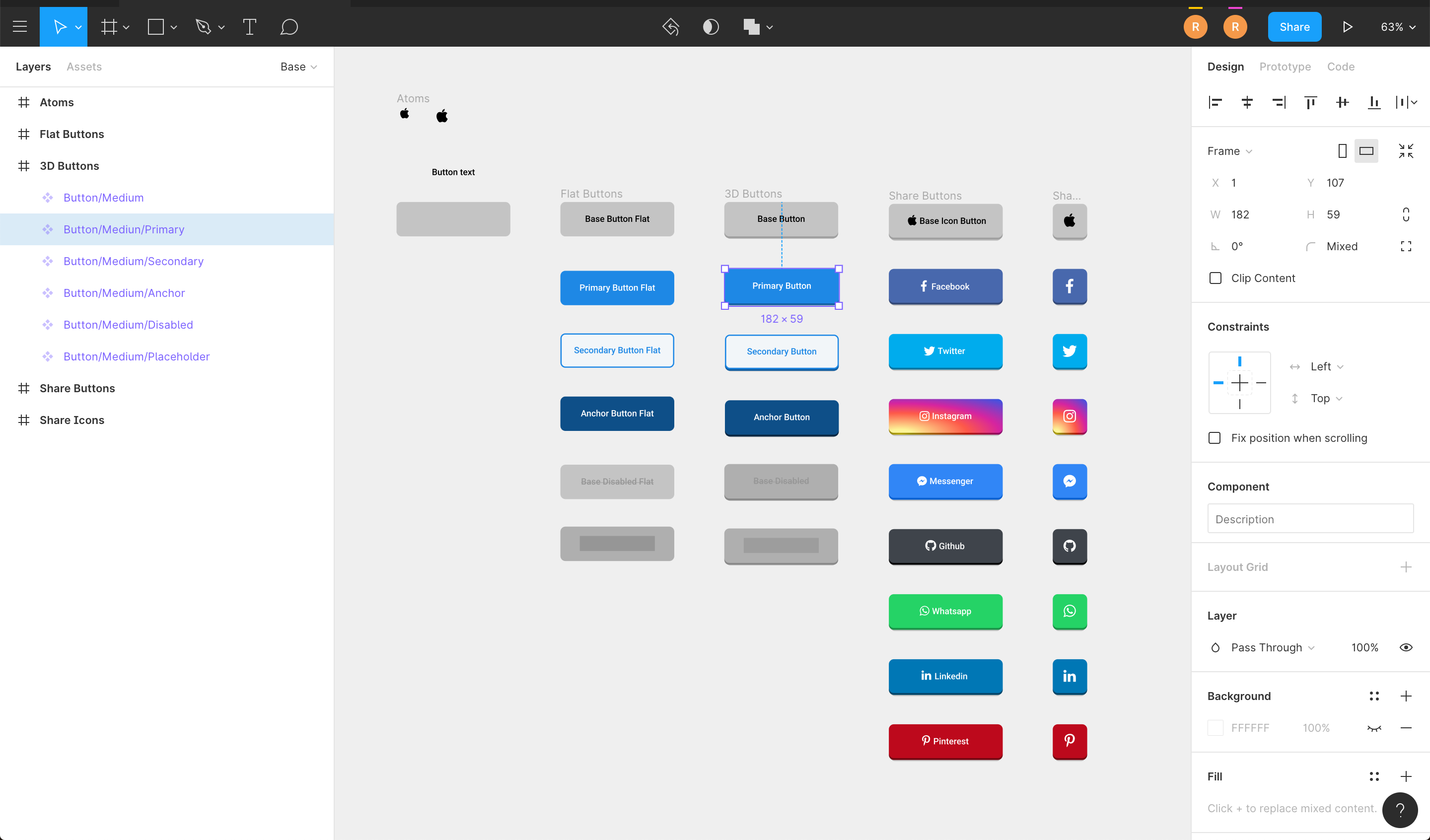
Figma File
Import the button visuals directly into your Figma project.
Install
npm install @rcaferati/react-native-awesome-button
Current peer support:
react >= 18.2.0react-native >= 0.76.0
Basic Usage
import AwesomeButton from '@rcaferati/react-native-awesome-button';

export function SaveButton() {
  return <AwesomeButton>Save</AwesomeButton>;
}
AwesomeButton supports both plain string labels and arbitrary React Native content.
Size Changes
animateSize is enabled by default.
- fixed-size
width/heightchanges animate with125ms cubic-bezier(0.3, 0.05, 0.2, 1) - auto-width string labels grow and shrink when their measured target width changes
- with
textTransitionplus auto width:- wider labels grow first, then animate text
- narrower labels animate text first, then shrink
animateSize={false}keeps size changes instant- fixed-to-auto and auto-to-fixed changes remain instant in
3.1.0
import AwesomeButton, {
  ThemedButton,
} from '@rcaferati/react-native-awesome-button';

export function SizeExample({
  isLong,
  size,
}: {
  isLong: boolean;
  size: 'small' | 'medium' | 'large';
}) {
  const label = isLong ? 'Open analytics dashboard' : 'Open';

  return (
    <>
      <AwesomeButton textTransition>{label}</AwesomeButton>
      <AwesomeButton animateSize={false}>{label}</AwesomeButton>
      <ThemedButton name="rick" size={size}>
        {size}
      </ThemedButton>
    </>
  );
}
Progress Buttons
When progress is enabled, onPress receives a next callback. Call it when your work is done to complete the progress animation and release the button.
import AwesomeButton from '@rcaferati/react-native-awesome-button';

export function SubmitButton() {
  return (
    <AwesomeButton
      progress
      onPress={(next) => {
        setTimeout(() => {
          next?.();
        }, 800);
      }}
    >
      Submit
    </AwesomeButton>
  );
}
Themed Buttons
import { ThemedButton } from '@rcaferati/react-native-awesome-button';

export function ThemeExample() {
  return (
    <>
      <ThemedButton name="rick" type="primary">
        Rick Primary
      </ThemedButton>
      <ThemedButton name="rick" type="secondary">
        Rick Secondary
      </ThemedButton>
    </>
  );
}
If you need the full registered theme object, use getTheme.
import { ThemedButton, getTheme } from '@rcaferati/react-native-awesome-button';

export function ThemeConfigExample() {
  const theme = getTheme(0);

  return (
    <ThemedButton config={theme} type="anchor">
      {theme.title}
    </ThemedButton>
  );
}
getTheme() safely falls back to the default basic theme if the provided index or name is invalid.
Before / After / Extra Content
Use before and after for inline content that should animate with the label, and extra for content rendered behind the button body.
import { StyleSheet, Text } from 'react-native';
import { AntDesign } from '@expo/vector-icons';
import { LinearGradient } from 'expo-linear-gradient';
import AwesomeButton from '@rcaferati/react-native-awesome-button';

export function ButtonContentExample() {
  return (
    <AwesomeButton
      before={<AntDesign name="arrowleft" size={18} color="#FFFFFF" />}
      after={<AntDesign name="arrowright" size={18} color="#FFFFFF" />}
      extra={
        <LinearGradient
          colors={['#4C63D2', '#BC3081', '#F47133', '#FED576']}
          style={StyleSheet.absoluteFillObject}
        />
      }
    >
      <Text style={{ color: '#FFFFFF', fontWeight: '700' }}>Continue</Text>
    </AwesomeButton>
  );
}
Transparent Buttons
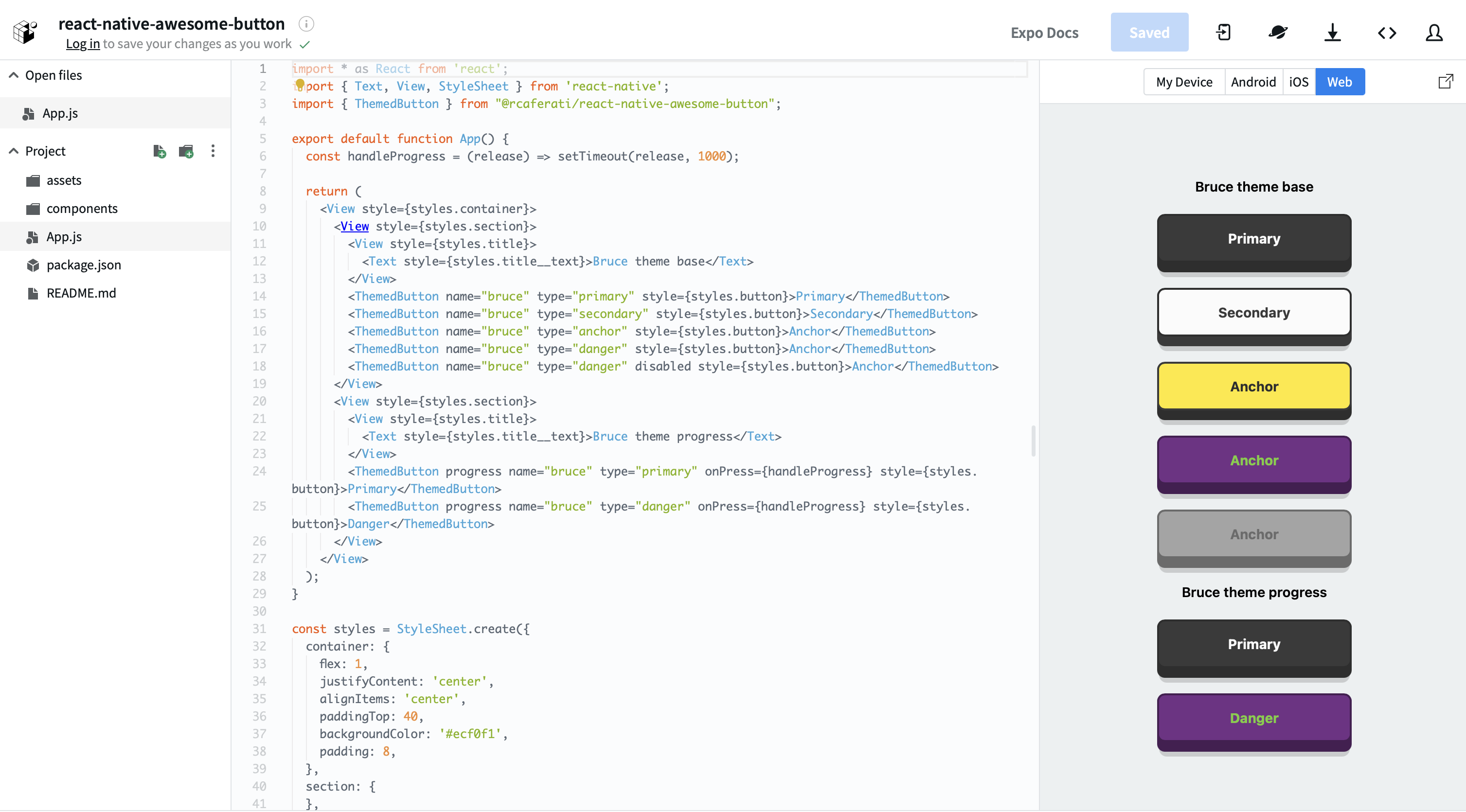
transparent is supported on ThemedButton. It removes the visible shell layers while preserving the content, hit target, and active/progress feedback.
import { ThemedButton } from '@rcaferati/react-native-awesome-button';

export function TransparentExample() {
  return (
    <ThemedButton name="bruce" type="anchor" transparent>
      Transparent
    </ThemedButton>
  );
}
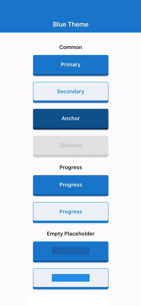
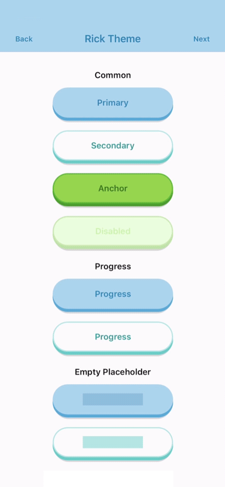
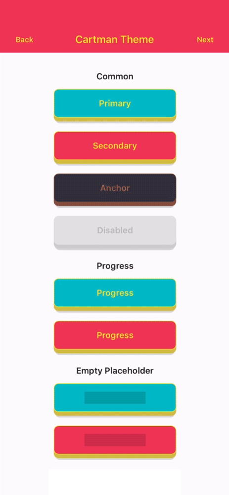
Built-in Theme Contract
Theme Names
basicbojackcartmanmysterionc137ricksummerbruce
Variants
primarysecondaryanchordangerdisabledflattwittermessengerfacebookgithublinkedinwhatsappredditpinterestyoutube
Unknown variants fall back safely at runtime instead of crashing, but only the variants above are part of the typed built-in API.
Sizes
iconsmallmediumlarge
Selected Props
The public prop surface is typed through AwesomeButtonProps and ThemedButtonProps.
AwesomeButton Props
| Attribute | Type | Default | Description |
|---|---|---|---|
activityColor | string | #FFFFFF | Activity indicator color shown during progress mode. |
activeOpacity | number | 1 | Opacity applied while the button is pressed. |
animatedPlaceholder | boolean | true | Enables the shimmer loop when the button has no children. |
animateSize | boolean | true | Animates fixed-size geometry changes and auto-width string-label changes. |
backgroundActive | string | rgba(0, 0, 0, 0.15) | Active overlay color rendered over the face while pressed. |
backgroundColor | string | #c0c0c0 | Main front-face background color. |
backgroundDarker | string | #9f9f9f | Bottom-face background color used for the raised 3D effect. |
backgroundPlaceholder | string | rgba(0, 0, 0, 0.15) | Placeholder bar background color when the button is empty. |
backgroundProgress | string | rgba(0, 0, 0, 0.15) | Progress bar background color used during progress mode. |
backgroundShadow | string | rgba(0, 0, 0, 0.15) | Shadow layer background color. |
before | ReactNode | null | Content rendered before the main label inside the button face. |
after | ReactNode | null | Content rendered after the main label inside the button face. |
extra | ReactNode | null | Content rendered behind the active/content layers, useful for gradients and custom backgrounds. |
children | ReactNode | null | Button label or custom content. Plain string labels also support textTransition. |
borderColor | string | undefined | Front-face border color. |
borderRadius | number | 4 | Shared border radius applied to the button face and lower layers. |
borderBottomLeftRadius | number | undefined | Bottom-left radius override. |
borderBottomRightRadius | number | undefined | Bottom-right radius override. |
borderTopLeftRadius | number | undefined | Top-left radius override. |
borderTopRightRadius | number | undefined | Top-right radius override. |
borderWidth | number | 0 | Front-face border width. |
dangerouslySetPressableProps | AwesomeButtonPressableProps | {} | Escape hatch for extra Pressable props. Core onPress, onPressIn, and onPressOut remain owned by the component. |
debouncedPressTime | number | 0 | Debounces onPress in milliseconds. |
disabled | boolean | false | Disables interactions and marks the internal Pressable as disabled. |
height | number | 60 | Base button height before padding and raise-level adjustments. |
hitSlop | PressableProps['hitSlop'] | undefined | Optional press target expansion. |
paddingHorizontal | number | 16 | Horizontal content padding. |
paddingTop | number | 0 | Additional top padding for the content row. |
paddingBottom | number | 0 | Additional bottom padding for the content row. |
progress | boolean | false | Enables the progress-button flow. onPress receives a next callback in this mode. |
progressLoadingTime | number | 3000 | Duration of the loading bar animation in progress mode. |
showProgressBar | boolean | true | Keeps the progress indicator visible while the button is in loading mode. |
raiseLevel | number | 4 | Vertical raise distance used to render the 3D depth effect. |
springRelease | boolean | true | Uses spring-based release animation instead of timing-based release. |
stretch | boolean | false | Makes the button fill the available horizontal space. |
style | StyleProp<ViewStyle> | undefined | Extra style applied to the outer animated container. |
textColor | string | #FFFFFF | Default label text color. |
textFontFamily | string | undefined | Optional font family for string labels. |
textLineHeight | number | 20 | Placeholder bar height and string label line-height baseline. |
textSize | number | 14 | Default font size for string labels. |
textTransition | boolean | false | Enables the built-in scramble/reveal animation for plain string labels. In auto-width mode, wider labels grow first and narrower labels shrink last. |
width | number | 'auto' | null | null | Fixed width, measured auto width (null / 'auto'), or pair with stretch for full width. Auto-width string labels can now both grow and shrink. |
onPress | (next?) => void | () => undefined | Main press callback. In progress mode it receives the completion handler. |
onLongPress | PressableProps['onLongPress'] | undefined | Native long-press callback forwarded to Pressable. |
onPressIn | (event) => void | () => undefined | Native press-in observer callback. |
onPressOut | (event) => void | () => undefined | Native press-out observer callback. |
onPressedIn | () => void | () => undefined | Fires after the internal press-in animation completes. |
onPressedOut | () => void | () => undefined | Fires after the internal release animation completes. |
onProgressStart | () => void | () => undefined | Fires when progress mode transitions into loading. |
onProgressEnd | () => void | () => undefined | Fires when progress mode finishes and the button releases. |
ThemedButton Additional Props
| Attribute | Type | Default | Description |
|---|---|---|---|
config | ThemeDefinition | undefined | Explicit theme object. When provided, it takes precedence over name and index. |
flat | boolean | false | Requests the flat theme variant when available. |
index | number | null | null | Theme index used by getTheme(index) when config and name are not provided. |
name | ThemeName | null | null | Named built-in theme selector. Falls back safely to basic if invalid. |
size | ButtonSize | medium | Built-in theme size preset: icon, small, medium, or large. |
transparent | boolean | false | Makes the visible shell layers transparent while keeping content, press, and progress feedback active. |
type | ButtonVariant | primary | Built-in variant to resolve from the selected theme. |
Development
Root quality gates:
yarn test
yarn typescript
yarn lint
yarn prepare
Demo app commands:
yarn --cwd demo install
yarn demo
yarn demo:ios
yarn demo:android
yarn demo:web
The Expo demo resolves @rcaferati/react-native-awesome-button to the local src/ folder, so you can iterate on the library without publishing it first.
Demo
The demo/ app is an Expo SDK 52 compatibility harness for:
- common themed buttons across all registered themes
- progress buttons
- variant transition examples
- text transition examples
- size animation parity examples
- empty placeholder states
- flat button variants
- before / after / icon content
- auto-width and stretch examples
- social variants
- extra-content button compositions
See demo/README.md for demo-specific instructions.
Author
Rafael Caferati
Website: https://caferati.dev
LinkedIn: https://linkedin.com/in/rcaferati
Instagram: https://instagram.com/rcaferati
License
MIT.