@rc-component/tooltip
May 12, 2026 · View on GitHub
React Tooltip


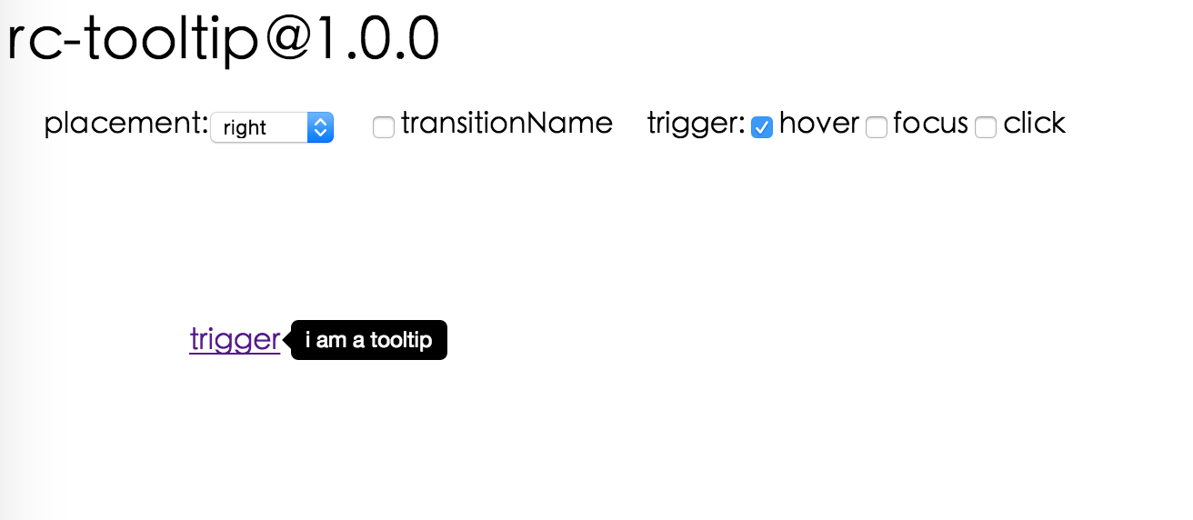
Screenshot
Browsers support
 IE / Edge |  Firefox |  Chrome |  Safari |  Opera |
|---|---|---|---|---|
| IE 8 + ✔ | Firefox 31.0+ ✔ | Chrome 31.0+ ✔ | Safari 7.0+ ✔ | Opera 30.0+ ✔ |
Install

Usage
var Tooltip = require('@rc-component/tooltip');
var React = require('react');
var ReactDOM = require('react-dom');

// By default, the tooltip has no style.
// Consider importing the stylesheet it comes with:
// '@rc-component/tooltip/assets/bootstrap_white.css'

ReactDOM.render(
  <Tooltip placement="left" trigger={['click']} overlay={<span>tooltip</span>}>
    <a href="#">hover</a>
  </Tooltip>,
  container,
);
Examples
npm start and then go to
http://localhost:8000/demo
Online demo: https://tooltip-react-component.vercel.app/
API
Props
| name | type | default | description |
|---|---|---|---|
| trigger | string | string[] | 'hover' | which actions cause tooltip shown. enum of 'hover','click','focus' |
| visible | boolean | false | whether tooltip is visible |
| defaultVisible | boolean | false | whether tooltip is visible by default |
| placement | string | 'right' | tooltip placement. enum of 'top','left','right','bottom', 'topLeft', 'topRight', 'bottomLeft', 'bottomRight', 'leftTop', 'leftBottom', 'rightTop', 'rightBottom' |
| motion | object | Config popup motion. Please ref demo for example | |
| onVisibleChange | (visible: boolean) => void; | Callback when visible change | |
| afterVisibleChange | (visible: boolean) => void; | Callback after visible change | |
| overlay | ReactNode | () => ReactNode | tooltip overlay content | |
| overlayStyle | object | deprecated, Please use styles={{ root: {} }} | |
| overlayClassName | string | deprecated, Please use classNames={{ root: {} }} | |
| prefixCls | string | 'rc-tooltip' | prefix class name of tooltip |
| mouseEnterDelay | number | 0 | delay time (in second) before tooltip shows when mouse enter |
| mouseLeaveDelay | number | 0.1 | delay time (in second) before tooltip hides when mouse leave |
| getTooltipContainer | (triggerNode: HTMLElement) => HTMLElement | () => document.body | get container of tooltip, default to body |
| destroyOnHidden | boolean | false | destroy tooltip when it is hidden |
| align | object | align config of tooltip, ref dom-align. See Align Overflow below | |
| showArrow | boolean | object | false | whether to show arrow of tooltip |
| zIndex | number | config popup tooltip zIndex | |
| classNames | classNames?: { root?: string; container?: string;}; | Semantic DOM class | |
| styles | styles?: {root?: React.CSSProperties;container?: React.CSSProperties;}; | Semantic DOM styles |
Align Overflow
The align prop accepts an object that may include an overflow field to control how the tooltip adjusts when it overflows the visible area. This is powered by dom-align.
| name | type | default | description |
|---|---|---|---|
| adjustX | boolean | number | false | adjust tooltip position in the X direction when it overflows |
| adjustY | boolean | number | false | adjust tooltip position in the Y direction when it overflows |
| alwaysByViewport | boolean | false | when true, always adjusts position based on the viewport rather than the scrollable parent container |
<Tooltip
  placement="top"
  align={{
    overflow: { adjustX: true, adjustY: true, alwaysByViewport: true },
  }}
  overlay={<span>tooltip content</span>}
>
  <button>hover me</button>
</Tooltip>
When alwaysByViewport is true, the tooltip will reposition itself to stay within the browser viewport. This is particularly useful when the trigger element is inside a scrollable container and you want the tooltip to always be visible on screen.
Important Note
Tooltip requires a child node that accepts an onMouseEnter, onMouseLeave, onFocus, onClick event. This means the child node must be a built-in component like div or span, or a custom component that passes its props to its built-in component child.
Accessibility
For accessibility purpose you can use the id prop to link your tooltip with another element. For example attaching it to an input element:
<Tooltip
    ...
    id={this.props.name}>
    <input type="text"
           ...
           aria-describedby={this.props.name}/>
</Tooltip>
If you do it like this, a screenreader would read the content of your tooltip if you focus the input element.
NOTE: role="tooltip" is also added to expose the purpose of the tooltip element to a screenreader.
Development
npm install
npm start
Test Case
npm test
npm run chrome-test
Coverage
npm run coverage
License
@rc-component/tooltip is released under the MIT license.