Weather Alerts Card
July 20, 2026 · View on GitHub
A custom Home Assistant Lovelace card for displaying weather alerts with severity indicators, progress bars, and expandable details. Supports NWS (US), BoM (Australia), MeteoAlarm (Europe), DWD (Germany), MeteoSwiss (Switzerland), ECCC (Canada), NSW RFS (Australian bushfire), PirateWeather, and CAP Alerts (multi-region).
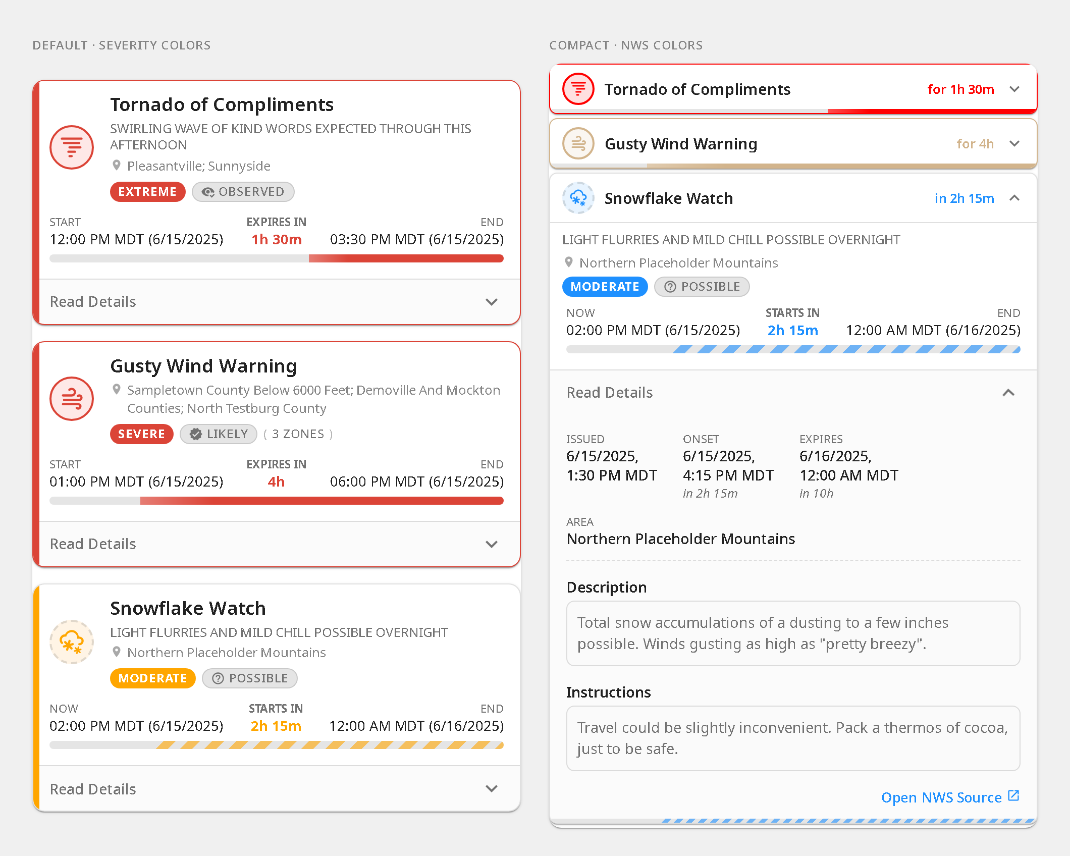
Features
- Multi-provider — NWS (US), BoM (Australia), MeteoAlarm (Europe), DWD (Germany), MeteoSwiss (Switzerland), ECCC (Canada), NSW RFS (Australian bushfire), PirateWeather, and CAP Alerts (multi-region) with auto-detection
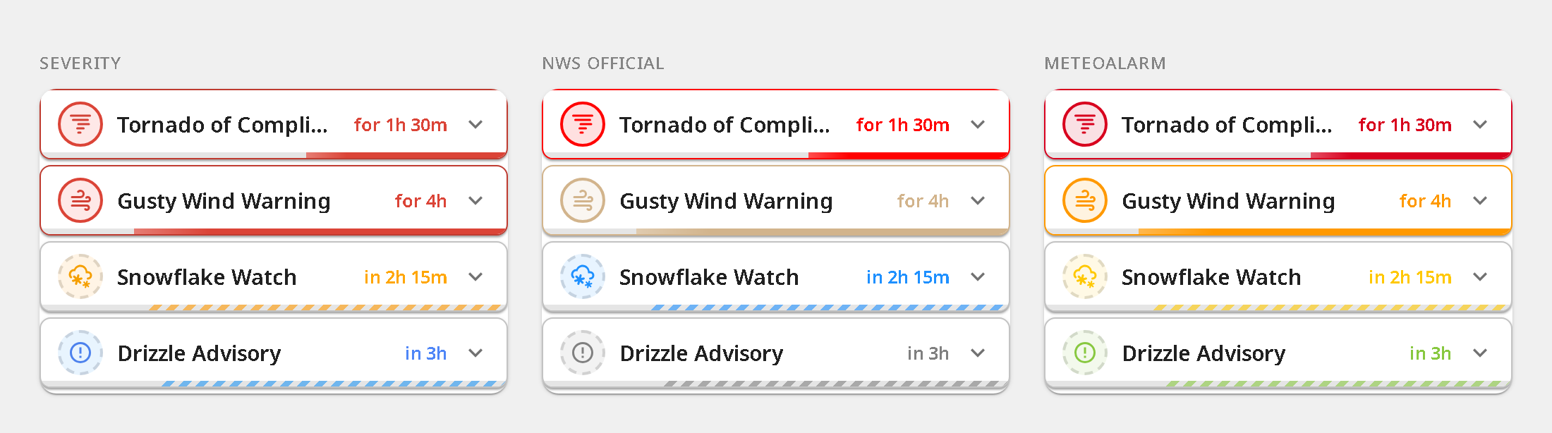
- Color themes — severity-based (default), NWS official event colors, MeteoAlarm awareness level colors, or ECCC public-alert colors
- Time progress bars — elapsed/remaining time with relative and absolute timestamps
- Alert headlines — contextual subtitle from provider data, with optional redundancy filtering
- Expandable details — sanitized description, instructions, and source link
- Affected-area mini-map (CAP) — optional inline outline of the alert's polygon, with an opt-in raster-tile basemap for geographic context (
showGeometry) - BoM phase badges — New, Updated, Renewed lifecycle indicators
- Compact layout — collapsed single-row alerts with progress bars that expand on tap
- Zone filtering — show only alerts for specific zone codes (CAP Alerts geocodes, BoM
area_id); see thezonesnote for provider support - Dismissable alerts — optional per-alert dismiss (button or swipe) with undo and a restore-all control, stored browser-locally
- Broken-source safety badge — when a configured sensor goes unavailable/unknown, a degraded indicator names the broken source instead of silently showing "no alerts" (a dead feed is never treated as proof of safety) (
unavailableBehavior) - Sort order — default, onset time, or severity
- Severity threshold — minimum severity to display (unclassified alerts always shown)
- Localized UI — English, French, Spanish, Italian, and German; auto-detected from Home Assistant locale
- Visual config — no YAML editing required
Themes
Surface theming (--wac-* tokens)
The card exposes a small, stable set of CSS custom properties for its surfaces.
Set them from theme YAML, card-mod,
or a dashboard style: block — no card config needed. Unset, every token falls
back to the value the card has always used, so the default look is unchanged.
The outer <ha-card> is the single painted surface; each alert box defaults to a
transparent fill and reveals it. That means a translucent theme
(--ha-card-background: rgba(...)) renders its alpha exactly once, instead of
compounding into a "solid" look on the alert bodies. The standard
--ha-card-background, --ha-card-border-radius, and --ha-card-box-shadow also
work as expected.
| Token | Default | Controls |
|---|---|---|
--wac-card-background | var(--ha-card-background, var(--card-background-color)) | Outer card wrapper fill |
--wac-alert-background | transparent | Per-alert box fill (reveals the outer surface) |
--wac-alert-border-radius | 12px (full) / 8px (compact) | Per-alert corner radius |
--wac-alert-border | 1px solid var(--divider-color) | Per-alert border |
--wac-alert-shadow | var(--ha-card-box-shadow, 0 2px 5px rgba(0,0,0,0.1)) | Per-alert shadow |
--wac-alert-gap | 16px (full) / 4px (compact) | Vertical gap between alerts |
--wac-progress-fill-color | var(--wac-progress-fg) | Wash color for progressFill: background (inherits the severity color + contrast boost) |
--wac-progress-fill-opacity | 0.10 (light) / 0.14 (dark) | Wash strength — kept low so alert text stays legible |
--wac-progress-fill-expired-opacity | 0.06 | Dimmer wash for expired rows |
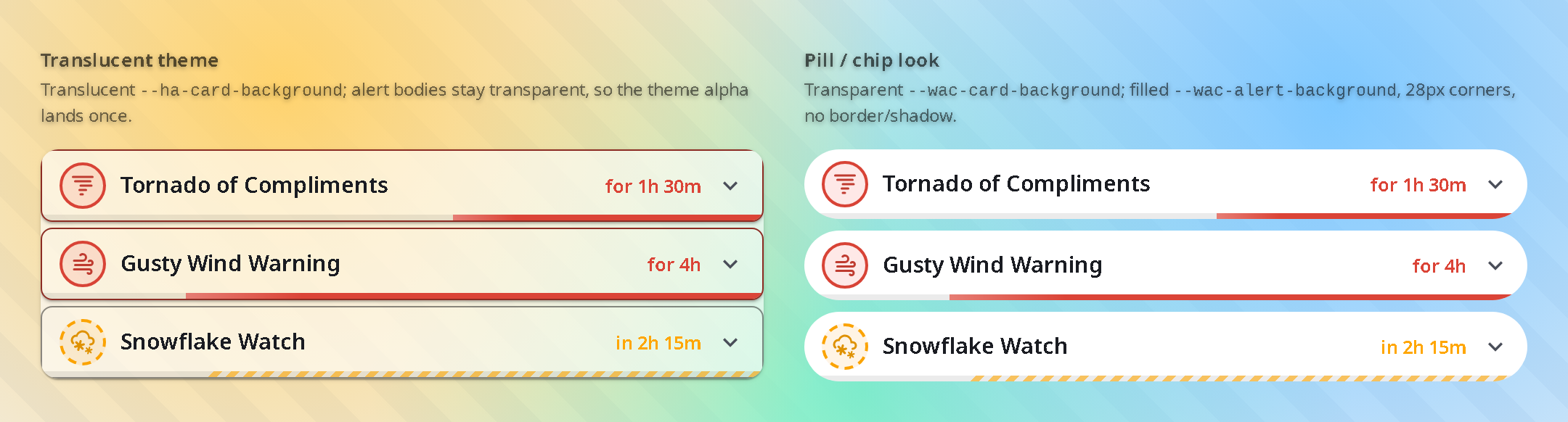
Left: a translucent theme (alert bodies transparent, so the surface alpha lands once). Right: a pill/chip look (transparent wrapper, filled boxes). Both come from the card-mod examples below.
Show card-mod examples
Translucent theme — set a translucent card background and let the alert boxes inherit it (this is the default, shown here for a per-card override):
type: custom:weather-alerts-card
entity: sensor.nws_alerts_alerts
provider: nws
card_mod:
  style: |
    ha-card {
      --ha-card-background: rgba(40, 40, 40, 0.6);
      --wac-alert-background: transparent; /* default; alert bodies stay translucent */
    }
Pill / chip look — filled alert boxes on a transparent wrapper, built from the
surface tokens (approximates a Bubble Card
style; contributed in #144).
Note the standard --ha-card-box-shadow: none alongside the tokens: with a
transparent --wac-card-background, the outer <ha-card> would otherwise still
cast its own shadow around the now-invisible wrapper.
type: custom:weather-alerts-card
entity: sensor.nws_alerts_alerts
sortOrder: severity
layout: compact
provider: nws
card_mod:
  style: |
    ha-card {
      --wac-card-background: transparent;
      --ha-card-box-shadow: none; /* flatten the now-invisible outer wrapper */
      --wac-alert-background: rgb(40, 40, 40);
      --wac-alert-border: none;
      --wac-alert-border-radius: 28px;
      --wac-alert-shadow: none;
      --wac-alert-gap: 8px;
    }
Deeper layout tweaks (row height, icon chip size) still require reaching into the card's internal class names, which are not a stable public API and may change between releases. Prefer the tokens above where they suffice.
Quick Start
- Install a weather alerts integration for your region (see Supported Providers)
- Install this card via HACS: search "Weather Alerts Card"
- Add to your dashboard and select your alert entity
Installation
HACS (recommended)

Then click the Download button, and click Reload when prompted.
Manual
- Download
weather-alerts-card.jsfrom the latest release - Copy to
config/www/weather-alerts-card.js - Add as resource: Settings → Dashboards → Resources → URL:
/local/weather-alerts-card.js, Type: JavaScript Module
Configuration
Surface appearance — backgrounds, borders, corners, shadows, translucency — isn't configured here; it's themed via CSS. See Surface theming (
--wac-*tokens).
| Option | Default | Description |
|---|---|---|
entity | (required, unless device is set) | Alert sensor entity |
entities | — | Additional alert entities to merge (e.g. DWD current + advance) |
device | — | HA device_id — auto-discovers all per-alert sensors under that device and re-discovers as alerts come and go. Currently only the CAP Alerts integration uses this shape. Can be combined with entity/entities or used on its own. |
sources | — | Feed source attribute values to auto-collect (e.g. ['nsw_rural_fire_service_feed']). Harvests every entity whose source attribute matches, re-scanning each render so per-incident entities appear and vanish with the live feed — no volatile geo_location.* ids to hand-list. Independent of provider (each collected entity still auto-detects its adapter). Can be used on its own or combined with entity/entities/device. |
provider | auto-detect | 'nws', 'bom', 'meteoalarm', 'dwd', 'meteoswiss', 'eccc', 'nsw_rfs', 'pirateweather', 'cap' |
title | — | Card header title |
zones | — | Restrict to specific zone codes, matched against each alert's zone list. Populated by CAP Alerts (UGC/SAME/EMMA_ID/NUTS and any other geocode scheme) and BoM (area_id, e.g. NSW_FL049; fork-dependent — the safepay/ha_bom_australia fork emits it). The recommended NWS integration doesn't emit zone codes, so this doesn't apply to it. Alerts with no matching zone are hidden, so setting zones on a provider that carries none hides everything |
sortOrder | 'default' | 'default', 'onset', 'severity' |
minSeverity | 'all' | 'all', 'minor', 'moderate', 'severe', 'extreme'. Alerts whose severity is unknown/unclassified are always shown, regardless of this threshold |
colorTheme | 'severity' | 'severity', 'nws', 'meteoalarm', 'eccc' — 'eccc' uses ECCC's published red/orange/yellow/grey palette (matches weather.gc.ca); falls back to the canonical severity tier for non-ECCC alerts displayed under this theme |
enhanceContrast | 'subtle' | 'off', 'subtle', 'strict' — boost foreground colors for NWS/MeteoAlarm events whose raw hex reads poorly against the active theme's card background, applied per event, per theme mode, and only in the direction where it fails. 'subtle' (default) uses a text tier (~2:1 for icon/label) and a stricter progress tier (~1.3:1 for progress-bar fill, which catches near-invisible tints like yellow Tornado Watch). 'strict' tightens both tiers (text ~3:1, progress ~2:1) toward WCAG AA-ish guarantees. 'off' always renders raw theme hex values. Events that already read cleanly (e.g. Tornado Warning) render unchanged in all modes. |
eventCodes | — | Event codes to include, e.g. ['SVR', 'TOR'] (NWS) or ['31', '95'] (DWD) |
excludeEventCodes | — | Event codes to exclude, e.g. ['SCY'] (NWS) or ['22'] (DWD) |
timezone | 'server' | 'server' or 'browser' (client's local time) |
deduplicateHeadlines | true | Suppress headlines that repeat the event name |
deduplicate | true | Collapse matching alerts across zones and providers |
animations | system | true, false, or respect prefers-reduced-motion. Gates motion only; progressStyle picks the pattern |
progressStyle | see below | Per-phase progress-bar decoration. An object with optional preparation / active / ongoing keys, each 'solid' | 'striped' | 'shimmer' | 'pulse'. Defaults reproduce the current look: preparation: striped, active: shimmer, ongoing: pulse (expired is always a fixed dimmed solid bar and is not configurable). Flow direction is intrinsic to each phase — a texture keeps the phase's direction wherever it is placed (e.g. active: striped marches with the bar). ongoing: solid caveat: a static full-width ongoing bar no longer signals "indeterminate / no known end" and can read like a nearly-expired alert; the default stays pulse. Has no effect when progressFill: background — the thin track it decorates is hidden, and the low-opacity wash renders the texture invisible, so the wash is always solid. |
iconBorderStyle | see below | Per-phase icon-ring border style. An object with optional preparation / active / ongoing keys, each 'dashed' | 'solid'. Defaults reproduce the current look: preparation: dashed, active: solid, ongoing: solid (expired is a fixed dimmed solid ring and is not configurable). |
showDetails | true | Show the expandable detail panel (hides entire "Read Details" section when false) |
expandDetails | false | Always show details inline without a toggle (ideal for wall-mounted displays) |
showProvider | false | Show provider label (e.g., NWS) above event title |
showMetadata | true | Show issued/onset/expires/area grid in detail panel |
showDescription | true | Show description text in detail panel |
showInstructions | true | Show instructions text in detail panel |
showGeometry | false | Show an inline SVG mini-map of the affected-area outline in the detail panel. CAP Alerts (cap_alerts) only — other providers have no geometry. Draws the bbox frame immediately and overlays the polygon once fetched out-of-band (falls back to the frame on cache miss). |
geometryStyle | 'shape' | Mini-map rendering when showGeometry is on. 'shape': bare polygon outline, fully offline. 'map': raster-tile basemap behind the polygon for geographic context — opt-in, fetches map tiles (online), and reveals the alert's bounding box to the tile host. Falls back to the outline if tiles fail. |
geometryTileUrl | CARTO | Slippy-map tile template ({z}/{x}/{y}, optional {s}) used when geometryStyle: 'map'. Default is the theme-aware CARTO basemap that Home Assistant's own map uses (light_all/dark_all, CORS-enabled). Override to point at a self-hosted or proxied tile source. |
geometryTileAttribution | © OpenStreetMap, CARTO | Attribution label shown over the map. Set this to credit your provider when using a custom geometryTileUrl. |
showSourceLink | true | Show "Open Source" link (false for kiosk mode) |
hideExpired | true | Hide expired alerts (set false to show them dimmed) |
hideNoAlerts | false | Hide the "No active alerts" banner when there are no alerts |
unavailableBehavior | 'message' | Degraded badge shown above the card content whenever some or all configured sources are broken (unavailable/unknown with no parseable alert). 'message': badge names the broken source (counts when >1); 'compact': icon-only badge; 'hide': no badge (not recommended — a broken source is not proof of safety). A visible badge keeps the card on screen even under hideNoAlerts; the card only hides completely when there are no alerts and hideNoAlerts is set and (unavailableBehavior: 'hide' or nothing is broken). |
fontSize | 'default' | 'small', 'default', 'large', 'x-large' — scales text and icons |
progressFill | 'track' | Progress-indication surface. 'track': the thin progress bar (full) / bottom mini-bar (compact). 'background': a Bubble Card-style whole-row wash — the entire alert row fills as a low-opacity tint of the alert color, growing to the current progress point behind the content (the thin track is hidden; the textual progress labels stay). Tune or disable the wash via the --wac-progress-fill-* surface tokens. Note: progressStyle textures do not apply here — the wash is always solid (the thin track is hidden, and texture is imperceptible at the wash's legibility-safe opacity). |
reformatText | true | Strip hard line wraps from alert text (NWS 69-char teletype breaks) while preserving paragraph breaks |
layout | 'default' | 'default' or 'compact' |
allowDismiss | false | Let users dismiss individual alerts (browser-local). Adds a × button and/or swipe gesture |
dismissTrigger | 'button' | 'button', 'swipe', or 'both' — how an alert is dismissed (swipe covers touch + mouse drag). Requires allowDismiss |
dismissButtonStyle | 'icon' | 'icon' or 'labeled' (icon + "Dismiss" text). No effect when dismissTrigger: 'swipe'; compact layout is always icon-only |
showDismissUndo | true | Show an Undo toast when an alert is dismissed. No effect when allowDismiss is off |
Examples
Basic
type: custom:weather-alerts-card
entity: sensor.nws_alerts_alerts
BoM with title and zone filtering
type: custom:weather-alerts-card
entity: sensor.sydney_warnings
provider: bom
title: Weather Alerts
zones:
  - NSW_FL049
NWS official colors, compact, sorted by severity
type: custom:weather-alerts-card
entity: sensor.nws_alerts_alerts
colorTheme: nws
layout: compact
sortOrder: severity
NWS filtered to specific event types, browser timezone
type: custom:weather-alerts-card
entity: sensor.nws_alerts_alerts
eventCodes:
  - TOR
  - SVR
timezone: browser
Custom progress-bar decoration and icon ring per phase
type: custom:weather-alerts-card
entity: sensor.nws_alerts_alerts
progressStyle:
  preparation: solid      # a straight (undecorated) pre-onset bar instead of diagonal dashes
  active: striped         # stripes that march with the bar (right)
iconBorderStyle:
  preparation: solid      # solid pre-onset ring instead of the default dashed
European MeteoAlarm warnings with awareness colors
type: custom:weather-alerts-card
entity: binary_sensor.meteoalarm
colorTheme: meteoalarm
Australian BoM warnings
type: custom:weather-alerts-card
entity: sensor.sydney_warnings
provider: bom
DWD (Germany)
type: custom:weather-alerts-card
entity: sensor.dwd_weather_warnings_hamburg_current
DWD current + advance warnings merged
type: custom:weather-alerts-card
entity: sensor.dwd_weather_warnings_current
entities:
  - sensor.dwd_weather_warnings_advance
MeteoSwiss (Switzerland)
type: custom:weather-alerts-card
entity: sensor.weather_warnings_at_8000
ECCC (Canada)
type: custom:weather-alerts-card
entity: sensor.marathon_alerts
ECCC with the official public-alert palette
type: custom:weather-alerts-card
entity: sensor.marathon_alerts
colorTheme: eccc
NSW RFS (Australian bushfire)
The nsw_rural_fire_service_feed integration creates one geo_location.* entity
per active incident, and that set churns constantly as fires start and clear.
Rather than hand-list volatile entity ids, point the card at the feed with
sources: — it auto-collects every current incident and keeps up as they come
and go:
type: custom:weather-alerts-card
sources:
  - nsw_rural_fire_service_feed
nsw_rural_fire_service_feed is the source state attribute each incident entity
carries, so the value maps one-to-one to what you see on the entity. In the visual
editor this is the Auto-collect from installed feeds checkbox, which only
appears when the integration is actually installed. (You can still hand-list
specific incidents under entities: or group them with a device: if you want a
fixed subset instead.)
Severity comes straight from the incident category (Emergency Warning / Watch
and Act / Advice — the Australian Warning System ladder). Incidents have no real
expiry, so the card shows an honest "ongoing" state with no progress bar, and the
showGeometry mini-map is unavailable (the entity carries only a point, not the
fire-ground polygon).
PirateWeather alerts
type: custom:weather-alerts-card
entity: sensor.pirateweather_alerts
CAP Alerts — auto-discover all per-alert sensors under a device
The CAP Alerts integration creates one sensor per active alert under a Home Assistant device. Point the card at the device and it picks up every active alert sensor automatically — and re-picks them up as alerts are issued or cleared.
type: custom:weather-alerts-card
device: 1a2b3c4d5e6f7a8b9c0d1e2f3a4b5c6d
Pick the device from the editor's CAP Alerts device selector to avoid hand-typing
the id. device can also coexist with entities: for mixed setups.
Theming the card surface — see Surface theming (--wac-* tokens) under Themes for the token table and card-mod examples (translucent theme, pill/chip look).
Supported Providers
The card auto-detects the provider from entity attributes. Any integration that produces a compatible data shape will work.
| Provider | Region | Tested integrations |
|---|---|---|
| NWS | US | finity69x2/nws_alerts |
| BoM | Australia | bremor/bureau_of_meteorology, safepay/ha_bom_australia |
| MeteoAlarm | Europe | Built-in meteoalarm |
| DWD | Germany | Built-in dwd_weather_warnings |
| MeteoSwiss | Switzerland | izacus/hass-swissweather — point the card at sensor.weather_warnings_at_<postcode> |
| ECCC | Canada | seevee/cap_alerts (provider: eccc) — the recommended ECCC source; see note below |
| NSW RFS | Australia (NSW) | Built-in nsw_rural_fire_service_feed — one geo_location.* entity per bushfire/grass-fire/hazard-reduction incident; auto-collect the whole feed with sources: [nsw_rural_fire_service_feed] |
| PirateWeather | Global | Pirate-Weather/pirate-weather-ha |
| CAP Alerts | Multi-region (NWS, ECCC, MeteoAlarm, WMO) | seevee/cap_alerts — one sensor per active alert; pair with device: for auto-discovery. Ingests any CAP 1.2 feed, including the WMO Severe Weather Information Centre firehose for countries without a dedicated integration |
Note on ECCC. For Environment and Climate Change Canada alerts, use CAP Alerts (
provider: eccc). It is the only ECCC source this card recommends — neither the bundled HA coreenvironment_canadaintegration nor the HACSenvironment_canadafork is routed to. See Canada: ECCC via CAP Alerts below for why.
Canada: ECCC via CAP Alerts
For Environment and Climate Change Canada (ECCC) alerts, CAP Alerts
(provider: eccc) is the source to use. It ingests the NAAD CAP firehose,
creating one sensor per active alert under a Home Assistant device. That carries
raw CAP severity and certainty, preserves the original multi-region alert
polygons, and unlocks the showGeometry affected-area mini-map.
Point the card at the device and it auto-discovers every active alert, re-discovering as alerts come and go:
type: custom:weather-alerts-card
device: 1a2b3c4d5e6f7a8b9c0d1e2f3a4b5c6d
colorTheme: eccc      # ECCC's official red/orange/yellow/grey palette
showGeometry: true    # affected-area mini-map
Pick the device from the editor's CAP Alerts device selector rather than
hand-typing the id. The provider auto-detects as eccc; set provider: eccc
explicitly only if you've disabled auto-detection.
Why not the other ECCC integrations? Two other ECCC integrations exist, but neither is the right source for this card:
- HA core
environment_canadaexposes rich alert detail only through aget_alertsaction (#172393, merged in place of the attribute-based #164481). A Lovelace card reads state and attributes during render and can't consume an action response, so core can't drive this card.- The HACS
environment_canadafork does surface alert attributes, but it's a stop-gap its own maintainer would rather not keep running (see discussion #3130), and it overrides the core integration's domain. Out of respect for that, we don't route ECCC users to it; CAP Alerts is the entity-based path the card author maintains for rich alert data.
Heads-up if you also run
environment_canadafor weather. Its alert list (GeoMet WFS, filtered by a point-in-polygon test against your coordinates) won't line up with CAP Alerts' (NAAD CAP polygons, ingested directly). The WFS feed lags and truncates NAAD coverage, so an alert can show up in one and not the other — that's upstream behaviour, not the card.
Data Fidelity
Severity and certainty badges are always localized to your configured language. When a value was inferred by the card's adapter logic (rather than provided directly by the alert source), it is rendered with italic text and a tilde prefix (~Moderate) so you can tell at a glance which badges reflect actual provider data.
| Provider | Severity | Certainty |
|---|---|---|
| NWS | Raw (from Severity field) | Raw (from Certainty field) |
| BoM | Inferred (parsed from title/type/group) | Absent |
| MeteoAlarm | Raw (from awareness_level or severity) | Raw (from certainty) |
| DWD | Raw (from integer level) | Absent |
| MeteoSwiss | Raw (from integer level) | Absent |
| ECCC | Derived (max of color, type, impact; tilde only when all three absent) | Mapped from confidence (High → Likely, Moderate → Possible, Low → Unlikely) |
| NSW RFS | Raw (from category — the Australian Warning System ladder) | Absent |
| PirateWeather | Raw (from severity field) | Absent |
| CAP Alerts | Raw (from severity_normalized / severity) | Raw (from certainty field) |
Development
npm install
npm run build     # bundle → dist/weather-alerts-card.js
npm run watch     # bundle with file watching
npm run lint      # TypeScript type-check
Migrating to v3
v3.0.0 removes backwards-compatibility shims that were deprecated in v2. If you are upgrading from v1.x or v2.x, make the following changes:
1. Card type rename (v1.x users only)
Change the card type in your dashboard YAML:
# Before
type: custom:nws-alerts-card

# After
type: custom:weather-alerts-card
2. headline config key removed (v1.x users only)
The headline key was replaced by deduplicateHeadlines in v2. If your card config still has headline:, rename it:
# Before
headline: true   # or false

# After
deduplicateHeadlines: true   # or false
3. Manual install only: resource filename changed
If you installed manually (not via HACS), update the resource path in Settings → Dashboards → Resources:
| Before | After |
|---|---|
/local/nws-alerts-card.js | /local/weather-alerts-card.js |
HACS users: no action needed — HACS manages the resource path automatically.
Support
If you find this card useful, tip me at Ko-fi to support development, or donate to The Y'all Squad — a rapid-response program providing direct aid, chainsaws, and supplies to families affected by severe weather events.
Resources: Home Assistant Community thread