Unchained Admin UI
June 26, 2026 · View on GitHub
Unchained Admin UI


The open-source admin dashboard for Unchained Commerce — manage your headless e-commerce with AI superpowers
📸 Screenshots
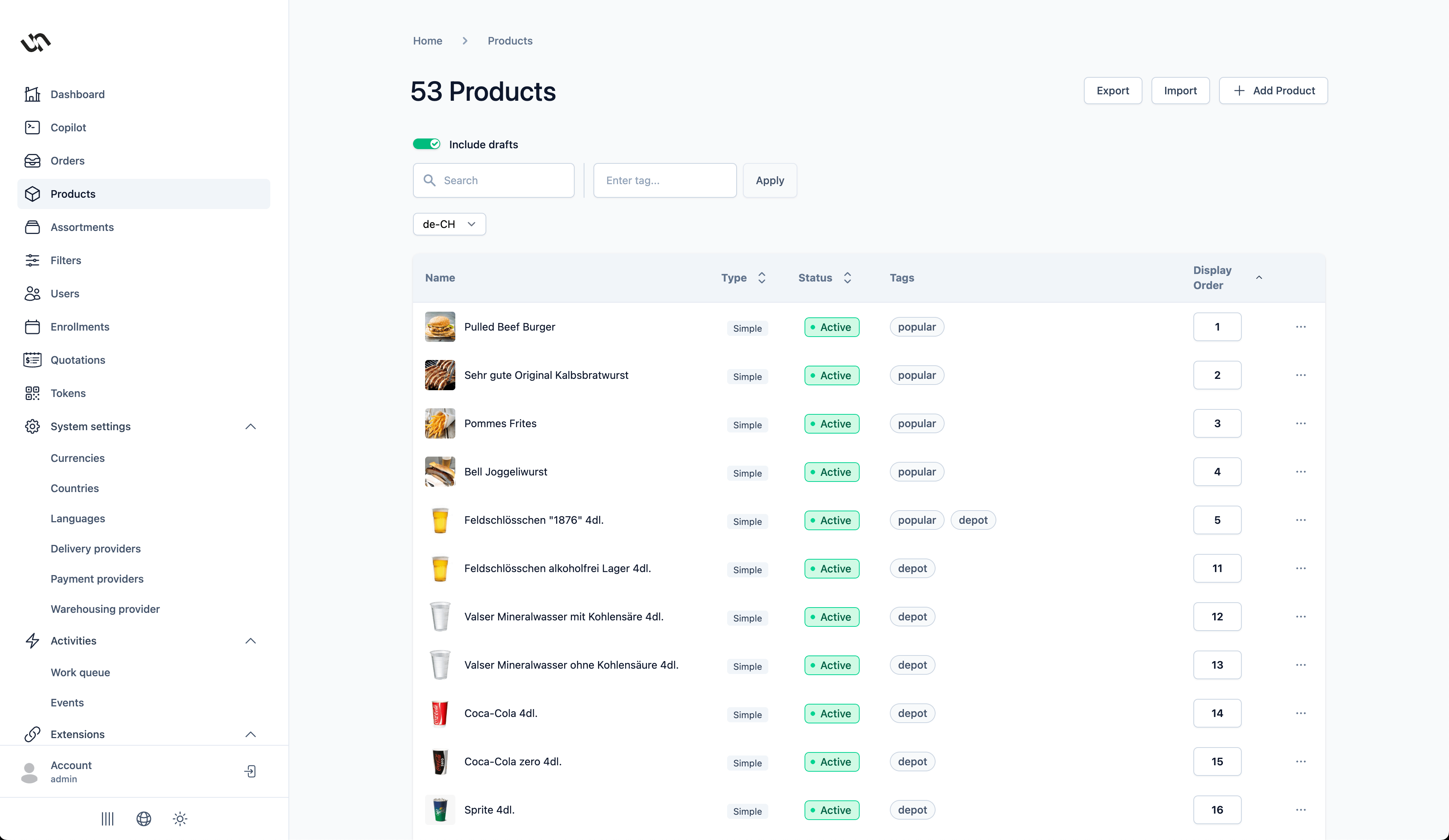 | 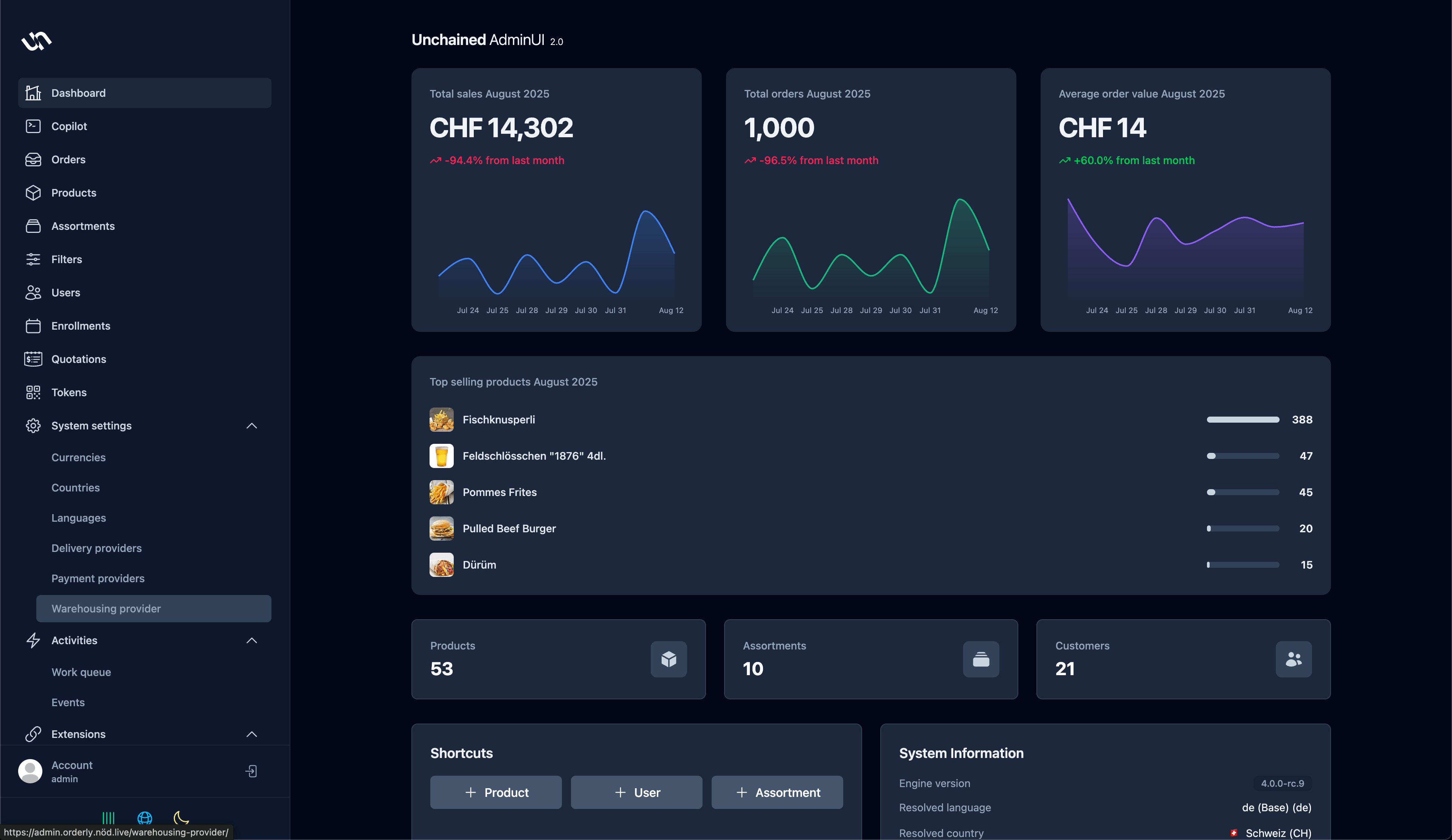 | 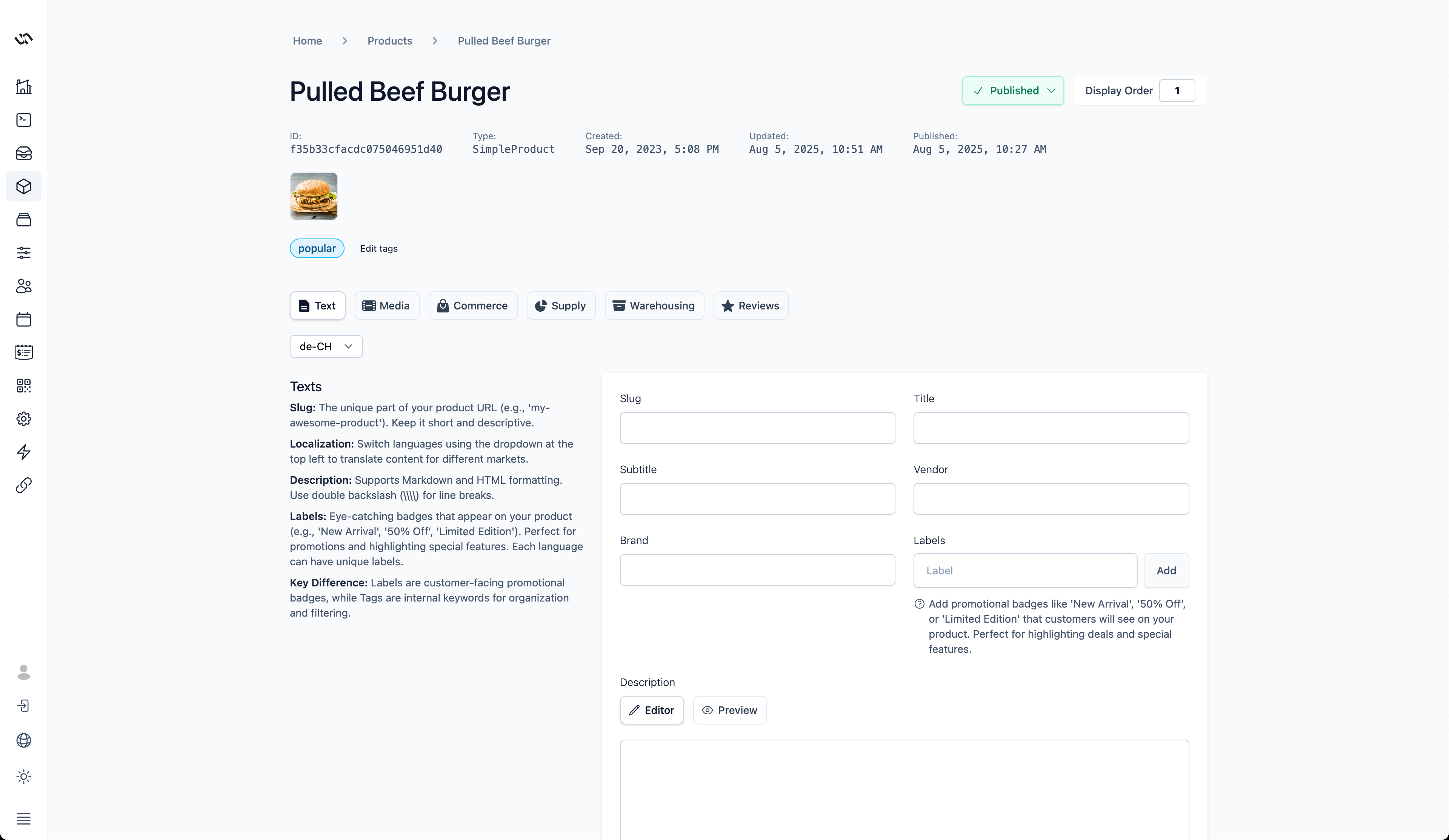 |
✨ Features
| Feature | Description |
|---|---|
| 🤖 AI Copilot | Built-in AI assistant with Model Context Protocol (MCP) for intelligent automation |
| 📦 Product Management | Simple, Bundle, Configurable, Subscription Plans & NFT-tokenized products |
| 🛒 Order & Fulfillment | Complete order lifecycle with configurable workflows |
| 💼 B2B Quotations | Professional quotation management with approval workflows |
| 📊 Inventory Control | Multi-warehouse tracking with low-stock alerts |
| 💳 Payment & Shipping | Integrate any payment gateway or delivery provider |
| 🌍 Multi-language & Currency | Full i18n support with country-specific locales |
| 🔐 Role-Based Access | Granular permissions with build-time security |
| 🎨 Customizable Branding | White-label ready with custom logos |
| 📱 Responsive Design | Works on desktop, tablet, and mobile |
🛠️ Tech Stack
| Next.js 15 | React 19 | Apollo GraphQL | Tailwind CSS 4 | TypeScript |
Plus: Formik • React Intl • Headless UI • Recharts • Cypress • AI SDK
🚀 Quick Start
Prerequisites
- Node.js 22+
- Unchained Engine running on
localhost:4010
Installation
# Clone the repository
git clone git@github.com:unchainedshop/unchained.git
cd admin-ui

# Install dependencies
npm install

# Start development server
npm run dev
Open http://localhost:3000 in your browser.
⚙️ Configuration
Environment Variables
| Variable | Default | Description |
|---|---|---|
NEXT_PUBLIC_GRAPHQL_ENDPOINT | http://localhost:4010/graphql | Unchained Engine GraphQL endpoint |
NEXT_PUBLIC_LOGO | — | URL to your custom logo |
Create a .env.local file for local development:
NEXT_PUBLIC_GRAPHQL_ENDPOINT=https://your-engine.example.com/graphql
NEXT_PUBLIC_LOGO=https://your-cdn.com/logo.svg
🐳 Deployment
Static Export (Recommended)
npm run build
# Output in ./out/ - deploy to any CDN (Vercel, Netlify, S3, etc.)
Express / Fastify Integration
// Express
import { expressRouter } from '@unchainedshop/admin-ui/express';
app.use('/admin', expressRouter);

// Fastify
import { fastifyRouter } from '@unchainedshop/admin-ui/fastify';
fastify.register(fastifyRouter, { prefix: '/admin' });
🎨 Custom Theming
The admin UI uses semantic CSS custom property tokens for all surface, text, and border colors. Engine consumers can override these at runtime — no rebuild required.
Pass a theme object with light and/or dark overrides when connecting the admin UI:
await connect(fastify, platform, {
  adminUI: {
    prefix: '/',
    theme: {
      light: {
        accent: '#8b5cf6',
        'accent-hover': '#7c3aed',
        'focus-ring': '#8b5cf6',
        'text-on-accent': '#ffffff',
      },
      dark: {
        accent: '#a78bfa',
        'accent-hover': '#8b5cf6',
        'focus-ring': '#a78bfa',
        'text-on-accent': '#ffffff',
      },
    },
  },
});
You only need to include the tokens you want to override — unset tokens use the built-in defaults. Each key maps to a --token-{key} CSS variable. The engine serves these as /admin-ui-theme.css which loads before first paint (no flicker).
Available tokens:
| Token | Light default | Dark default | Description |
|---|---|---|---|
surface | #ffffff | #1e293b | Main backgrounds (cards, modals) |
surface-subtle | #f8fafc | #0f172a | Page backgrounds |
surface-raised | #f1f5f9 | #334155 | Hover states, raised elements |
surface-input | #ffffff | #0f172a | Form input backgrounds |
border | #cbd5e1 | #475569 | Default borders |
border-subtle | #e2e8f0 | #334155 | Subtle/secondary borders |
text-primary | #0f172a | #f1f5f9 | Headings, primary text |
text-secondary | #475569 | #94a3b8 | Labels, secondary text |
text-muted | #64748b | #64748b | Captions, placeholders |
accent | #1e293b | #475569 | Primary buttons, active elements |
accent-hover | #020617 | #64748b | Hover state for accent |
focus-ring | #1e293b | #94a3b8 | Focus ring color for interactive elements |
text-on-accent | #ffffff | #ffffff | Text on accent-colored backgrounds |
danger | #f43f5e | #fb7185 | Error states, destructive actions |
danger-surface | #fff1f2 | oklch(...) | Danger background |
success | #10b981 | #34d399 | Success states |
warning | #f59e0b | #fbbf24 | Warning states |
🧩 SDK — Using UI Primitives in Custom Apps
The admin UI exports its component library, form system, hooks, and providers as separate entry points. This allows custom admin pages, plugins, or white-label apps to reuse the design system without forking.
npm install @unchainedshop/admin-ui
Available imports:
// UI primitives — Button, Badge, Combobox, Card, Tab, etc.
import { Button, Badge, Loading, Tab, Accordion } from '@unchainedshop/admin-ui/ui';

// Form components — TextField, SelectField, Combobox, CheckboxField, etc.
import { TextField, SelectField, Combobox, SubmitButton } from '@unchainedshop/admin-ui/form';

// Hooks — useTheme, useModal, useField, useForm, etc.
import { useTheme, useModal, useField, useForm } from '@unchainedshop/admin-ui/hooks';

// Providers — ThemeWrapper, ModalWrapper for app composition
import { ThemeWrapper, ModalWrapper } from '@unchainedshop/admin-ui/providers';

// Modal system — Modal, AlertMessage, DangerMessage
import { Modal, AlertMessage, DangerMessage, useModal } from '@unchainedshop/admin-ui/modal';

// Styles — import the full design token stylesheet
import '@unchainedshop/admin-ui/styles';
Building a custom admin page:
import { ThemeWrapper, ModalWrapper } from '@unchainedshop/admin-ui/providers';
import { Button, Card, CardContent } from '@unchainedshop/admin-ui/ui';
import { TextField, SubmitButton } from '@unchainedshop/admin-ui/form';
import '@unchainedshop/admin-ui/styles';

export default function CustomPage() {
  return (
    <ThemeWrapper>
      <ModalWrapper>
        <Card>
          <CardContent>
            <h1>My Custom Admin Page</h1>
            <Button variant="primary" text="Click me" />
          </CardContent>
        </Card>
      </ModalWrapper>
    </ThemeWrapper>
  );
}
Peer dependencies: React 19+, Next.js 15+ (for components that use next/link and next/router).
Build the SDK: npm run build:sdk generates the dist/ directory with ESM bundles and TypeScript declarations.
📝 Development
| Command | Description |
|---|---|
npm run dev | Start dev server with debugging |
npm run build | Production build |
npm run lint | Run ESLint |
npm run format | Format with Prettier |
npm run codegen | Generate GraphQL types |
npm run test:e2e | Run Cypress E2E tests |
npm run test:component | Run Cypress component tests |
npm run extract-translation | Extract i18n strings |
npm run compile-translation | Compile translations |
🏗️ Architecture
Modular architecture with 27+ domain modules:
src/modules/
├── product/           # Catalog & variants
├── order/             # Order management
├── quotation/         # B2B quotations
├── copilot/           # AI assistant
├── token/             # NFT tokenization
├── enrollment/        # Subscriptions
├── assortment/        # Categories
├── user/              # Customer management
├── payment-providers/ # Payment gateways
├── delivery-provider/ # Shipping
├── country/           # Multi-country
├── currency/          # Multi-currency
└── ...                # And more
Each module follows the pattern:
components/— React componentshooks/— Data fetching hooks (use{Action}{Entity})fragments/— GraphQL fragmentsutils/— Domain utilities