Minimal Tiptap Editor
March 30, 2026 · View on GitHub
Overview
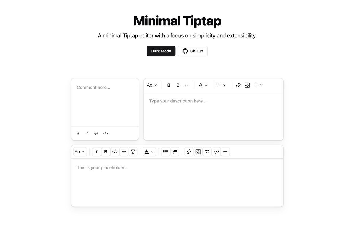
The Minimal Tiptap Editor is a lightweight, customizable rich text editor component designed for integration with Shadcn UI. It provides an intuitive interface for text formatting and editing while maintaining excellent performance.
Table of Contents
Installation
If you are using shadcn/ui in your project, you can install the component directly from the registry.
npx shadcn@latest add https://raw.githubusercontent.com/Aslam97/shadcn-minimal-tiptap/main/registry/block-registry.json
Manual Installation
- Install the required dependencies:
npm install lowlight react-medium-image-zoom @radix-ui/react-icons @tiptap/extension-bubble-menu @tiptap/extension-code-block-lowlight @tiptap/extension-color @tiptap/extension-horizontal-rule @tiptap/extension-image @tiptap/extension-list @tiptap/extension-table @tiptap/extension-text-style @tiptap/markdown @tiptap/extension-typography @tiptap/extensions @tiptap/pm @tiptap/react @tiptap/starter-kit
- Configure the
TooltipProvider:
Add the TooltipProvider to your application's root component (e.g., App.tsx or main.tsx):
import { TooltipProvider } from "@/components/ui/tooltip"

export const App = () => {
  return (
    <TooltipProvider>
      {/* Application components */}
      <YourComponent />
    </TooltipProvider>
  )
}
Tailwind CSS Setup
Ensure you reference your Tailwind CSS entry point in /minimal-tiptap/styles/index.css:
@reference "path-to-your-entry-point-tailwind.css";
Dependencies
The following Shadcn UI components are required:
Usage
- Copy the
minimal-tiptapdirectory into your project - Implement the component in your React application:
import { useState } from "react"
import { Content } from "@tiptap/react"
import { MinimalTiptapEditor } from "./minimal-tiptap"

export const App = () => {
  const [value, setValue] = useState<Content>("")

  return (
    <MinimalTiptapEditor
      value={value}
      onChange={setValue}
      className="w-full"
      editorContentClassName="p-5"
      output="html"
      placeholder="Enter your description..."
      autofocus={true}
      editable={true}
      editorClassName="focus:outline-hidden"
    />
  )
}
Props
The editor accepts all standard Tiptap editor props, plus these additional configuration options:
| Prop | Type | Default | Description |
|---|---|---|---|
value | string | - | Initial editor content |
onChange | function | - | Content change event handler |
editorContentClassName | string | - | CSS class for the editor content container |
output | 'html' | 'json' | 'text' | 'markdown' | 'html' | Desired output format |
placeholder | string | - | Editor placeholder text |
editorClassName | string | - | CSS class for the editor container |
throttleDelay | number | 0 | Update throttling delay in milliseconds |
Image Support
Configuration
Configure the Image extension with custom options:
Note: The
uploadFnmust return the uploaded image URL. If nouploadFnis specified, enable theallowBase64option.
Image.configure({
  allowedMimeTypes: ["image/jpeg", "image/png", "image/gif"],
  onImageRemove: handleImageRemove,
  maxFileSize: 5 * 1024 * 1024, // 5MB
  uploadFn: customImageUploader,
  onActionSuccess: handleActionSuccess,
  onActionError: handleActionError,
  onValidationError: handleValidationError,
})
Upload Management
Implement a custom upload handler:
const customImageUploader = async (file: File, editor: Editor) => {
  // Implement upload logic
  // Return the uploaded image URL
  return "https://example.com/uploaded-image.jpg"
}

Image.configure({
  uploadFn: customImageUploader,
})
Error Management
Implement comprehensive error handling:
Image.configure({
  onActionError: (error, props) => {
    console.error("Image upload failed:", error, props)
    // Implement user notification
  },
  onValidationError: (errors) => {
    console.error("Image validation failed:", errors)
    // Display validation feedback
  },
})
Toolbar Configuration
Customize toolbar sections using various configuration options:
<SectionOne editor={editor} activeLevels={[1, 2, 3, 4, 5, 6]} variant="outline" />

<SectionTwo
  editor={editor}
  activeActions={['bold', 'italic', 'strikethrough', 'code', 'clearFormatting']}
  mainActionCount={2}
/>

<SectionFour editor={editor} activeActions={['orderedList', 'bulletList']} mainActionCount={0} />

<SectionFive editor={editor} activeActions={['codeBlock', 'blockquote', 'horizontalRule']} mainActionCount={0} />
To prevent Dropdown Menu Trigger focus after selection:
onCloseAutoFocus={event => event.preventDefault()}
Key Features
- Automatic formatting removal when pressing Enter or creating new blocks
- Performance optimization through configurable
shouldRerenderOnTransaction - Comprehensive image handling with upload support
- Customizable toolbar with flexible section configuration
- Markdown input/output support via official
@tiptap/markdownextension
Development
Build component registry after updating the component:
npm run build-registry
Host the registry locally:
npm run host-registry
Use the local registry in a project:
npx shadcn@latest add http://127.0.0.1:8080/block-registry.json -o
Or initialize a new project with the local registry:
npx shadcn@latest init http://127.0.0.1:8080/block-registry.json
Official Tiptap Template
For a more comprehensive Tiptap editor template, check out the official Tiptap Template.
Related Projects
License
This project is licensed under the MIT License. See the LICENSE file for details.