@dravensoft/arena-react
August 23, 2026 · View on GitHub


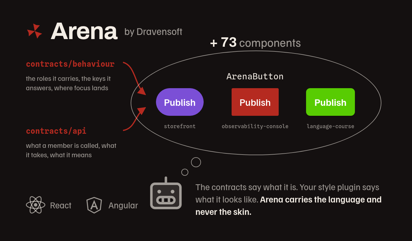
Arena is Dravensoft's design system. This package is its React layer: 73 components whose every value traces to a design token, with one stylesheet to import and no theme provider to wrap your tree in.
The package carries the language. It does not carry a skin. Your palettes and your fonts
are yours, declared in one JSON file, and the arena-to-prod command that ships here turns
that file into the stylesheets Arena reads.
What comes down with it. react and react-dom, which you already have, and
@phosphor-icons/web, which you may not: Arena's icons are Phosphor class names a component
renders, never SVGs it bundles, so the font is installed alongside the package rather than
bundled inside it. There is no runtime dependency and no CSS toolchain to run. Every component's
CSS ships compiled, written against Arena's own class names and Arena's own tokens and against
nothing else, so a project running its own utility framework cannot collide with it in either
direction.
What Arena gives a project
Components whose API is a contract. Every member of every component is declared once, in one place both layers are generated from and held to, so a name, a type, a default and what it means are the same under either framework, and the table documenting a component is emitted from that declaration rather than written beside it.
Behaviour each component binds rather than an audit somebody runs. A component names the accessibility pattern it implements, most of them a WAI-ARIA Authoring Practices one: the roles it carries, the keys it answers, where focus goes and what dismisses it. The pattern is recorded per component, and so is anything a component does not yet meet, with its reason.
A style kernel, which is how Arena stops looking like Arena. Arena keeps the questions about shape, space, weight and depth and ships one set of answers; a project writes its own as a style plugin, which is the ordinary case rather than an escape hatch. A palette is not an appearance, so the config below is the smaller half of that decision.
Every member documents itself where you already are. The members of every component, each with
the paragraph saying what it is for, ship as this package's type declarations, so an editor shows
them on hover and the file the types entry resolves to is the same reference in one place. That
is the member-level answer; what it does not carry is the language above it, which is the next
section.
What a machine reads off a screen is part of what a component draws. ArenaBreadcrumbs
describes the trail it draws in schema.org terms, so a crawler reads the same trail a person
does. Whether this package also writes your <head> is a thing only this package can answer,
and it answers it below.
A <head> is not this package's to write, and that is the answer. @dravensoft/arena-react
renders no title, description, canonical or og:* pair, so those stay wherever your application
already owns them, which is your router or your metadata framework rather than a component
library. Nothing here competes with that or has to be turned off for it.
The screens it is for
Arena is a product-application library: its components are the furniture of an application somebody works in, tables and their rows, forms and their fields, navigation, dialogs, charts, cards and the empty, loading and error states around them. A media or a consumer product is a different register, so a photo wall, a story ring, a feed of posts, a slideshow, a document editor and a game map are markup you write yourself.
The skin travels either way. A style plugin answers every role whatever the product is, so what Arena does draw wears your appearance rather than Arena's. What runs out first is the component list.
When the answer is that the markup is yours, the pattern is still not. This package ships
contracts/behaviour/, one file per accessibility pattern, stating normatively what markup of
yours has to do to carry it: the roles it takes, the keys it answers, where focus goes on open,
what it returns to on close and what dismisses it. dialog-modal.json is the one a lightbox or a
viewer of yours binds; feed.json a scrolling list of posts. Read the file for the pattern you
are drawing, and take the exported helper named in the table below rather than writing a second
copy of either half.
This package ships the components and not the language
See it before you install it: https://arena.dravensoft.org has the guidelines, a kitchen sink and a playground for every component. Source and full documentation: https://github.com/dravensoft-dev/arena
An agent building with Arena needs the repository, and this is a prerequisite rather than a
recommendation. The rules every component answers to, the usage document of each one, and the
style kernel a project answers to make Arena look like its own product are all there and none of
them is in this tarball. Install the Claude Code plugin, or clone the repository and point your
agent at skills/design/SKILL.md, before you ask for the first screen. Over HTTP the same route
starts at https://arena.dravensoft.org/llms.txt.
Without them an agent guesses, and no gate reads your application, so nothing reports the difference: the screen renders, and the rules it breaks are the ones only a reader notices.
The package is the code. The repository is the language.
Install
bun add @dravensoft/arena-react # or: npm i / pnpm add
npm, bun and pnpm all install this, and pnpm is the one worth naming because its layout is the strict one: nothing here is hoisted into place by accident, since every peer is declared rather than assumed, and the command below resolves the icon font through the symlinked store like any other dependency. No hoisting flag is needed under any of the three.
That is the whole install. react, react-dom and @phosphor-icons/web are peer dependencies,
so your package manager brings down whichever of them the project does not already have. The
package declares engines: { node: ">=22" }, which is the oldest line Node still supports.
The command it ships is plain JavaScript reading node:fs, node:path and node:url, so the
floor is the support window rather than a capability, and a project on a supported Node installs
without an engine warning.
An icon is a class name, not an element. Every icon prop takes a Phosphor class list,
"ph-bold ph-bell", and the component renders it. The stylesheet that turns those classes into
glyphs is not the one Phosphor ships: it is the subset arena-to-prod writes for you, below.
What this works with
Arena is built with bun, and bun is required nowhere. The command below is a Node program reading three node modules, so whatever runs a Node program runs it. These are the two axes that decide whether this package fits a project at all; the rest of the repertoire, the bundler, the stylesheet route and the framework versions, each carrying the evidence behind it, is at the repertoire page.
What runs the command?
| You may choose | Evidence | What is true |
|---|---|---|
| Node >=22 | held by a gate | the command is a Node program, and that floor is the oldest line Node still supports rather than a capability the command needs |
| any runner that reaches a Node program | allowed by the manifest, not exercised | npx and bunx both reach the same file. No runner is required: the command imports three node modules and no runtime API of its own |
How is the package loaded?
| You may choose | Evidence | What is true |
|---|---|---|
| an ES module import | held by a gate | the package is a module, and every target its exports name resolves to a file that is there |
| a CommonJS require | does not work | there is no require condition and no second build. A project that cannot load a module cannot load this one, and it fails at the first import rather than somewhere later |
One name everywhere
Every export carries the Arena prefix, and so does every type: the component is
ArenaButton, its props are ArenaButtonProps, and a tone is an ArenaTone.
import { ArenaButton, ArenaCard } from '@dravensoft/arena-react';
import type { ArenaTone } from '@dravensoft/arena-react';
The prefix is the name rather than a decoration on it, which is what lets "components": "auto" tell a component of Arena's from one of yours: a <Card> in your own source belongs to
whoever wrote it, and an <ArenaCard> belongs here.
The class names carry it too, and they carry it once. A component renders
.arena-button__root, spelt from the component's own name, so a rule of yours written against
that class is a rule about this component and nothing else. Every sheet is named the same way,
which is why css/components/arena-button.css is the file and arena-button is what you write
in a stylesheet list.
Your layout goes on a container you own
Put your spacing and sizing on an element you wrote, and let the Arena element be its child.
Arena draws no outer margin on anything, so the air between two components is always yours to
place, and no component takes a className or a style of yours: there is no route into an
Arena element's own box, by design.
React renders the real element in almost every case, so a .row > * { ... } rule of yours does
reach it. ArenaTabs is the exception that makes the rule worth stating: it returns a fragment
and puts no element of its own in the DOM at all, so a rule written against it matches the
tablist and the panels separately, or nothing. Wrap it, the way you would wrap anything else
whose layout is yours.
Write the rule the same way wherever you write it. A component's own element is Arena's, and what it renders is free to change: today it is the real element, and a component that wraps or that renders none owes you no warning, because that element was never something to lay out.
The page around the components
The floor is yours, and this package paints none of it. --fill-page is the role the page
itself takes, and it goes on the element that owns the whole viewport. A page with no floor shows
the browser's own canvas below the first screenful, which is white under a dark palette and is the
most common way a correctly built screen looks broken. What the package does declare is
color-scheme, from the palette's polarity, so the scrollbars, the native controls and the
autofill the browser draws point the way the palette does without you asking.
Markup of your own takes a role the same way a component does. --fill-surface and
--edge-surface for a panel or a block of yours that reads as a card, --fill-surface-sunken
for a well or a code block, --fill-field for a box somebody types into, --fill-hover for a
row of yours under the pointer, and --ink-heading, --ink-body and --ink-muted for a
heading, for text somebody reads and for text held back. A role is what a style plugin answers, so
a page painted through one wears the appearance the project adopts later without a rule of yours
being edited. contracts/design/roles.json in the repository is one entry per role.
The short names in css/colors.css are aliases over the palette: --crimson and
--gold for the two accents with a soft wash beside each, --danger, --success,
--warning and --info for the four status colours with the same, and --bone and
--mute for text at full strength and held back. Both are legitimate, and the difference is what
happens when the appearance changes: a role follows the style plugin and an alias follows the
palette. Reach for a role when the thing you are drawing is furniture, and an alias when it is
voice.
A role says which colour text takes, and a level says how far it is held back. They are two
values and both are needed: under the appearance this package installs with, --ink-muted and
--ink-body resolve to the same colour, and what makes the held-back register held back is the
level mixed into it. Write it the way every component here writes it,
color: color-mix(in oklab, var(--ink-muted) var(--level-ink-muted), transparent), with
--level-ink-body and --level-ink-quiet beside it. The levels are floors rather than
constants, and arena-to-prod raises one for a palette whose ink has too little room to clear its
contrast bar, so a percentage of your own is the one value here that cannot follow the palette. A
bare var(--ink-muted) paints at full strength, which is body copy wearing the name of a caption.
The column is three classes and the air between two things is a named step. .arena-shell
fills the window, .arena-shell__main goes on the one child that should take the slack, and
.arena-band centres the content at the page width with a gutter either side. Inside it,
.arena-stack is the step between two peers, .arena-stack--group the one for things that read
as one unit, .arena-stack--section the one between two sections, and .arena-row all three
laid across instead of down. Every one of them goes on a container of your own, and none of them
does anything on a component this package draws.
.arena-row is for ANY two things side by side, and most of the misses are small ones. A
mark beside the product's name, two links in a bar, a label next to the badge it describes, an
icon and the word after it: each is a row at the group step, and each is where a
display: flex with a gap of somebody's choosing gets written instead, because a pair of
elements does not look like it needs a class. It wraps when the line runs out, which is a
property of the class rather than the reason to reach for it.
When the child that should take the slack IS a component this package draws, put a <div> of
your own around it and .arena-shell__main on the div. A component's own element may declare
display: contents and carry no box, so the class lands on nothing and the shell distributes
its slack to an element that cannot hold it. The wrapper is not a workaround: these classes go on
markup you wrote, and that is as true of the one that grows as it is of the rest.
The miss those replace has one shape, and it is small enough to look like nothing. A column of
your own carrying display: flex, flex-direction: column and a gap, or two blocks with a
margin between them, holding a title over its service inside a table cell, or a label over the
value under it, written inline because reaching for a class felt like more than two lines were
worth. .arena-stack--group is exactly that block, and the step a group is spent at is the same
step wherever it is spent.
The band carries the width and the gutter and no block air, so the space above and below a
page's content column is yours, spent on the --sp-* scale. The rhythm classes answer the gap
between two siblings, and this is the padding of the box that holds them. The gutter is a CEILING
rather than a fixed inset: at or above the page width the band stands off by the whole of it, and
below that width it holds the same share of the space it has, so a phone keeps a content column
instead of spending two fifths of the screen on margin.
Two densities, and each is a class on an ancestor rather than a member on anything.
.arena-compact re-densifies the controls and the rows for a screen that has to hold more.
.arena-comfortable grows them to a 48px touch target for a screen a thumb drives. Both answer
the same keys, so a container wearing both gets whichever the stylesheet emits last, which is why
the two are exclusive. Each re-answers the control and row sizes and nothing
else: the rhythm above does not re-densify, so the air between two components stays where you
spent it.
Declare your skin
A palette is not an appearance. Arena keeps 72 questions about shape, space, weight and depth,
and the answers are a style plugin your project writes: the config below decides which colours a
surface takes and none of how round, how tight or how heavy the product is. That decision is paid
once per project and belongs before the first screen, and
skills/design/references/style-kernel.md in the repository is where it is made.
Write arena.config.json in your project root. This is the whole file, with one palette and
three fonts served by Google Fonts, and it is enough to start:
{
  "palettes": [
    {
      "name": "dark",
      "default": true,
      "polarity": "dark",
      "colors": {
        "base-100": "#141010",
        "base-200": "#1d1715",
        "base-300": "#241c19",
        "base-content": "#f3ede5",
        "primary": "#b52a20",
        "primary-content": "#ffffff",
        "secondary": "#c5a059",
        "secondary-content": "#141010",
        "neutral": "#2c221e",
        "neutral-content": "#d8cfc4",
        "info": "#3182ce",
        "info-content": "#141010",
        "success": "#38a169",
        "success-content": "#141010",
        "warning": "#ecc94b",
        "warning-content": "#141010",
        "error": "#e85151",
        "error-content": "#ffffff",
        "error-fill": "#ce3838",
        "cat-1": "#3c7b0a",
        "cat-2": "#3b63be",
        "cat-3": "#0a924b",
        "cat-4": "#6a59bc",
        "cat-5": "#00a3c0",
        "cat-6": "#884da9",
        "cat-7": "#00a99a",
        "cat-8": "#984697"
      }
    }
  ],
  "fonts": {
    "display": { "family": "Archivo", "src": "https://fonts.googleapis.com/css2?family=Archivo:wght@400;500;600;700;800;900&display=swap" },
    "body": { "family": "Familjen Grotesk", "src": "https://fonts.googleapis.com/css2?family=Familjen+Grotesk:wght@400;500;600;700;800;900&display=swap" },
    "mono": { "family": "Spline Sans Mono", "src": "https://fonts.googleapis.com/css2?family=Spline+Sans+Mono:wght@400;500;600;700;800;900&display=swap" }
  },
  "stylePlugins": ["default"]
}
arena.config.example.json in this package is the same file with both Dravensoft palettes in
it, ready to copy and edit.
stylePlugins is in that block because leaving it out is a decision and not a blank. The
value above is the appearance this package installs with, which is Dravensoft's, and a project
that means to look like itself replaces it with the path to a plugin directory of its own. Both
are finished answers; only one of them is one somebody made.
What each part means:
palettesis an array, so declare as many as you want. Exactly one is thedefaultand reaches:root; every other one becomes a class,.arena-<name>, that you put on<html>to switch skin.polarityisdarkorlight. It decides the native date picker's colour and it is what a first visit matchesprefers-color-schemeagainst.colorstakes all 27 keys above.error-fillis the only optional one: leave it out and Arena darkenserrorin oklab for the single filled danger surface it has.cat-1throughcat-8are the chart ramp. Their order is their identity, so slot 3 is always slot 3, and they are never used to mean anything, only to tell series apart.fontsfills the three families Arena reads.srctakes either a stylesheet URL, as above, or a font binary you host yourself, which becomes an@font-face:{ "family": "Archivo", "src": "/fonts/archivo.woff2", "weight": "400 900" }.stylesheetis optional and names what you render, so you send nothing else. See Build to production, below.stylePluginsnames the appearance.["default"], or leaving the key out, is a finished answer rather than a step somebody has not taken yet, and it is the right one for a first screen, for a prototype and for a tool nobody outside the team looks at. What it leaves unresolved is the appearance: the product wears the answers this package installs with, and every project stopping there looks like every other one. Writing one of your own is what makes the corners, the weights, the borders, the depth and the internal air the product's own, with no component rewritten to get there. It is a list, because a build can carry more than one register, and the first entry is what a page with no class on it looks like; every later one emits under.arena-<name>and is a difference. An entry is the worddefault, which is the appearance this package installs with, or a path to a directory of your own holdingplugin.tokens.jsonand optionallyplugin.css. The first entry answers every role Arena declares, and the command refuses one that does not: a custom property with no value is invalid at computed-value time, so an unanswered role is a missing border rather than a plainer look. Declare a list withoutdefaultand you do not receive its stylesheet, the same way the preflight can already be dropped.gradientMarkis optional, a boolean, and says the mark your product is drawn with is a gradient. Arena ships no element that is one, so yours lives in your own CSS, where--auditreports it: the scope reads which directory a line sits in, which is right for a part hook and wrong for a brand. Declare it once and that rule goes quiet in your sources; the colours inside the gradient are still reported, since they are the skin. It replaces anarena-audit allowmarker, which silences every rule on its line and is repeated wherever the mark is drawn.
A plugin carrying a plugin.css gets a third generated file, plugin.generated.css, and
you import it beside the other two. It declares the cascade layer order itself and then opens
the reserved layer, so where your bundler places it among your other stylesheets cannot change
what wins.
Build to production
npx arena-to-prod # or: bunx / pnpm exec / yarn dlx
One command and no arguments. It reads arena.config.json, your src tree and every style
plugin directory that config declares, wherever those sit, and writes two files into src:
arena.generated.css, your palettes and your@font-facerules, led by an@importof the package's own stylesheet. This file is where every colour comes from: the package declares no--color-*of its own, only the rules that read them, so the config and this command are how Arena gets a palette at all rather than a way to override one. The font roles are the half that is an override: the package declares them and your file, coming later at equal specificity in:root, wins.icons.generated.css, the class rules inwoff2alone for every glyph your sources draw and every glyph Arena draws for you. It exists because Phosphor's own stylesheet declares a rule for every icon it has in every format it ships, and a screen draws a handful, which makes that sheet the largest stylesheet an Arena project would send that nothing on it reads. The font binary is not cut down: the@font-faceit writes points at the weight Phosphor ships, so what a bundler copies is that whole file. Host a subset of your own there if the bytes matter, and the glyph list this file names is what to cut it to. Counting what Arena draws is the part you cannot do by hand: a component renders icons you never wrote, and leaving those out is an empty box in a menu you did not know had one. The two halves are answered differently. Your sources are read as text, because there is nothing else to read them by. Arena's half is not: the package shipsicons.json, the list its own components draw, computed when the package was built from the renders themselves, so the command reads a list instead of searching this package for anything that looks like a class name. A search cannot tell a render from a sentence about one, and it is the glyph list that a self-hosted subset gets cut to. Every glyph you name also reaches the filled weight, whichever weight you wrote it beside, because a navigation item draws its active destination filled and asks for a rule you never wrote: name the glyph the way its member documents it,icon="ph-bold ph-receipt", and the sheet has both.
A style plugin carrying a plugin.css gets a third file, plugin.generated.css, holding
that CSS wrapped in the reserved cascade layer. It leads with the layer order itself, so a
bundler that emits one <link> per stylesheet and does not keep your import order cannot
change what wins.
Import them last:
import './icons.generated.css';
import './arena.generated.css';
import './plugin.generated.css';   // only when a style plugin of yours carries CSS
A TypeScript project declares what a stylesheet is before it can import one. Those three lines
are a bundler's idiom rather than TypeScript's: a .css specifier resolves to no module, so under
strict the compiler reports TS2307 on every one of them and the build stops at the file that
wires Arena in. Most toolchains already ship the declaration and the fix is to reference it,
"types": ["vite/client"] in tsconfig.json for one, the next-env.d.ts the framework
generates for another. A project whose toolchain ships none declares them once, in a declaration
file of its own that its include already reaches:
declare module '*.css';
declare module '*.svg' {
  const src: string;
  export default src;
}
The second line is the same problem one asset later. ArenaAppLogo takes the mark as a node you
pass, and a bundled import mark from './mark.svg' is a specifier TypeScript resolves no better
than a stylesheet; passing the path as a bare string in src avoids the question and gives up
the hashed filename a build would have written. Neither declaration is Arena's to ship: an
ambient *.css is global to whoever compiles it, and a package that declared one would decide
that for every project that installs it.
| flag | what it does |
|---|---|
--audit | Report where your own sources break a rule of the language: a class of yours on a component Arena draws, a stylesheet rule reaching an arena- slot, or one reaching a data-arena-part hook from outside a style plugin; an Arena component wrapped in your router's own link; a raw colour, a bare pixel length or a gradient where a token belongs, raw meaning a hex, channels or a name; an icon passed as an element; an emoji. Every rule is read in a scope: inside a directory your stylePlugins declares, a part hook is what you are meant to select and a gradient is yours to paint, so neither is reported there; the compiled arena- class name and a raw value are reported in both, because the hook is the contract and the class is output. The run also names the parts your plugins paint, which is where the evidence for promoting one into a role comes from. No gate reads your application, so this is the only automatic signal there is, and it is a report rather than a failure until you pass --strict. It decides only what source text shows, so it never claims to have checked one primary per view or a filled danger surface. A comment is prose and declares nothing, so a note about a value costs no allowance. Exempt a line it is wrong about with an arena-audit allow comment on that line, and it reports the allowance once there is nothing left on the line to exempt. |
--undrawn | Name the components this package ships that your sources draw nowhere. It is the answer to "which of them have I not used yet", and it walks your sources a second time to answer it, which is the only flag here that costs a pass of its own. A component Arena draws on your behalf counts as undrawn, because you never wrote it. |
--strict | Exit 1 on a report rather than writing anyway. Bare, it holds every kind; --strict=contrast,audit holds the kinds you name, out of components, contrast, ramp, weight, glyph, markers, audit, environment and restated. Name them when one of them is a decision you already made: a brand under 4.5:1 is measured and deliberate, and one switch over all of them would make it the price of holding the rest in CI. environment says the run is outside an Arena package, so Arena's own icons went uncounted; weight says a role asks for a weight the face you loaded does not carry, so the browser draws it by smearing the nearest one; wash is the one kind --strict never holds: a token on a wash of its own colour clears AA at no percentage, and a build nobody can fix is not a gate; restated says a plugin rule restates the value that part's slot already paints, so it changes nothing. |
--skill, --skill-check | Write the discovery record every IDE agent scans for, .agents/skills/arena/SKILL.md, and do nothing else: no config is read and no stylesheet is written, because a project that wants the language has no reason to own an arena.config.json yet. The record is not a copy of the language: the corpus travels inside this package and the record routes into it, so an agent reads the rules, the style kernel and every component's usage document with no clone and no network. --skill=.github/skills writes a different scanned location, --global writes one for every project you open, and --vendor copies the documents beside the record for a tree where node_modules is not checked out. --skill-check reads it back and reports that it is absent, that another version of this package wrote it, that it was edited by hand, or that a document it routes to is not there; --strict=skill makes any of those fatal. It is the only thing in Arena that reads your project, and it reads only this one file. |
--no-import | Omit the @import of the package stylesheet, for when you would rather import @dravensoft/arena-react/arena.css yourself. |
--config, --src, --out | The config file, the trees to scan and where the two files go. They default to arena.config.json, src and src. --src is repeatable and names the trees of your own, and a style plugin is not one of them: a directory your stylePlugins declares is resolved from the config and walked wherever it lives, so every scope rule in the --audit row reaches it whether or not it sits under src. One command and no arguments is the whole of it, and a plugin in design/ costs nothing to remember. |
It reports rather than refuses. If a text colour lands under 4.5:1, if two ramp slots are too close to tell apart with a common colour vision deficiency, or if you name a glyph Phosphor does not have, it says so on stderr and writes the files anyway. Your brand is yours; Arena's job is to tell you what it costs. A malformed config is a different matter and always fails, naming the key.
stylesheet in arena.config.json is how you pay for only what you render. Set
"components": "auto" and the command reads your sources and works the list out:
{ "stylesheet": { "components": "auto", "preflight": false } }
It counts a component as drawn when you import it from this package or open its tag, and it adds
what Arena draws on your behalf, because an ArenaTable renders an ArenaPagination and an ArenaSelect you
never wrote. It prints both counts, and names on stderr anything it saw and could not place.
preflight: false is separate: set it when your project already ships an equivalent browser
reset.
What a scan cannot see, it cannot send. A component reached only through a value your code computes is a component this misses, and a missing sheet renders with no border, no padding and no colour, with nothing to tell you. Naming the sheets yourself is still there, and is the honest choice for a project that renders through indirection:
{ "stylesheet": { "components": ["arena-button", "arena-page-head", "arena-side-nav", "arena-stat-card", "arena-table"] } }
A name this package does not ship fails the command and lists the ones it does, so a typo stops the build instead. That list is then yours to keep current.
Run it before your build
{
  "scripts": {
    "prebuild": "arena-to-prod",
    "predev": "arena-to-prod"
  }
}
Both bun and npm run a pre<name> script ahead of the script it names, so wiring it once is
what keeps the two files from ever going stale. They are build products of your config and your
sources, so ignore them in version control the way you ignore the rest of your build.
Switch palettes
import { initArenaTheme, useArenaTheme } from '@dravensoft/arena-react';

initArenaTheme({
  palettes: [
    { name: 'dark', polarity: 'dark' },
    { name: 'light', polarity: 'light' },
  ],
  default: 'dark',
});

function ThemeButton() {
  const [theme, setTheme] = useArenaTheme();
  return <ArenaButton onClick={() => setTheme(theme === 'dark' ? 'light' : 'dark')}>{theme}</ArenaButton>;
}
Pass the same palettes your config declares. initArenaTheme reads the stored choice, falls
back to prefers-color-scheme matched against each palette's polarity, and puts the right
class on <html>. Called with nothing, it answers dark and light.
To avoid a flash on first paint, apply the class before your stylesheet loads:
<script>
  (function () {
    var PALETTES = [               // every palette your arena.config.json declares, in its order
      { name: 'dark', polarity: 'dark' },
      { name: 'light', polarity: 'light' }
    ];
    var DEFAULT = 'dark';          // the palette your arena.config.json marks default
    try {
      var name = localStorage.getItem('arena-theme');
      if (!name) {
        var wants = window.matchMedia('(prefers-color-scheme: light)').matches ? 'light' : 'dark';
        for (var i = 0; i < PALETTES.length; i++) {
          if (PALETTES[i].polarity === wants) { name = PALETTES[i].name; break; }
        }
      }
      if (name && name !== DEFAULT && /^[a-z][a-z0-9-]*$/.test(name)) {
        document.documentElement.classList.add('arena-' + name);
      }
    } catch (e) {}
  })();
</script>
Set the list to your own palettes and DEFAULT to the one your config marks default. Those are the
same two values the theme surface takes, so a build carrying three or four palettes states them once
and the snippet cannot drift from the app. The default reaches :root and wears no class, so a
snippet naming the wrong one puts a class on the very palette that must not have it. The media query is
the half a stored-value-only snippet gets wrong: on a first visit nothing is stored, the theme
surface falls back to the first palette whose polarity matches the device, and a snippet that
reads only storage paints the default first and is corrected after the app boots, which is the
flash it exists to prevent.
What the package ships besides the components
Every component is imported from the package root, and its types ship with it, emitted from the components' own source rather than written beside it. Everything else that reaches that root is in the table below, each answering a question a consumer cannot answer from outside.
| export | what it is |
|---|---|
initArenaTheme, useArenaTheme, getArenaTheme, setArenaTheme, toggleArenaTheme, arenaPalettes, ArenaPalette, ArenaThemeConfig | the theme surface above |
useArenaContainerWidth(target?) | [ref, width]: attach the ref to the box and read the width a ResizeObserver reports. For a component or a panel that has to fit the room it was given. width is null until the first measurement, so render the wide branch while it is: a panel that flashes into its phone shape on every mount is worse than one that settles into it |
useArenaViewportBelow(name) | a boolean over not all and (min-width: N), where name is 'sm' | 'md' | 'lg' and resolves the same --bp-* token Arena's own components branch on. For a page's own layout, and never for a component: that is wrong the first time somebody puts it in a narrow column. Call forgetArenaBreakpoints() if your app swaps its stylesheet at runtime |
arenaCatColor(slot), arenaCatSurface(slot), arenaCatTint(colour), arenaCatSlotFor(key), ARENA_CAT_SLOTS | the chart ramp, for a legend or a chip you draw yourself. The ramp's order is its identity, so a slot means the same thing in every chart on the screen. arenaCatTint is the soft surface an identity colour stands on, over whatever answers fill-surface; it takes a colour, not a slot, and fills arenaCatSurface |
useArenaToasts() | the notice queue: it holds their identity and their order, and runs the clock ArenaToastHost deliberately does not own. raise(notice) returns an id, dismiss(id) takes one away, and toasts is what you render into the host. The three-branch dismissal rule is inside it, including the one invisible in a signature: a danger notice is never put on a timer, and it ignores a persist of false |
arenaToastDelay(notice, dismiss) | that rule on its own, for a queue of your own: the interval a notice runs on, or null when it must not be taken away |
isArenaPrimaryActivation(event) | the predicate behind the anchor rule: true for a primary click with no modifier, false for every modified click, middle click and context menu |
isArenaOwnActivation(target, container) | true when an activation landed on the container itself rather than on a link, a button, a field or any other interactive element inside it: the predicate that lets a clickable row hold a checkbox and a row action without taking their presses |
useArenaDialogModal({ open, panelRef, onDismiss }), arenaFocusableElements(container), arenaFocusFirstFocusable(container), arenaTrapTabKey(container, event, activeElement) | the modal contract, for an overlay Arena does not ship. Arena's own dialogs run on these, so a lightbox or a viewer of yours traps Tab, takes focus on open and restores the invoker on close by the same code rather than by a second one written from memory. This is the surface to reach for whenever the answer is that the markup is yours |
ARENA_MAIN_ID | the id ArenaMain writes on its landmark and ArenaSkipLink points at, as a string. A page has one main region, so the id is a constant rather than something coordinated at the call site: read it when you write a second route into the content, an anchor of your own or a test that has to find the region |
arenaToneColor(tone) | the colour a status tone resolves to, for a shape you draw yourself and want to keep meaning what the components mean by it. Status colours are meaning and the chart ramp is identity, so this is never a series colour |
arenaSrOnly | the style object that hides an element from sight and keeps it for a screen reader, for markup of yours that needs a label the design does not show. css/sr-only.css is the same thing as a class |
Every other symbol reaching the root is an internal of this layer, exported because the barrel
is generated wholesale rather than curated, and carries no compatibility promise. It carries
the prefix too, since the convention is about the name and not about the promise, so reading
Arena on a symbol tells you where it comes from and never that it is yours to depend on. What this
page names is what you may lean on; a symbol you found by autocomplete is not.
The stylesheets are a tree, and you pick your depth. arena.css is all of it and the
zero-friction path:
| stylesheet | what it is |
|---|---|
css/base.css | the browser reset and nothing of Arena's. Arena needs one: without button, input, select, textarea { font: inherit } a control falls back to the browser's 13.33px Arial and every control in the library is 20% off, with nothing to tell you. Keep yours or keep this one, but keep one |
css/components.css | every component Arena draws |
css/components/<name>.css | one component, named for its sheet as arena-button.css or arena-stat-card.css. Each imports the prelude it needs itself, so importing one alone is safe |
css/numerals.css | .arena-num, the mono face and tabular-nums and no colour. Put it on a figure you draw yourself and a column of them aligns by digit the way a table's does |
css/sr-only.css | .arena-sr-only, a label a screen reader announces and nothing paints. Put it on the name of an icon-only control you drew yourself. It is here so the one-pixel clip box is never written into a sheet of yours, where a raw length is what it looks like |
css/page.css | .arena-shell and .arena-band, the column your page sits in: a shell that fills the window so a footer never floats halfway up it, .arena-shell__main on the one child that should take the slack, and a band that centres its contents at the page width with a gutter either side. Both lengths are the same pair a style plugin re-answers, so one written for reading narrows the page you already shipped |
css/prose.css | .arena-prose, the width of a reading column as a measure in ch rather than a pixel width, so it tracks the font size the way a measure has to. Put it on an article or a section you wrote; a style plugin written for reading narrows it and every page you already shipped follows |
css/rhythm.css | .arena-stack and .arena-row, the air between components as named steps rather than a number you pick. A stack is a column: .arena-stack alone is the step between two peers, .arena-stack--group the one for things that read as one unit, .arena-stack--section the one between two sections of a page. A row is a wrapping line, grouped by default, and .arena-row--component opens it to the wider step. The modifiers that carry no length line the items up instead: .arena-stack--start, .arena-stack--end, .arena-row--start, .arena-row--baseline and .arena-row--between. Put one on a container of your own, which is where your layout goes anyway |
The rest of what ships under css/ is not a choice. The token layer is six sheets,
css/reset.css, css/typography.css, css/spacing.css, css/effects.css, css/colors.css and
css/environment.css, which arena.css imports in the order they have to be in, and
css/prelude.css is what a single component sheet pulls in for itself. The one that IS a decision
is css/style-plugin-default.css, the appearance this package installs with: it arrives through
arena.css like the rest, and a stylePlugins list of your own that does not name default does
not receive it, which is the point of writing one.
Importing the halves rather than arena.css makes order yours: Arena's components have to
come before your own rules if you want yours to win.
Why might this package's latest version not match Arena's latest version?
Why are the published package versions not identical?
License
MIT. See the repository.