ngx-input-color
April 20, 2026 · View on GitHub
Color Picker, Gradient Picker and Box Shadow


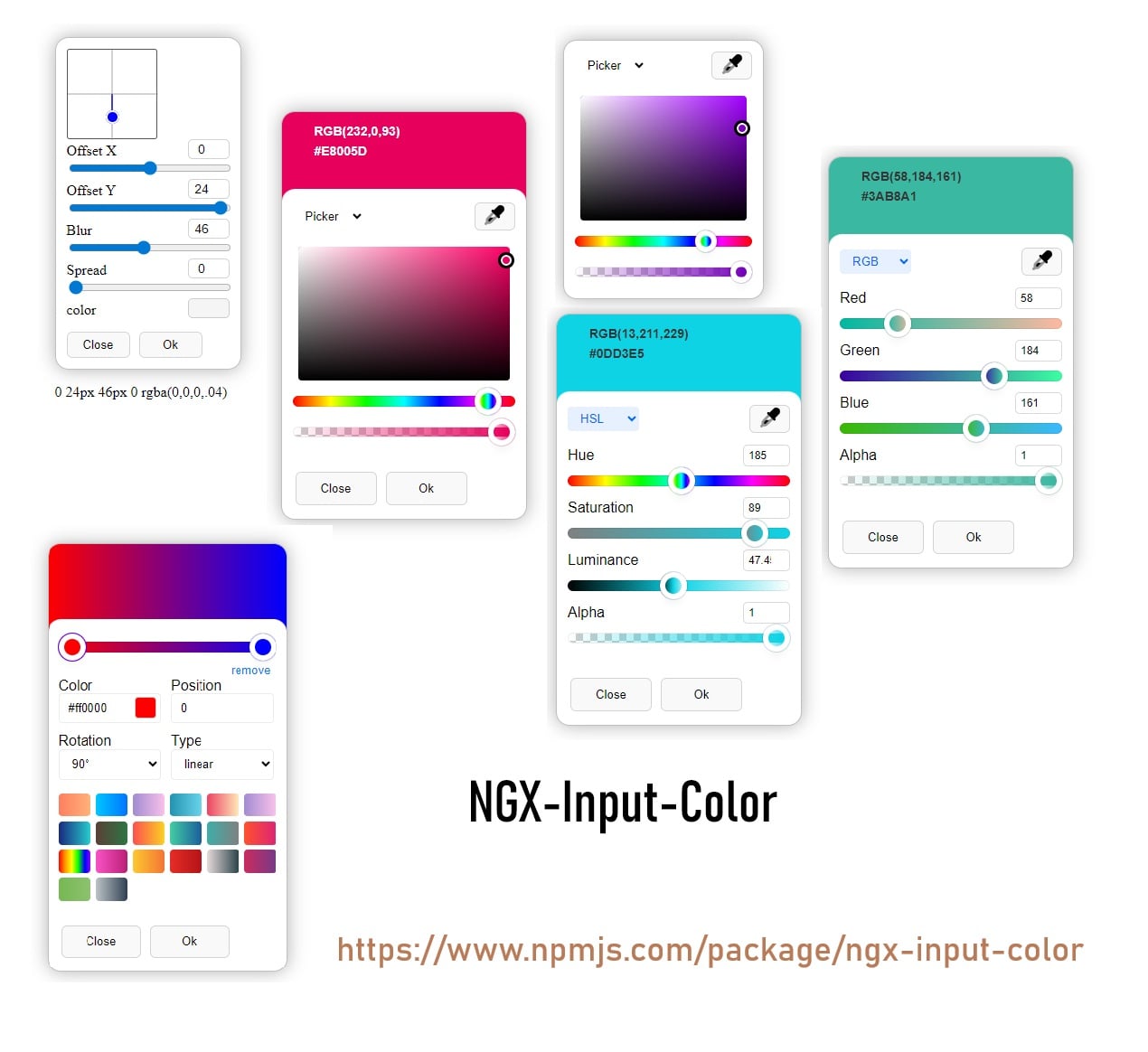
ngx-input-color and ngx-input-gradient are powerful, customizable Angular components for color and gradient picking. They support multiple color formats, real-time preview, inline and input modes, and seamless integration with Angular forms.
🚀 Live Demo
✨ Features
- Multiple Color Formats: HEX, RGBA, HSLA, HSVA, CMYK (for color), and full CSS gradients (for gradient)
- Interactive UI: Drag-and-drop sliders for hue, saturation, lightness, alpha, and more
- Angular Forms Integration: Works with
ngModeland reactive forms - EyeDropper API Support: Pick colors from anywhere on your screen (if supported)
- Live Preview: Instantly see the selected color or gradient
- Highly Customizable: set input background color, Simple mode and more
- Inline & Input Modes: Use as a popup input or as an always-visible inline component
- Unit Tested: Includes comprehensive unit tests
📦 Installation
npm install ngx-input-color
# or
yarn add ngx-input-color
# or
pnpm add ngx-input-color
🛠️ Usage
Import in standalone component or module
import { NgxInputColor } from 'ngx-input-color/color-picker';

@Component({
  selector: 'app-component',
  templateUrl: './app.component.html',
  styleUrls: ['./app.component.scss'],
  imports: [FormsModule, NgxInputColor,...],
})
...
Input Mode (Popup)
- Color Picker Input
<input ngxInputColor [(ngModel)]="color" />
<span>Selected: {{ color }}</span>
- Gradient Picker Input
import { NgxInputGradient } from 'ngx-input-color/gradient-picker';

@Component({
  selector: 'app-component',
  templateUrl: './app.component.html',
  styleUrls: ['./app.component.scss'],
  imports: [FormsModule, NgxInputGradient,...],
  template:`
  <input ngxInputGradient [(ngModel)]="gradient" />
  <span>Selected: {{ gradient }}</span>
  `
})
...
Inline Mode (Always Visible)
- Inline Color Picker
<ngx-input-color [(ngModel)]="inlineColor" [simpleMode]="false"></ngx-input-color>
<span>Selected: {{ inlineColor }}</span>
- Inline Gradient Picker
<ngx-input-gradient [(ngModel)]="inlineGradient"></ngx-input-gradient>
<span>Selected: {{ inlineGradient }}</span>
📚 API Reference
NgxInputColor (Input & Inline)
| Name | Type | Default | Description |
|---|---|---|---|
setInputBackgroundColor | boolean | true | Set input background to selected color |
simpleMode | boolean | false | Compact UI |
useAlphaChannel | boolean | true | Use alpha channel |
defaultInspector | ColorInspector enum | Picker | Default inspector (Picker, RGB, HSL, CMYK) |
[(ngModel)] / formControl | string | Two-way binding for the selected color | |
change (Output) | EventEmitter<string> | Emits the color value on change |
Supported Color Formats
- HEX (
#RRGGBBor#RRGGBBAA) - RGBA (
rgba(255,255,255,1)) - HSLA (
hsla(360,100%,100%,1)) - HSVA
- CMYK
NgxInputGradient (Input & Inline)
| Name | Type | Default | Description |
|---|---|---|---|
[(ngModel)] / formControl | string | Two-way binding for the selected gradient | |
change (Output) | EventEmitter<string> | Emits the gradient value on change |
Supported Gradient Formats
- CSS Linear Gradients (e.g.
linear-gradient(90deg, #ff0000 0%, #00ff00 100%)) - CSS Radial Gradients (e.g.
radial-gradient(circle, #ff0000 0%, #00ff00 100%))
⚙️ Customization
- visibility, and UI modes are fully customizable via component inputs.
- Works seamlessly with both Template-driven and Reactive Forms.
🧪 Testing & Development
- This library includes comprehensive unit tests. Run
ng testto verify functionality. - Contributions are welcome! Please open an issue or submit a pull request.
❓ FAQ
-
Can I programmatically set the color/gradient?
Yes, simply update the variable bound tongModelor your form control. -
Is EyeDropper API supported?
Yes, in modern browsers that support the EyeDropper API.
📄 License
MIT
🔗 Useful Links
Developer: Mohammadreza Samani
Made With 🧡 From IRAN