BoxPlot 차트
February 17, 2021 · View on GitHub
차트별로 사용할 수 있는 API는 이 가이드에서 다루지 않는다. 사용 가능한 API가 궁금하다면 API 가이드를 참고하자.
차트 생성하기
BoxPlot 차트의 생성 방법은 두 가지가 있다. 생성자 함수와 정적 함수를 통해 생성할 수 있다. 결과는 모두 차트의 인스턴스가 반환된다. 매개 변수는 차트가 그려지는 영역인 HTML 요소 el, 데이터값인 data, 옵션값 options가 객체로 들어간다. el 값은 차트의 컨테이너 영역이므로 차트 외에 다른 요소들이 포함되어 있으면 차트에 영향을 줄 수 있음으로 비어있는 HTML 요소를 사용하는 것을 권장한다.
import { BoxPlotChart } from '@toast-ui/chart';

const chart = new BoxPlotChart({el, data, options});

// 혹은

import Chart from '@toast-ui/chart';

const chart = Chart.boxPlotChart({el, data, options});
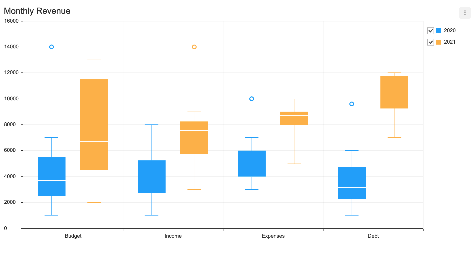
기본 차트
데이터 타입
categories 값은 x축의 틱에 나타나며 series 값은 name과 data가 모두 작성된 데이터를 입력해야 한다. 필요에 따라 outlier 데이터를 입력해야 한다. name은 각각의 시리즈를 구분할 목적으로 사용하는 유일한 id로 작성한다.
const data = {
  categories: ['Budget', 'Income', 'Expenses', 'Debt'],
  series: [
    {
      name: '2020',
      data: [
        [1000, 2500, 3714, 5500, 7000],
        [1000, 2750, 4571, 5250, 8000],
        [3000, 4000, 4714, 6000, 7000],
        [1000, 2250, 3142, 4750, 6000]
      ],
      outliers: [
        [0, 14000],
        [2, 10000],
        [3, 9600]
      ],
    },
    {
      name: '2021',
      data: [
        [2000, 4500, 6714, 11500, 13000],
        [3000, 5750, 7571, 8250, 9000],
        [5000, 8000, 8714, 9000, 10000],
        [7000, 9250, 10142, 11750, 12000]
      ],
      outliers: [[1, 14000]]
    },
  ],
};
visible 옵션
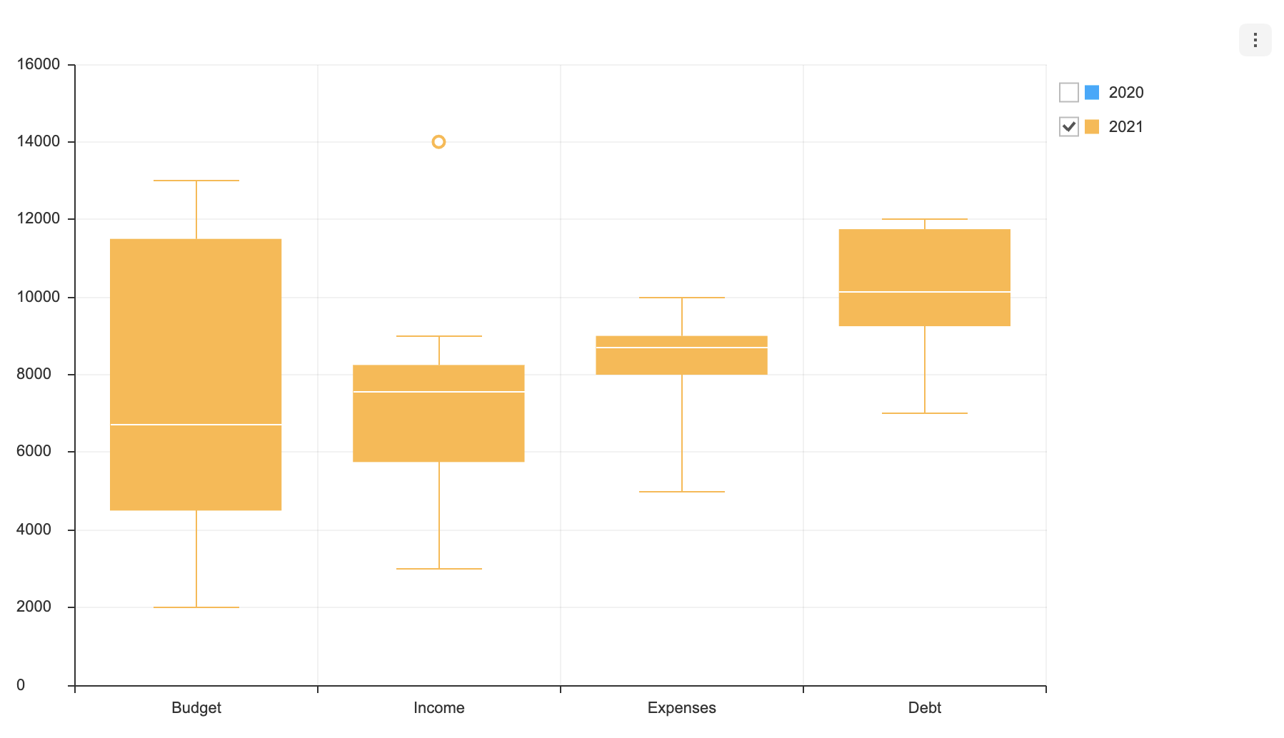
각각의 series는 visible 옵션을 가질 수 있다. visible 옵션은 처음 차트가 그려졌을 때 시리즈를 나타낼지에 대한 여부를 결정한다. 기본값은 true이다.
const data = {
  categories: ['Budget', 'Income', 'Expenses', 'Debt'],
  series: [
    {
      name: '2020',
      data: [
        [1000, 2500, 3714, 5500, 7000],
        [1000, 2750, 4571, 5250, 8000],
        [3000, 4000, 4714, 6000, 7000],
        [1000, 2250, 3142, 4750, 6000]
      ],
      outliers: [
        [0, 14000],
        [2, 10000],
        [3, 9600]
      ],
      visible: false
    },
    {
      name: '2021',
      data: [
        [2000, 4500, 6714, 11500, 13000],
        [3000, 5750, 7571, 8250, 9000],
        [5000, 8000, 8714, 9000, 10000],
        [7000, 9250, 10142, 11750, 12000]
      ],
      outliers: [[1, 14000]]
    },
  ],
};
위 옵션을 적용해 차트를 생성해보면 체크박스가 해제되어 생성되는 것을 확인할 수 있습니다.
옵션
options는 객체로 작성한다.
type options = {
  chart?: {
    // ...
  },
  xAxis?: {
    // ...
  },
  yAxis?: {
    // ...
  },
  legend?: {
    // ...
  },
  exportMenu?: {
    // ...
  },
  tooltip?: {
    // ...
  },
  plot?: {
    // ...
  },
  responsive?: {
    // ...
  },
  theme?: {
    // 아래 테마 챕터에서 설명
  },
  series?: {
    selectable?: boolean;
    eventDetectType?: 'point' | 'grouped';
  }
};
이 차트에서 사용할 수 있는 공통 옵션에 대해서는 이 가이드에서 다루지 않는다. 필요하다면 해당 옵션의 가이드를 참고하자. (링크:
chart옵션, 축, 범례, 내보내기, 툴팁, 플롯,responsive옵션 )
selectable
해당 시리즈를 선택할 수 있다.
- 기본값:
false
const options = {
  series: {
    selectable: true
  }
};
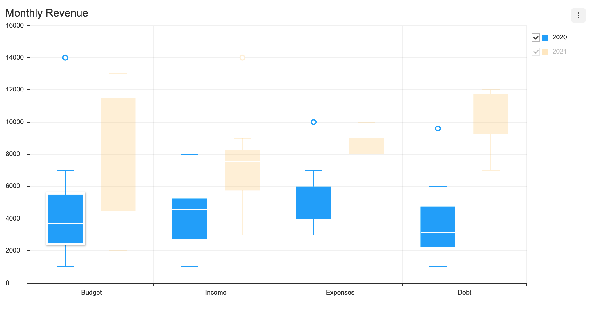
selectable 옵션과 on API의 selectSeries, unselectSeries를 함께 사용할 경우 해당 시리즈에 대한 제어를 추가로 할 수 있다.
eventDetectType
툴팁을 나타낼 때 발생하는 마우스 오버와 시리즈를 선택할 때 발생하는 마우스 클릭 시 데이터를 탐지하는 방법을 정의한다.
| 타입 | 설명 |
|---|---|
point | 현재 마우스가 가리키고 있는 포인트를 기준으로 단 한 개만 탐지됨 |
grouped | X축을 기준으로 값이 같은 모든 데이터가 탐지됨 |
- 기본값:
point
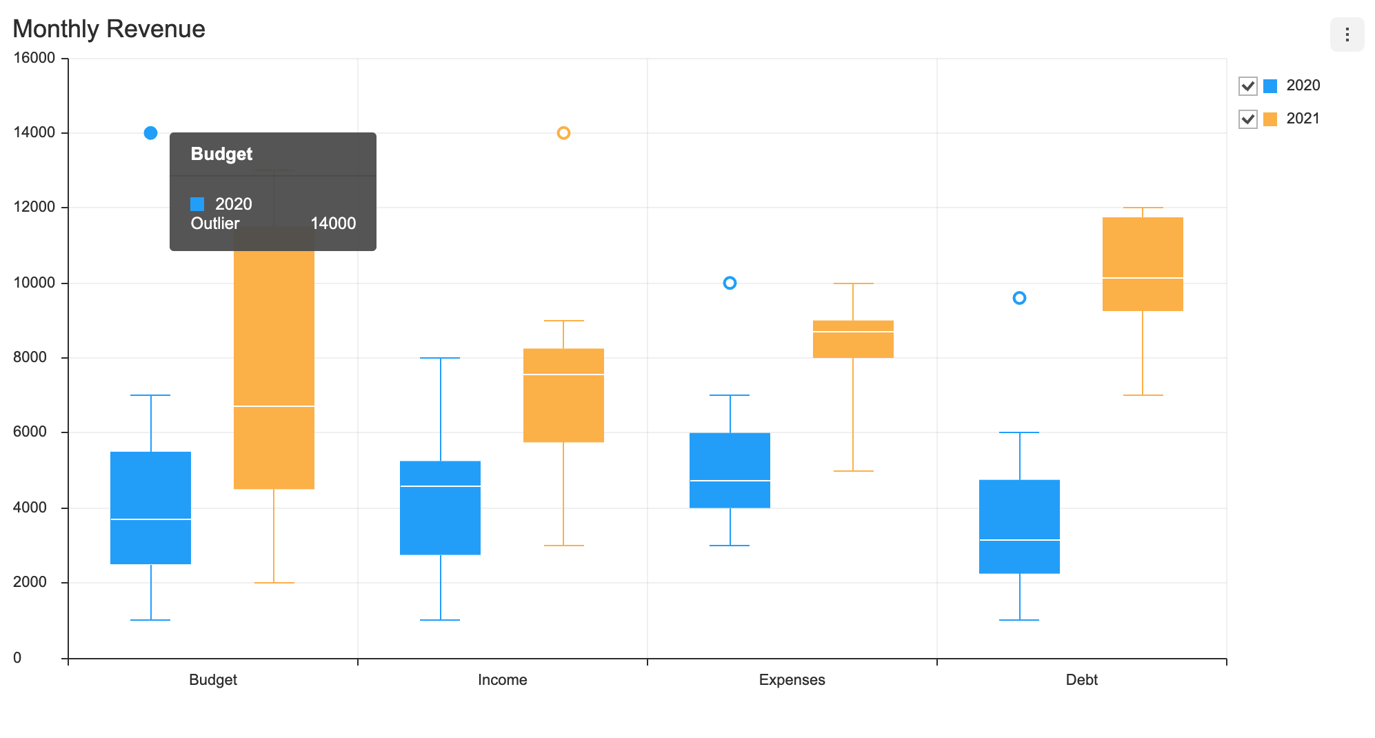
eventDetectType가 'point'이면, 이상치를 나타내는 점은 중앙값, 상한/하한 사분위수, 최소/최대값을 나타내는 영역과 별개로 탐지된다.
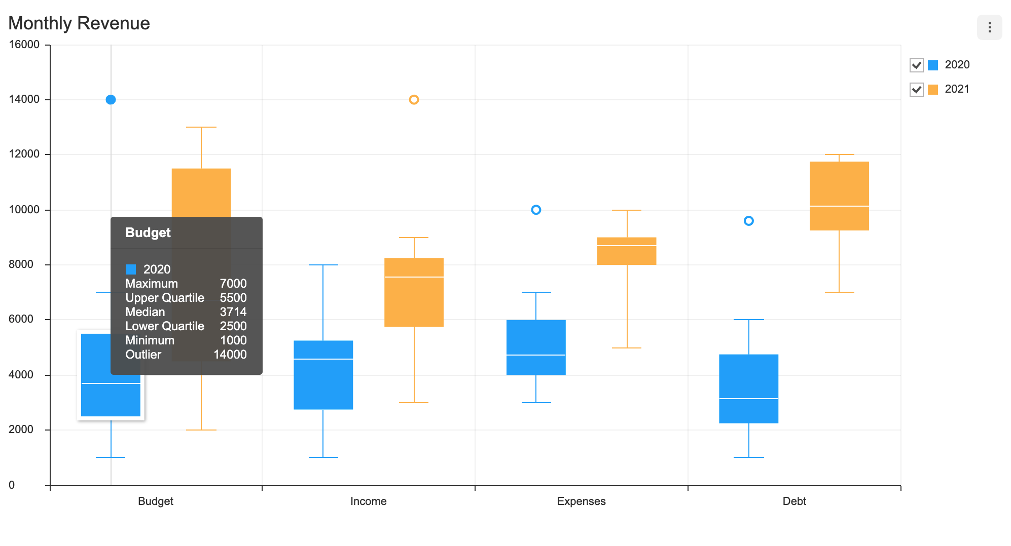
eventDetectType을 'grouped'로 설정할 경우 해당 시리즈의 중앙값, 상한/하한 사분위수, 최소/최대값, 이상치가 모두 탐지된다.
const options = {
  series: {
    eventDetectType: 'grouped'
  }
};
시리즈 theme
BoxPlot 차트에서 수정할 수 있는 시리즈 테마이다.
interface BoxPlotChartSeriesTheme {
  areaOpacity?: number;
  colors?: string[];
  barWidth?: number | string;
  barWidthRatios?: {
    barRatio?: number;
    minMaxBarRatio?: number;
  };
  dot: {
    color?: string;
    radius?: number;
    borderColor?: string;
    borderWidth?: number;
    useSeriesColor?: boolean;
  };
  line?: {
    whisker?: { lineWidth?: number; color?: string };
    minimum?: { lineWidth?: number; color?: string };
    maximum?: { lineWidth?: number; color?: string };
    median?: { lineWidth?: number; color?: string };
  };
  rect?: {
    borderColor?: string;
    borderWidth?: number;
  };
  hover?: {
    color?: string;
    rect?: {
      borderColor?: string;
      borderWidth?: number;
    };
    dot?: {
      color?: string;
      radius?: number;
      borderColor?: string;
      borderWidth?: number;
      useSeriesColor?: boolean;
    };
    line?: {
      whisker?: { lineWidth?: number; color?: string };
      minimum?: { lineWidth?: number; color?: string };
      maximum?: { lineWidth?: number; color?: string };
      median?: { lineWidth?: number; color?: string };
    };
    shadowColor?: string;
    shadowOffsetX?: number;
    shadowOffsetY?: number;
    shadowBlur?: number;
  };
  select?: {
    color?: string;
    rect?: {
      borderColor?: string;
      borderWidth?: number;
    };
    dot?: {
      color?: string;
      radius?: number;
      borderColor?: string;
      borderWidth?: number;
      useSeriesColor?: boolean;
    };
    line?: {
      whisker?: { lineWidth?: number; color?: string };
      minimum?: { lineWidth?: number; color?: string };
      maximum?: { lineWidth?: number; color?: string };
      median?: { lineWidth?: number; color?: string };
    };
    shadowColor?: string;
    shadowOffsetX?: number;
    shadowOffsetY?: number;
    shadowBlur?: number;
    areaOpacity?: number;
    restSeries?: {
      areaOpacity?: number;
    };
  };
}
| 이름 | 타입 | 설명 |
|---|---|---|
colors | string[] | 시리즈의 색상 |
areaOpacity | number | 모든 시리즈가 활성 되어 있을 때의 전체 영역 투명도 |
barWidth | number | string | 시리즈 박스 너비 |
barWidthRatios | object | 박스 너비와 최소/최대값 길이 비율 설정 |
barWidthRatios.barRatio | number | 박스 너비 비율 (기본값: 1) |
barWidthRatios.minMaxBarRatio | number | 최소/최대값 길이 비율 (기본값: 0.5) |
dot | object | 이상치에 해당하는 점 스타일 |
dot.color | string | 점의 배경색 |
dot.radius | number | 점의 반지름 길이 |
dot.borderColor | string | 점의 테두리 색깔 |
dot.borderWidth | number | 점의 테두리 두께 |
dot.useSeriesColor | boolean | 시리즈 색깔을 사용 유무 |
line | object | 중앙값, 최소/최대값, 최대와 최소값을 잇는 선(whisker)을 나타내는 선 스타일 |
line.whisker | object | 최대와 최소값을 잇는 선 스타일 |
line.whisker.lineWidth | number | 선의 두께 |
line.whisker.color | string | 선의 색깔 |
line.minimum | object | 최소값을 나타내는 선 스타일 |
line.maximum | object | 최대값을 나타내는 선 스타일 |
line.median | object | 중앙을 나타내는 선 스타일 |
rect | object | 상한/하한 사분위 값을 나타내는 박스 스타일 |
rect.borderColor | string | 박스 테두리 색깔 |
rect.borderWidth | number | 박스 테두리 두께 |
hover | object | 데이터에 마우스를 올렸을 때 스타일 |
select | object | 옵션 series.selectable: true로 설정 되어 있을 때 시리즈가 선택 되면 적용되는 스타일 |
select.areaOpacity | number | 선택된 시리즈의 영역 투명도 |
select.restSeries | object | 선택되지 않은 시리즈의 스타일 |
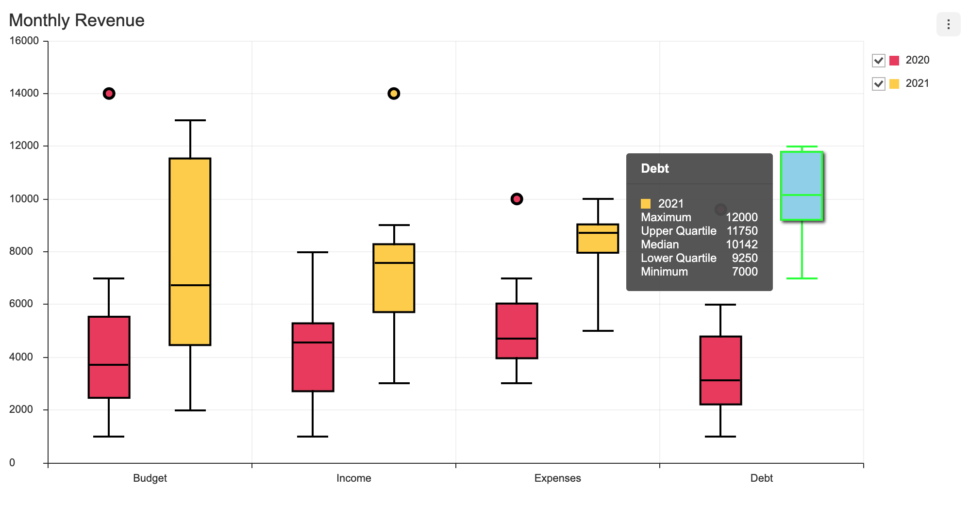
테마는 옵션에서 theme 옵션을 지정하고 시리즈 테마는 theme.series로 설정한다. 아래 코드는 BoxPlot 시리즈의 색상과 너비를 바꾸고, 마우스를 올렸을 때 스타일을 변경한 옵션이다.
const options = {
  theme: {
    series: {
      colors: ['#EE4266', '#FFD23F'],
      barWidth: 40,
      barWidthRatios: {
        barRatio: 1,
        minMaxBarRatio: 0.8,
      },
      dot: {
        radius: 5,
        borderWidth: 3,
        borderColor: '#000000',
        useSeriesColor: true,
      },
      rect: {
        borderWidth: 2,
        borderColor: '#000000',
      },
      line: {
        whisker: {
          lineWidth: 2,
          color: '#000000',
        },
        maximum: {
          lineWidth: 2,
          color: '#000000',
        },
        minimum: {
          lineWidth: 2,
          color: '#000000',
        },
        median: {
          lineWidth: 2,
          color: '#000000',
        },
      },
      hover: {
        color: '#96D6ED',
        rect: { borderColor: '#00ff00', borderWidth: 2 },
        dot: { radius: 6 },
        shadowColor: 'rgba(0, 0, 0, 0.7)',
        shadowOffsetX: 4,
        shadowOffsetY: 4,
        shadowBlur: 6,
        line: {
          whisker: {
            lineWidth: 2,
            color: '#00ff00',
          },
          maximum: {
            lineWidth: 2,
            color: '#00ff00',
          },
          minimum: {
            lineWidth: 2,
            color: '#00ff00',
          },
          median: {
            lineWidth: 2,
            color: '#00ff00',
          },
        },
      }
    }
  }
};
옵션에 대한 결과는 다음과 같다.