🎨 Shadcn Theme Editor
September 28, 2025 · View on GitHub
🎨 Shadcn Theme Editor
Effortless Shadcn Theme Customization Made Simple
Manage Shadcn theme colors with an intuitive UI, adjust styles in real-time, and keep your design consistent without diving into raw CSS.







📍 Overview
The Shadcn Theme Editor is a lightweight component designed to simplify theme customization in Shadcn projects.
- 🎛 Visual UI for adjusting theme colors
- ⚡ Real-time preview of changes
- 🌗 Supports light & dark mode via the
html.darkclass - 🛠 Works seamlessly with Shadcn components
- 📦 Install as a dev dependency (recommended, due to bundle size)
This makes it a must-have dev tool for anyone building with shadcn/ui.
🚀 Installation
There are two ways to install shadcn-theme-editor:
- Via npm/yarn/pnpm/bun (as a dev dependency)
- Via Scaflo CLI (copies fully editable components)
1️⃣ Install via npm (as a dev dependency)
Install the package as a development dependency:
# npm
npm install --save-dev shadcn-theme-editor

# yarn
yarn add --dev shadcn-theme-editor

# pnpm
pnpm add -D shadcn-theme-editor

# bun
bun add -D shadcn-theme-editor
TailwindCSS:
-
Tailwind v4
@import "tailwindcss"; +@source "../node_modules/shadcn-theme-editor"; /** <-- depends on your project structure */ -
Tailwind v3
module.exports = {
content: [
  // ...
+  "./node_modules/shadcn-theme-editor/**/*", /** <-- depends on your project structure */
],
// ...
};
2️⃣ Install via Scaflo CLI
The Scaflo CLI installs Shadcn Theme Editor as source components into your project, so you can fully customize them.
# pnpm (recommended)
pnpm dlx shadcn@latest add sheet button accordion
pnpm dlx scaflo@0.0.4 https://shadcnthemeeditor.vercel.app/r/editor.json -e %COMPONENTS%/shadcn-theme-editor

# or with npx
npx shadcn@latest add sheet button accordion
npx scaflo@0.0.4 https://shadcnthemeeditor.vercel.app/r/editor.json -e %COMPONENTS%/shadcn-theme-editor

# or with bun
bunx shadcn@latest add sheet button accordion
bunx scaflo@0.0.4 https://shadcnthemeeditor.vercel.app/r/editor.json -e %COMPONENTS%/shadcn-theme-editor
Follow the CLI prompts to generate and configure the components inside your own codebase.
⚠️ Note for Next.js: Add
"use client";tocomponents/shadcn-theme-editor/index.tsx.
📖 Usage
Import the component and add it to your layout:
import ShadcnThemeEditor from "shadcn-theme-editor";
Load in Development Only
Exclude the editor from production builds:
let ShadcnThemeEditor: any;
if (process.env.NODE_ENV === 'development') {
  import('shadcn-theme-editor').then(module => {
    ShadcnThemeEditor = module.default; // or module, depending on the module's export
  });
} else {
  // eslint-disable-next-line react/display-name
  ShadcnThemeEditor = ()=>null
}
and use
<ShadcnThemeEditor />
🖼️ Screenshots
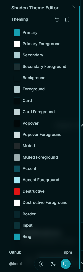
For detailed UI examples, see: usage.md
⚙️ Props
| Prop | Type | Default | Description |
|---|---|---|---|
side | "left" | "right" | "left" |
className | string | undefined | Extra CSS classes for the root element. |
triggerClassName | string | undefined | Extra CSS classes for the trigger button. |
title | string | "Shadcn Theme Editor" | Sidebar header text. |
customColors | Record<string, string> | undefined | Map of CSS vars → labels (e.g. --primary: "Primary"). |
getContainer | () => HTMLElement | () => document.documentElement | Element where dynamic styles will be injected. |
🙌 Special Thanks
- Julian creator of ui.jln.dev, featuring 10,000+ Shadcn themes.
📄 License
Licensed under the MIT License.