Svelte Command Palette
January 4, 2026 · View on GitHub
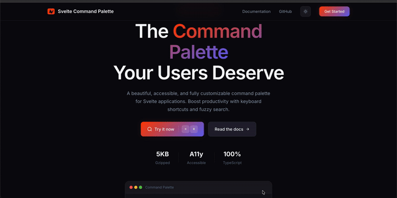
Increase your productivity exponentially. 🚀🚀
A beautiful, accessible, and fully customizable command palette for Svelte 5 applications.
~2.1KB Minified | ~700B Gzipped
Demo
✨ Features
- 🔍 Fuzzy Search - Powered by Fuse.js for intelligent searching
- ⌨️ Keyboard Shortcuts - Define custom shortcuts for any action
- 🎨 Fully Customizable - Style every element with classes or inline styles
- 📱 Mobile Responsive - Bottom sheet UI on mobile devices
- ♿ Accessible - Full ARIA support and keyboard navigation
- 🎯 Conditional Actions - Run actions based on current state
- 📦 Action Grouping - Organize actions into logical groups
- 🔔 Event Callbacks -
onOpen,onClose,onActionSelecthooks - 🎭 Custom Empty State - Render custom UI when no results found
- 🌙 Dark Mode Ready - Built-in dark mode support
- 📝 TypeScript - Full type definitions included
What's New in v2.0
- Svelte 5 Support - Fully migrated to Svelte 5 with runes (
$props,$state,$effect,$derived) - Customizable Trigger Shortcut - Change the default
$mod+kto any shortcut - Component Callbacks -
onOpen,onClose,onActionSelectprops - Action Icons - Add icons to your actions
- Action Grouping - Group related actions together
- Custom Empty State - Provide a custom snippet for empty results
- Focus Trap - Keyboard focus stays within the palette
- Improved Accessibility - Better ARIA attributes and keyboard handling
- Type Exports - Export
actiontype for TypeScript users
⚠️ Breaking Changes (v1.x → v2.x)
Version 2.0 is a complete rewrite for Svelte 5 and includes breaking changes:
| Change | v1.x (Svelte 3/4) | v2.x (Svelte 5) |
|---|---|---|
| Svelte version | Svelte 3/4 | Svelte 5+ |
| Props syntax | export let | $props() runes |
| Event handlers | on:click | onclick |
| Slots | <slot /> | {#snippet} / {@render} |
| Reactivity | $: statements | $derived, $effect |
New Props in v2.0
shortcut- Customize the keyboard shortcut (default:$mod+k)onOpen- Callback when palette opensonClose- Callback when palette closesonActionSelect- Callback when an action is selectedemptyState- Custom snippet for empty results
New Action Properties
icon- Add an icon (emoji or string) to actionsgroup- Group related actions together
Using with Svelte 3/4
If you're still using Svelte 3 or 4, install the legacy version:
# For Svelte 3/4 projects
npm install svelte-command-palette@1.2.1
The v1.x documentation is available at the v1.2.1 release.
Version Compatibility
| svelte-command-palette | Svelte Version |
|---|---|
^2.0.0 | Svelte 5+ |
^1.2.1 | Svelte 3, 4 |
Installation
npm install svelte-command-palette
pnpm add svelte-command-palette
yarn add svelte-command-palette
Quick Start
<script>
  import CommandPalette, { defineActions, createStoreMethods } from 'svelte-command-palette';

  const storeMethods = createStoreMethods();

  const actions = defineActions([
    {
      title: 'Go to Dashboard',
      subTitle: 'Navigate to the main dashboard',
      onRun: () => {
        window.location.href = '/dashboard';
      },
      shortcut: '$mod+d',
      keywords: ['home', 'main'],
      group: 'Navigation'
    },
    {
      title: 'Toggle Dark Mode',
      subTitle: 'Switch between light and dark themes',
      onRun: () => {
        document.documentElement.classList.toggle('dark');
      },
      shortcut: '$mod+Shift+d',
      icon: '🌙',
      group: 'Settings'
    },
    {
      title: 'Open GitHub',
      subTitle: 'View source code on GitHub',
      onRun: () => {
        window.open('https://github.com/rohitpotato/svelte-command-palette');
      },
      icon: '📦'
    }
  ]);
</script>

<button onclick={() => storeMethods.openPalette()}>
  Open Command Palette
</button>

<CommandPalette
  commands={actions}
  placeholder="What would you like to do?"
  shortcut="$mod+k"
  onOpen={() => console.log('Palette opened')}
  onClose={() => console.log('Palette closed')}
  onActionSelect={(action) => console.log('Selected:', action.title)}
/>
API Reference
CommandPalette Component Props
| Property | Type | Default | Description |
|---|---|---|---|
commands | action[] | [] | Array of actions to display |
placeholder | string | "Search for an action..." | Input placeholder text |
shortcut | string | "$mod+k" | Keyboard shortcut to open palette |
onOpen | () => void | - | Callback when palette opens |
onClose | () => void | - | Callback when palette closes |
onActionSelect | (action) => void | - | Callback when action is selected |
unstyled | boolean | false | Disable default styles |
emptyState | Snippet | - | Custom empty state content |
Styling Props
All styling props accept either a class name (string) or style object (Properties).
| Class Prop | Style Prop | Description |
|---|---|---|
overlayClass | overlayStyle | Backdrop overlay |
paletteWrapperInnerClass | paletteWrapperInnerStyle | Main palette container |
inputClass | inputStyle | Search input |
resultsContainerClass | resultsContainerStyle | Results list container |
resultContainerClass | resultContainerStyle | Individual result item |
optionSelectedClass | optionSelectedStyle | Active/selected result |
titleClass | titleStyle | Result title |
subtitleClass | subtitleStyle | Result subtitle |
descriptionClass | descriptionStyle | Result description |
keyboardButtonClass | keyboardButtonStyle | Keyboard shortcut badges |
Action API
Define actions using the defineActions helper:
type action = {
  actionId?: string | number;        // Unique identifier (auto-generated if not provided)
  title: string;                      // Main display text (required)
  subTitle?: string;                  // Secondary text
  description?: string;               // Additional description
  keywords?: string[];                // Search keywords
  shortcut?: string;                  // Keyboard shortcut (e.g., "$mod+k")
  icon?: string | Snippet;           // Icon (emoji, URL, or Snippet for custom SVG/component)
  group?: string;                     // Group name for organizing actions
  onRun?: (params) => void;          // Callback when action is executed
  canActionRun?: (params) => boolean; // Conditional execution
};
onRun and canActionRun Parameters
type onRunParams = {
  action: action;                     // The current action
  storeProps: storeParams;           // Current store state
  storeMethods: StoreMethods;        // Store manipulation methods
};
Store Methods
Access palette controls from anywhere in your app:
import { createStoreMethods } from 'svelte-command-palette';

const methods = createStoreMethods();

// Available methods:
methods.openPalette();           // Open the palette
methods.closePalette();          // Close the palette
methods.togglePalette();         // Toggle open/close
methods.resetPaletteStore();     // Reset to initial state
methods.getAllCalledActions();   // Get history of executed actions
methods.storeCalledAction(id);   // Add action to history
methods.revertLastAction(id);    // Remove last action from history
methods.resetActionLog();        // Clear action history
Direct Store Access
For advanced use cases, access the store directly:
import { paletteStore } from 'svelte-command-palette';

// Subscribe to changes
paletteStore.subscribe(state => {
  console.log('Palette visible:', state.isVisible);
  console.log('Search text:', state.textInput);
  console.log('Results:', state.results);
});

// Update directly
paletteStore.update(state => ({
  ...state,
  isVisible: true
}));
Examples
Conditional Actions
const actions = defineActions([
  {
    title: 'Admin Panel',
    subTitle: 'Only visible to admins',
    canActionRun: ({ storeProps }) => {
      return storeProps.user?.role === 'admin';
    },
    onRun: () => {
      window.location.href = '/admin';
    }
  }
]);
Action Groups
const actions = defineActions([
  { title: 'Dashboard', group: 'Navigation', onRun: () => goto('/') },
  { title: 'Settings', group: 'Navigation', onRun: () => goto('/settings') },
  { title: 'Profile', group: 'User', onRun: () => goto('/profile') },
  { title: 'Logout', group: 'User', onRun: () => signOut() }
]);
Custom Icons
The icon property supports multiple formats:
Emoji Icons
const actions = defineActions([
  { title: 'Settings', icon: '⚙️', onRun: () => {} },
  { title: 'Search', icon: '🔍', onRun: () => {} }
]);
Image URLs
const actions = defineActions([
  { title: 'GitHub', icon: 'https://github.com/favicon.ico', onRun: () => {} },
  { title: 'Logo', icon: '/images/logo.svg', onRun: () => {} }
]);
Custom SVG with Snippets
<script>
  import CommandPalette, { defineActions } from 'svelte-command-palette';

  // Define a snippet for custom SVG
  const settingsIcon = {
    icon: settingsIconSnippet
  };
</script>

{#snippet settingsIconSnippet()}
  <svg xmlns="http://www.w3.org/2000/svg" width="20" height="20" viewBox="0 0 24 24" fill="none" stroke="currentColor" stroke-width="2">
    <circle cx="12" cy="12" r="3"></circle>
    <path d="M12 1v2M12 21v2M4.22 4.22l1.42 1.42M18.36 18.36l1.42 1.42M1 12h2M21 12h2M4.22 19.78l1.42-1.42M18.36 5.64l1.42-1.42"></path>
  </svg>
{/snippet}

<!-- Use in actions -->
<script>
  const actions = defineActions([
    {
      title: 'Settings',
      icon: settingsIconSnippet,
      onRun: () => openSettings()
    }
  ]);
</script>

<CommandPalette commands={actions} />
Third-Party Icon Libraries (Lucide, Heroicons, etc.)
<script>
  import CommandPalette, { defineActions } from 'svelte-command-palette';
  import { Settings, Search, User } from 'lucide-svelte';
</script>

{#snippet settingsIcon()}
  <Settings size={20} />
{/snippet}

{#snippet searchIcon()}
  <Search size={20} />
{/snippet}

{#snippet userIcon()}
  <User size={20} />
{/snippet}

<script>
  const actions = defineActions([
    { title: 'Settings', icon: settingsIcon, onRun: () => {} },
    { title: 'Search', icon: searchIcon, onRun: () => {} },
    { title: 'Profile', icon: userIcon, onRun: () => {} }
  ]);
</script>

<CommandPalette commands={actions} />
Custom Empty State
<CommandPalette commands={actions}>
  {#snippet emptyState()}
    <div class="empty-state">
      <p>No results found</p>
      <button onclick={() => createNewAction()}>Create new action</button>
    </div>
  {/snippet}
</CommandPalette>
Custom Styling
<CommandPalette
  commands={actions}
  overlayClass="bg-black/50 backdrop-blur-sm"
  paletteWrapperInnerClass="bg-gray-900 rounded-xl shadow-2xl"
  inputClass="bg-transparent text-white placeholder-gray-400"
  resultContainerClass="hover:bg-gray-800 transition-colors"
  optionSelectedClass="bg-blue-600"
  inputStyle={{ fontSize: '18px' }}
/>
Keyboard Shortcuts
Use tinykeys syntax for shortcuts:
const actions = defineActions([
  { title: 'Save', shortcut: '$mod+s', onRun: save },      // Cmd+S / Ctrl+S
  { title: 'Undo', shortcut: '$mod+z', onRun: undo },      // Cmd+Z / Ctrl+Z
  { title: 'Search', shortcut: '$mod+Shift+f', onRun: search }, // Cmd+Shift+F
  { title: 'Help', shortcut: 'F1', onRun: showHelp }       // F1
]);
Keyboard Navigation
| Key | Action |
|---|---|
Cmd/Ctrl + K | Open/close palette (customizable) |
↑ / ↓ | Navigate through results |
Enter | Execute selected action |
Escape | Close palette |
Tab | Cycle through focusable elements |
TypeScript
Full TypeScript support with exported types:
import type { action, commands, storeParams, ActionId, onRunParams } from 'svelte-command-palette';

const myAction: action = {
  title: 'My Action',
  onRun: ({ action, storeProps, storeMethods }: onRunParams) => {
    console.log(action.title);
  }
};
Browser Support
- Chrome/Edge (latest)
- Firefox (latest)
- Safari (latest)
Contributing
Contributions are welcome! Please read our contributing guidelines before submitting a PR.
# Clone the repo
git clone https://github.com/rohitpotato/svelte-command-palette.git

# Install dependencies
npm install

# Run development server
npm run dev

# Run tests
npm test

# Run unit tests only
npm run test:unit

# Run E2E tests only
npm run test:e2e
License
MIT © Rohit Kashyap