ng-diagram
August 18, 2026 · View on GitHub


A robust Angular library for building interactive diagrams, node-based editors, and visual programming interfaces. Designed with Angular and TypeScript, it offers a complete toolkit to create sophisticated, customizable, and high-performance diagramming applications.
Unlike generic diagramming libraries, ng-diagram is Angular-first - built on Angular signals and templates for seamless integration and performance.
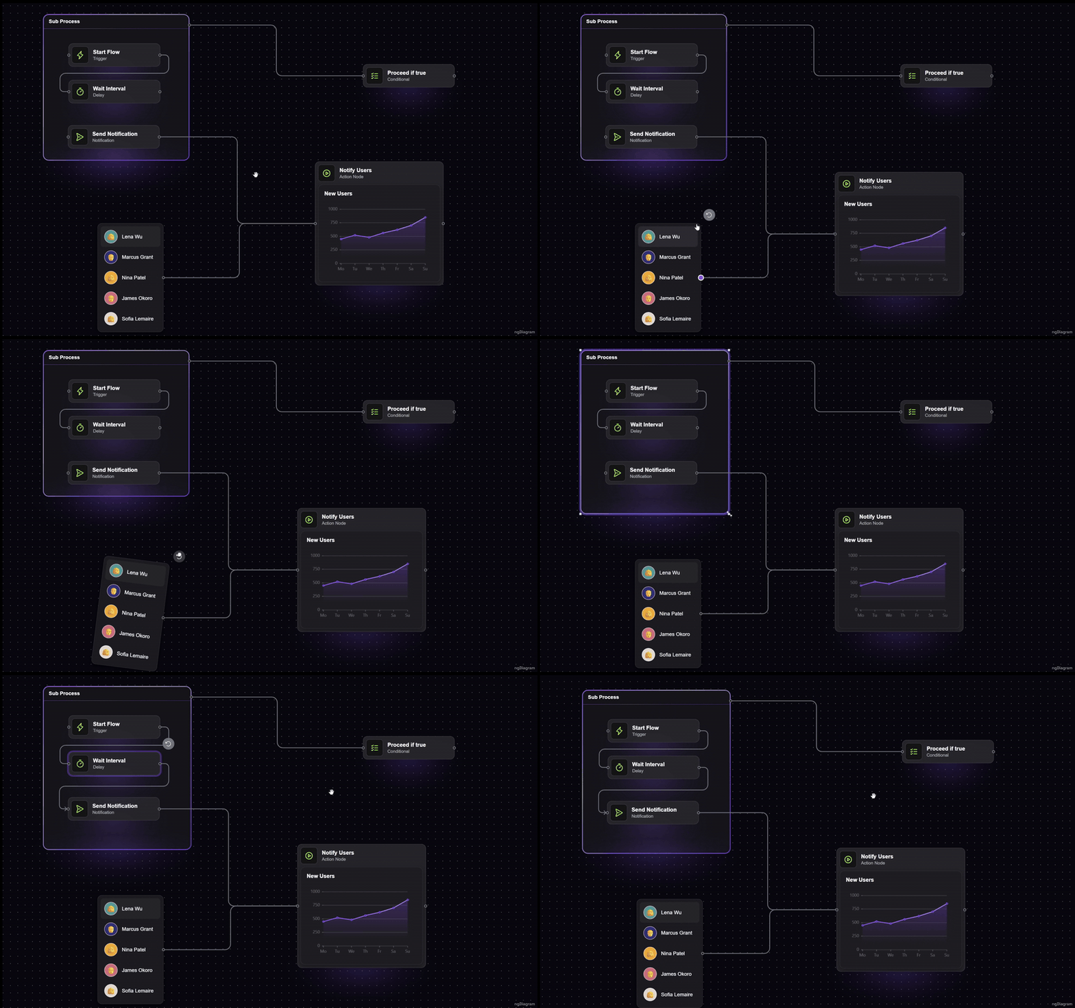
✨ Features
- 🎯 Interactive Elements: Draggable, resizable, and rotatable nodes
- 🔗 Flexible Edges: Orthogonal, polyline, and bezier routing, custom arrowheads, labels, and floating edges that connect without ports
- 🧩 Custom Templates: Your own Angular components as nodes and edges — templates, signals, DI, everything works
- 📦 Groups: Container nodes with nesting and group-aware dragging
- 🎛️ Rich Interactions: Selection, box selection, copy/paste, snapping, panning, zooming, and more
- ⌨️ Keyboard Shortcuts: Configurable, platform-aware bindings for all common actions
- 📱 Touch Support: Pinch zoom, two-finger panning, and long-press box selection out of the box
- 🗺️ Minimap: Bird's-eye overview widget with click-and-drag navigation
- 🎨 Consistent Styling: Built-in design system with CSS variables and light/dark themes
- 🖱️ Embedded Palette: Built-in drag-and-drop palette system for adding nodes to diagrams
- ⚡ Performance: Signal-based reactivity, spatial hashing, and viewport virtualization for large diagrams
- 🔌 Extensible Architecture: Middleware pipeline for custom behaviors and business logic
- 🤖 AI-Ready Docs: Official MCP server lets AI assistants search the docs and API from your editor
📚 What You Can Build
With ng-diagram, you can create:
- Flow Diagrams: Process flows, decision trees, and workflow visualizations
- Node-Based Editors: Visual programming interfaces and data flow editors
- Network Diagrams: System architectures and network topologies
- Mind Maps: Hierarchical information structures and brainstorming tools
- Circuit Diagrams: Electronic schematics and technical drawings
- Custom Visualizations: Any diagram type with custom node and edge templates
See our Templates for production-ready examples you can fork and customize.
🎮 Try the Demo
See ng-diagram in action: Live Demo | Source Code
🧩 Templates
Production-ready starter kits built with ng-diagram. Fork, customize, ship.
| Template | Description | Demo | Source |
|---|---|---|---|
| Org Chart | Tree-based org chart with drag-and-drop reordering, expand/collapse, ELK.js layout, minimap, dark/light theme | Live Demo | Source |
| Electric Circuit | Electronic circuit editor with a searchable SVG parts library, smart wire junctions, and SVG/JPEG/JSON export | Live Demo | Source |
| Single-Line Diagram | High-voltage substation SLD editor with IEC 60617 symbols and a schema-driven properties panel | Live Demo | Source |
| AV Schematic | Audio/video signal-flow editor with typed connectors (XLR, HDMI, Speakon) and PNG/DXF export for AutoCAD | Live Demo | Source |
| Assembly Line | Production-line monitor with Edit/Monitor modes, a live data feed, threshold-colored KPIs, sparklines, and PNG/SVG/DXF export | Live Demo | Source |
🚀 Quick Start
Installation
npm install ng-diagram
Import Styles
⚠️ Important: You must import the required styles for the diagram to display correctly.
Because the library uses CSS variables, import the stylesheet in your global file (e.g. src/styles.scss), not inside a component.
/* src/styles.scss */
@import 'ng-diagram/styles.css';
Create Your First Diagram
import { Component } from '@angular/core';
import { NgDiagramComponent, initializeModel, provideNgDiagram } from 'ng-diagram';

@Component({
  imports: [NgDiagramComponent],
  providers: [provideNgDiagram()],
  template: ` <ng-diagram [model]="model" /> `,
  styles: `
    :host {
      display: flex;
      height: 300px;
    }
  `,
})
export class MyDiagramComponent {
  model = initializeModel({
    nodes: [
      { id: '1', position: { x: 100, y: 150 }, data: { label: 'Node 1' } },
      { id: '2', position: { x: 400, y: 150 }, data: { label: 'Node 2' } },
    ],
    edges: [
      {
        id: '1',
        source: '1',
        sourcePort: 'port-right',
        targetPort: 'port-left',
        target: '2',
        data: {},
      },
    ],
  });
}
That's it! You now have a working diagram with default node and edge templates.
🎨 Customization
Custom Nodes
Create custom node components with any Angular template:
import { Component, input } from '@angular/core';
import { NgDiagramPortComponent, type NgDiagramNodeTemplate, type Node } from 'ng-diagram';

type CustomNodeData = { title: string; description: string };

@Component({
  selector: 'app-custom-node',
  imports: [NgDiagramPortComponent],
  template: `
    <div class="custom-node">
      <h3>{{ node().data.title }}</h3>
      <p>{{ node().data.description }}</p>
    </div>
    <ng-diagram-port id="input" side="left" type="target" />
    <ng-diagram-port id="output" side="right" type="source" />
  `,
  styles: [
    `
      .custom-node {
        background: #fff;
        border: 2px solid #333;
        border-radius: 8px;
        padding: 16px;
        min-width: 200px;
      }
    `,
  ],
})
export class CustomNodeComponent implements NgDiagramNodeTemplate<CustomNodeData> {
  node = input.required<Node<CustomNodeData>>();
}
Custom Edges
Create custom edge components with unique visual styles:
import { Component, input } from '@angular/core';
import { NgDiagramBaseEdgeComponent, type Edge, type NgDiagramEdgeTemplate } from 'ng-diagram';

@Component({
  selector: 'app-custom-edge',
  imports: [NgDiagramBaseEdgeComponent],
  template: ` <ng-diagram-base-edge [edge]="edge()" stroke="#962ee5" [strokeWidth]="2" /> `,
})
export class CustomEdgeComponent implements NgDiagramEdgeTemplate {
  edge = input.required<Edge>();
}
🛠️ Core Building Blocks
The library ships components for the diagram canvas, backgrounds, ports, palette, and minimap; injectable services (model, nodes, selection, viewport, clipboard, groups) for programmatic control; and directives for selection and highlight styling. Start with the Services guide and browse the full API reference in the documentation.
👩💻 About the Creators
ng-diagram is built and maintained by Synergy Codes - a team of developers who’ve spent over a decade designing and delivering diagramming solutions for clients worldwide.
We are continuously distilling everything we know about building interactive diagrams, editors, and visual tools into this library. Our goal is simple: to empower Angular developers to create diagramming applications faster, easier, and with confidence.
When you use this library, you can be sure you’re in good hands - backed by a team that knows diagrams inside out.
📖 Documentation
For comprehensive documentation, examples, and API reference, visit:
The documentation includes:
- Detailed API reference
- Interactive examples
- Customization guides
- Best practices
- Advanced use cases
🤖 MCP Server
Use AI assistants like Claude, Cursor, or Windsurf to search ng-diagram docs and API directly from your editor. No browser needed.
{
  "mcpServers": {
    "ng-diagram-docs": {
      "command": "npx",
      "args": ["-y", "@ng-diagram/mcp"]
    }
  }
}
See @ng-diagram/mcp for setup details and Windows configuration.
🔧 Requirements
- Angular: 18.0.0 or higher
- TypeScript: 5.6.0 or higher
- Node.js: 18.19.1 or higher
📄 License
This project is licensed under the Apache 2.0 License - see the LICENSE file for details.
🔗 Links
- Documentation: https://www.ngdiagram.dev/docs
- GitHub: https://github.com/synergycodes/ng-diagram
- NPM: https://www.npmjs.com/package/ng-diagram
- MCP Server: @ng-diagram/mcp - let AI assistants search ng-diagram docs and API
- Website: https://www.ngdiagram.dev
🆘 Support
- Issues: GitHub Issues
- Discussions: GitHub Discussions, Discord
- Project consulting: Contact
- Documentation: https://www.ngdiagram.dev/docs
Built with ❤️ by the Synergy Codes team